Quick response.
We'll reply within 24 hours so you know whether the project is a fit and what the next step looks like.

HelixWell is a biotech company pioneering advanced therapies in stem cell and genome editing. Their work is deeply scientific — but also profoundly human. They needed a brand and digital presence that could reflect both: precise enough for investors and researchers, yet approachable enough for patients and families.
LER Web Services was brought in to lead the visual identity, logo design, and complete UX/UI overhaul of the website. The goal is to position HelixWell as a leader in cutting-edge science, while building trust through warmth, clarity, and modern storytelling.


The original HelixWell brand leaned heavily on clinical language and stock imagery, making it feel distant and generic. There was little distinction in a field that demands confidence and credibility. The site also lacked hierarchy, accessibility, and narrative flow — key elements for audiences unfamiliar with complex biotech.
This project wasn’t just about creating a beautiful site. It was about simplifying the science, highlighting the people, and giving HelixWell a unique voice in a saturated space.
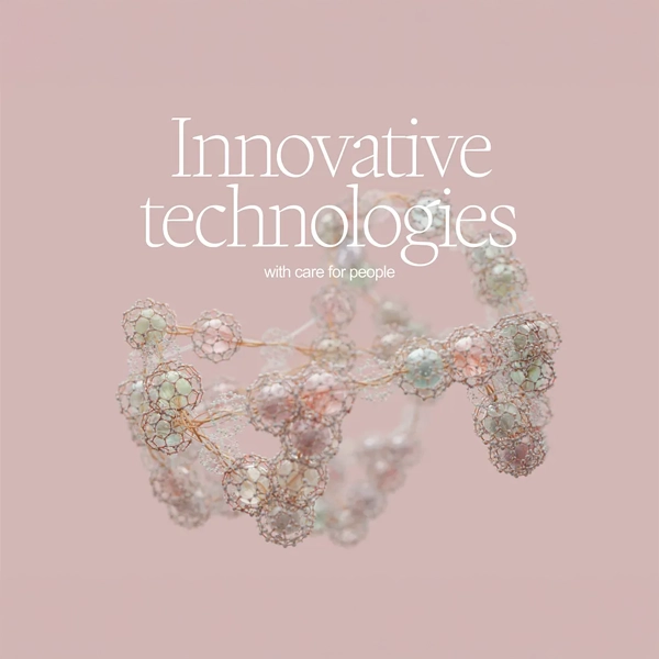
We started by rethinking the logo — designing a symbol that captures both the DNA strand and the human heart, expressing empathy within scientific rigor. The resulting mark is distinctive, scalable, and memorable.
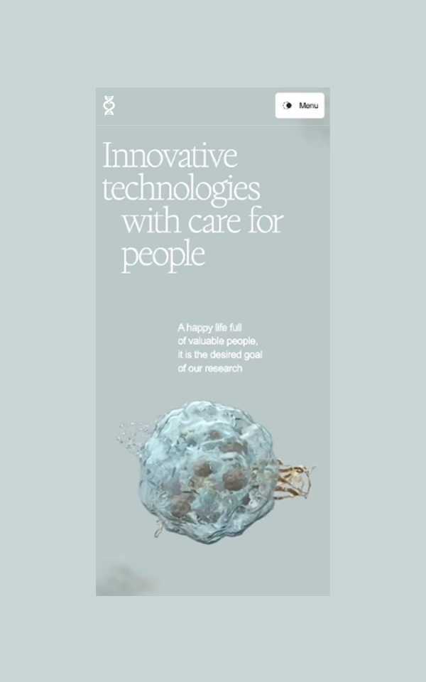
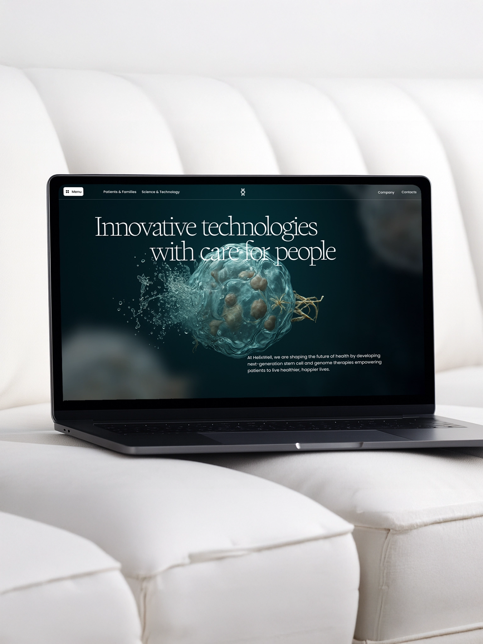
Typography leaned on Writer, a typeface that feels editorial and intelligent but soft enough for patient-facing language. The color palette blends deep teal, warm neutrals, and soft rose tones to reinforce clarity and care without feeling sterile.
This visual system extended through every asset — from marketing to pitch decks — setting the tone for a cohesive, credible brand.

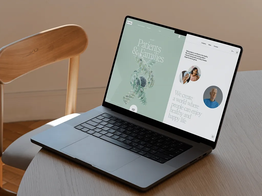
The HelixWell website was built to feel alive — full of motion, light, and depth. 3D cell visuals introduce visitors to the science, while real imagery of families, patients, and researchers anchors the experience in emotion and humanity. Each section was intentionally structured to tell a clear story: what the company does, who it helps, and why it matters.
Typography leaned on Writer, a typeface that feels editorial and intelligent but soft enough for patient-facing language. The color palette blends deep teal, warm neutrals, and soft rose tones to reinforce clarity and care without feeling sterile.
We approached the design with accessibility at its core, ensuring optimal contrast, readability, and mobile responsiveness across all screens. The result is a site that feels premium, intuitive, and timeless — a rare combination in the biotech space.
Since launch, HelixWell has received overwhelmingly positive feedback from investors, partners, and patients. The new identity helped secure greater visibility across conferences and press, while the site now supports their growing content needs with flexibility and consistency.
Most importantly, HelixWell finally feels like what it is: a future-facing biotech brand that leads with both heart and innovation.
LER Web Services helped us turn complex science into a brand that actually connects with people. The site is beautiful, clear, and communicates exactly who we are without compromise.
Have an idea for a website, app, or platform? Let's talk through the next step and shape the work around what the business actually needs.
We'll reply within 24 hours so you know whether the project is a fit and what the next step looks like.
After the first conversation, you'll have a clearer view of scope, timing, and the right way to move the work forward.