
Milam Transport · Case study
A clearer logistics presence for capability-led buyers.
A transportation website direction built around capability clarity, operational trust, and a more direct route to quote conversations.
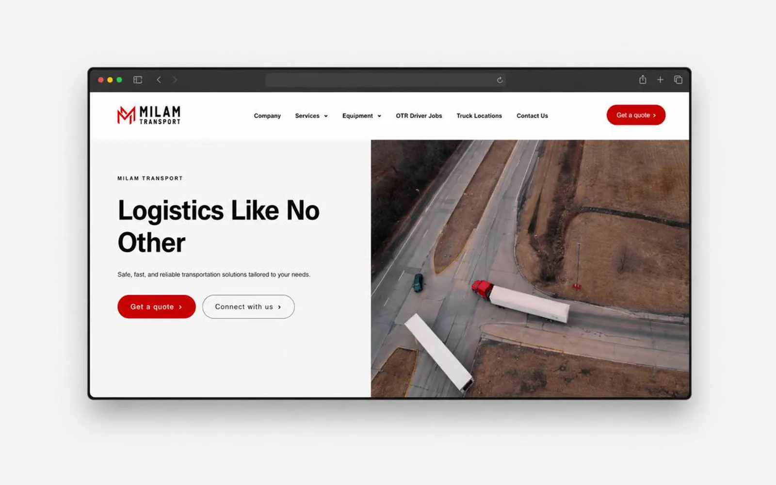
What the website had to do.
Transportation buyers need to understand capability, coverage, and reliability before starting a quote conversation.
LER Web Services framed Milam around practical service messaging, equipment context, and direct inquiry cues.
- 5Core pages, one hierarchy
- 4Workstreams in scope
- 1Primary path to contact
- 2025Launched
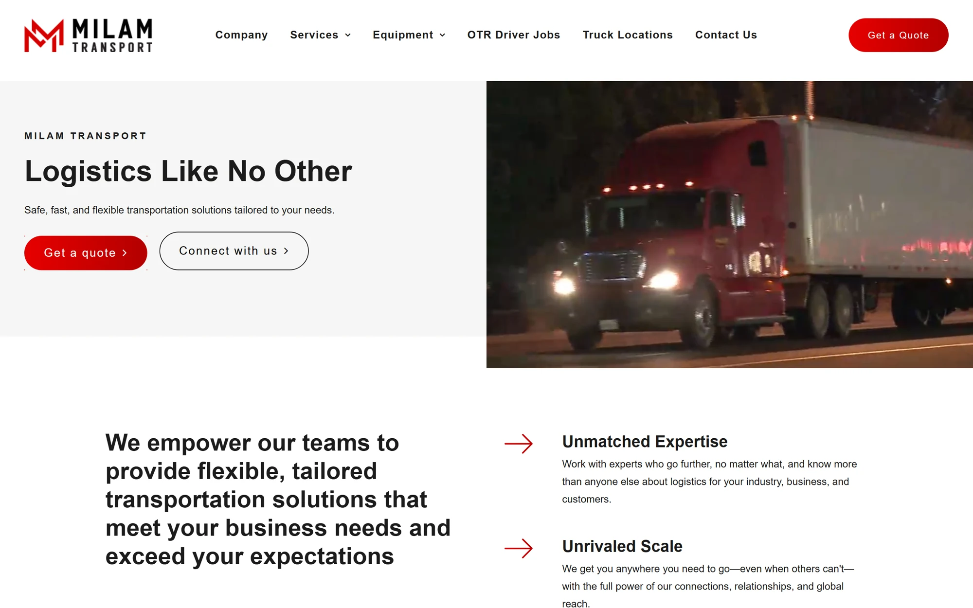
What had to change.
Service capability needed to be clearer from the first page.
The visual direction had to feel dependable and operational, not generic.
Equipment and service-area content needed room to expand.
The quote path needed to be direct for busy commercial buyers.
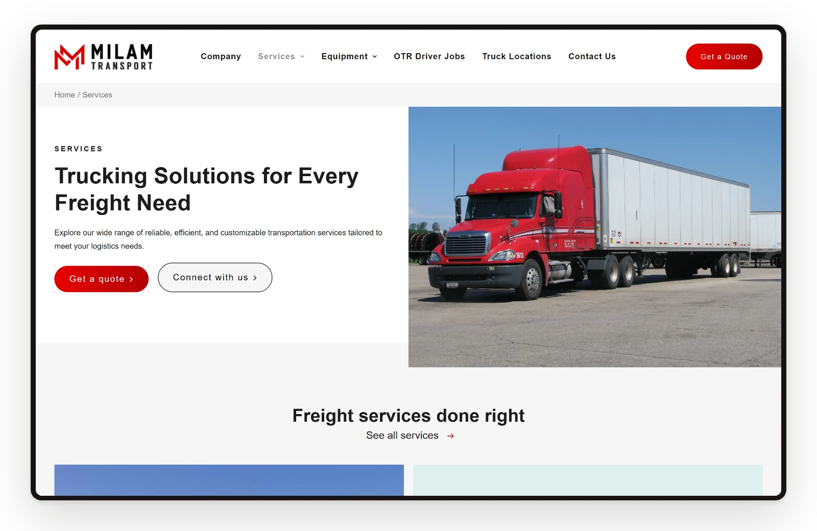
Screens
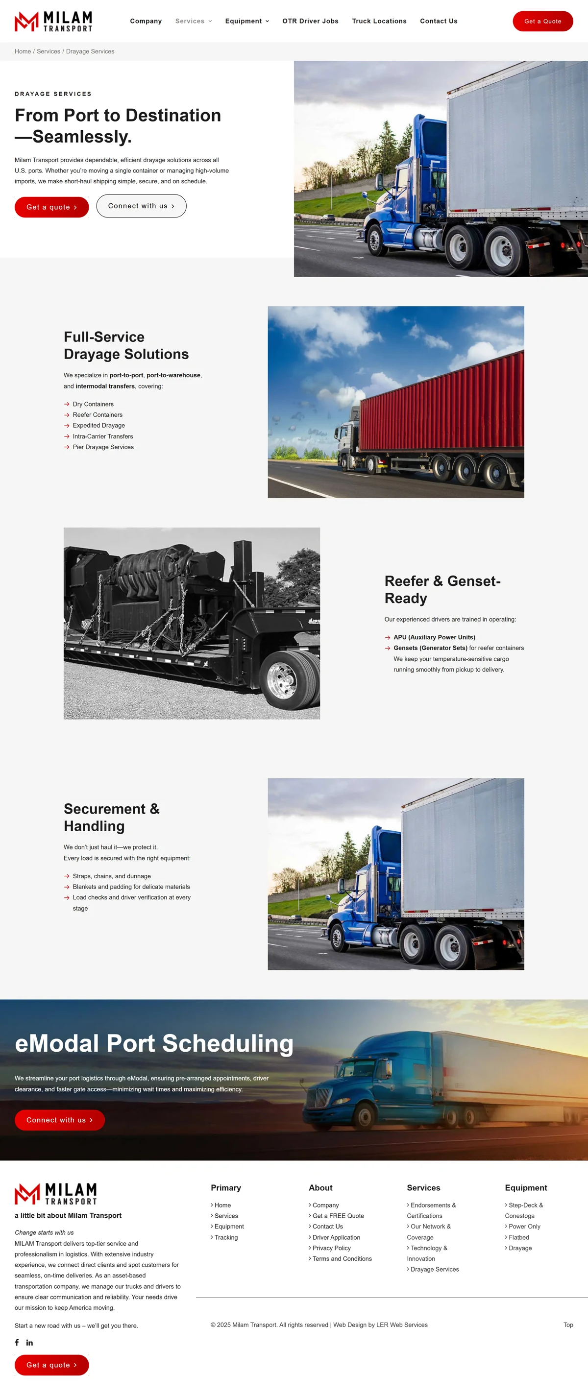
Every page, one system.
Home, services, drayage, equipment, and company share one hierarchy, so a visitor moves from the offer to the next step in a few scrolls.
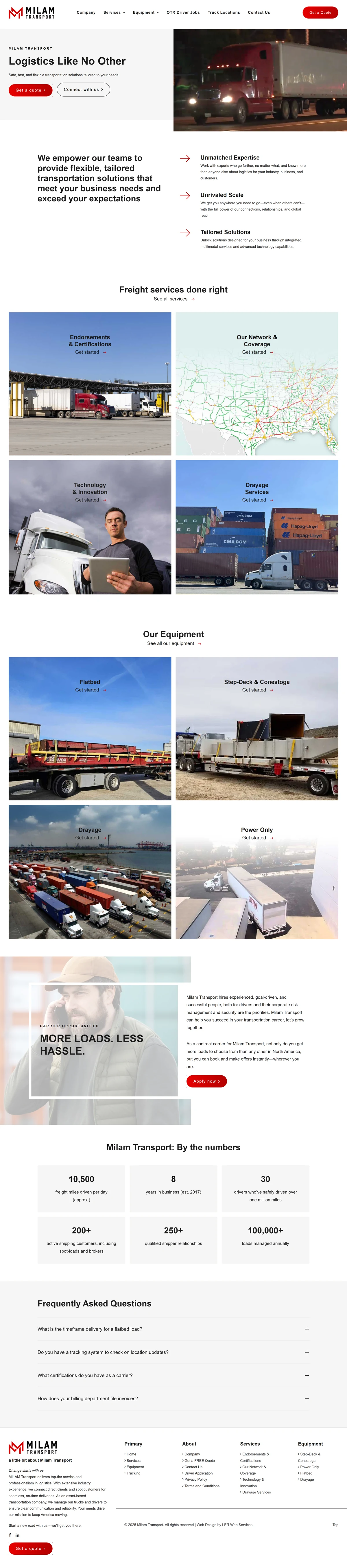
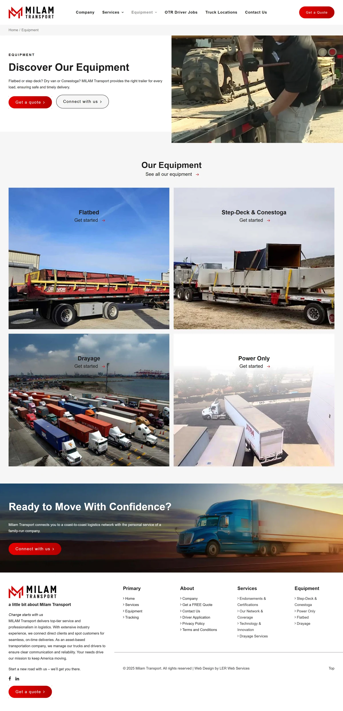
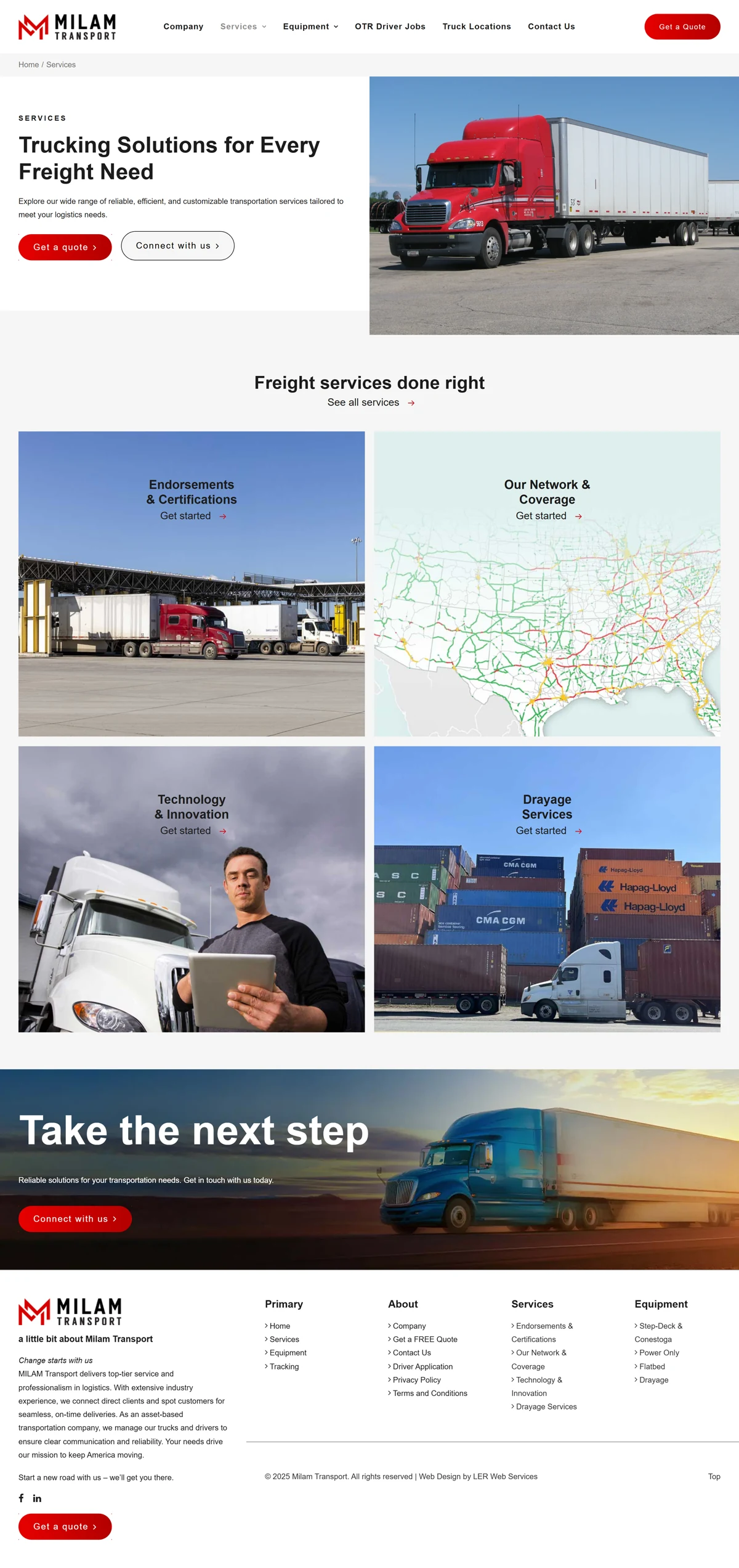
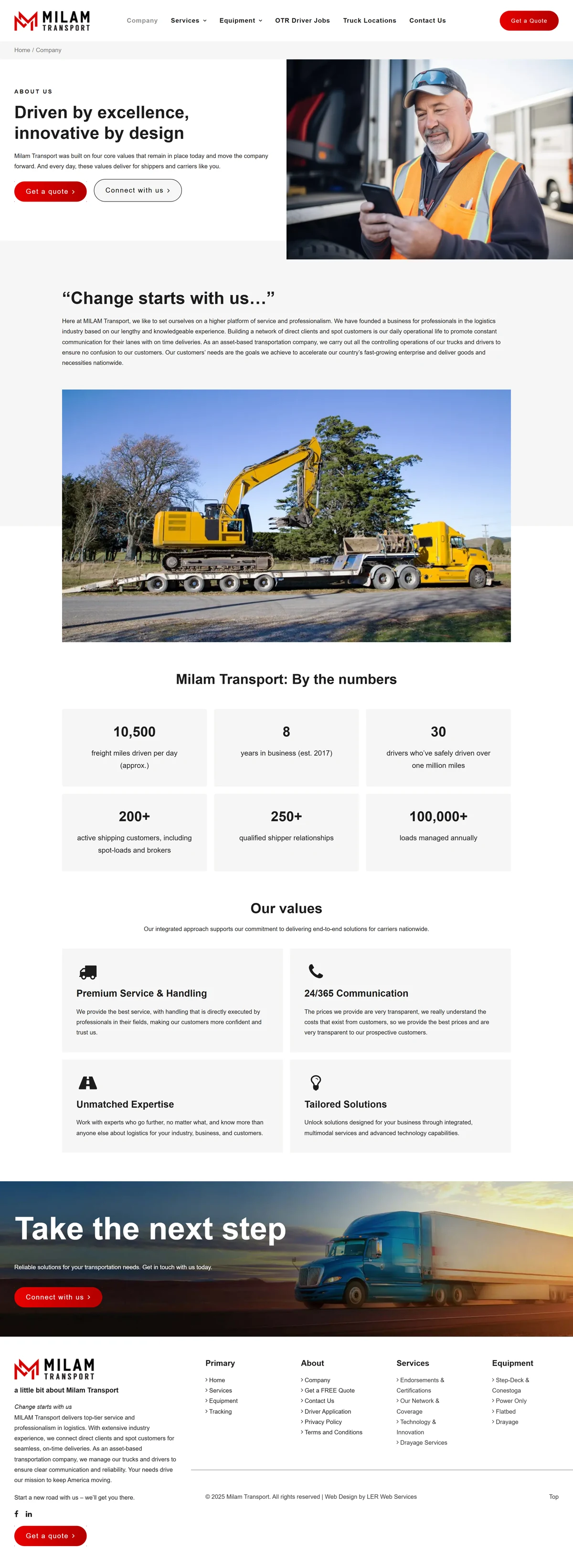
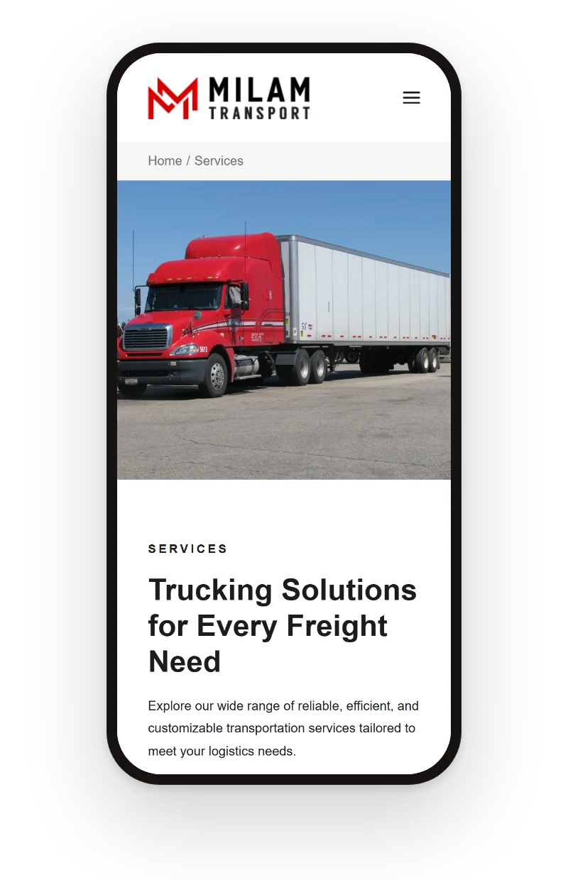
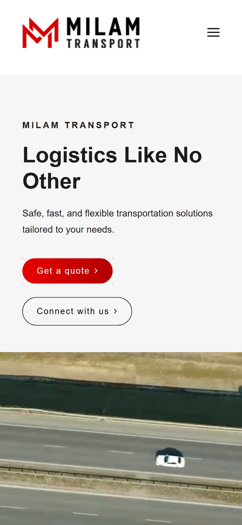
The same clarity on a phone.
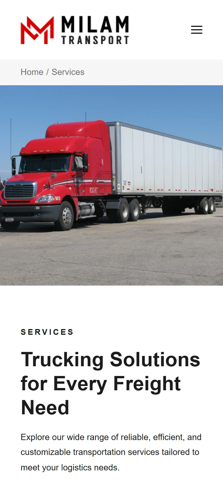
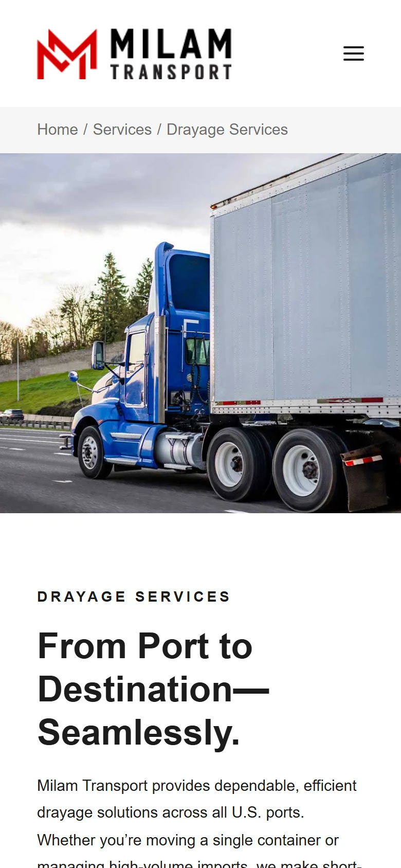
Most visitors arrive on a phone: the offer, the proof, and the contact action keep the same order on mobile.
Visual system.
The site's own palette over the LER paper, and real screens of the live site instead of stock scenes.
- #151515
- #D71920
- #B5121B
- #6B6B6B
- #F5F5F5
Outcome.
Milam Transport now has a cleaner direction for presenting logistics capability and guiding request conversations.
The project now gives visitors a clearer read on service coverage and reliability.
How this one came together.
The four steps behind this build, and what each one had to settle.
Discovery
I clarified the audience, offer, and practical questions the website needed to answer.
Page structure
I organized the page flow around service clarity, proof, and the next action a qualified visitor should take.
Responsive design direction
I shaped the visual system and core screens so the experience could stay polished across devices.
QA and refinement
I reviewed the experience for visual consistency, responsive behavior, and clear paths to contact or purchase.