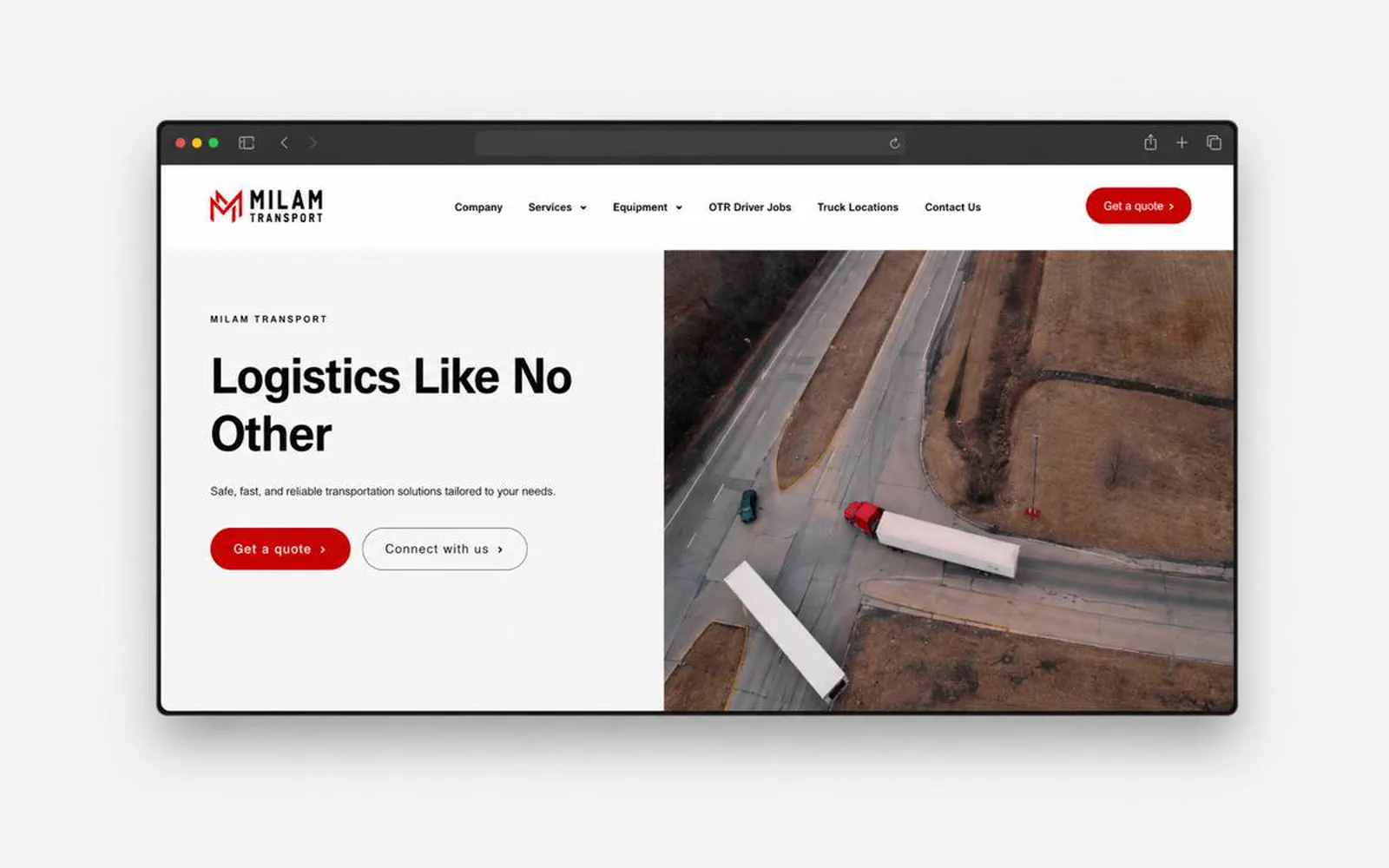
Sphere Integrated Solutions · Case study
A more structured digital presence for technology services.
A B2B technology website direction built around solution clarity, enterprise credibility, and a more confident path to consultation.
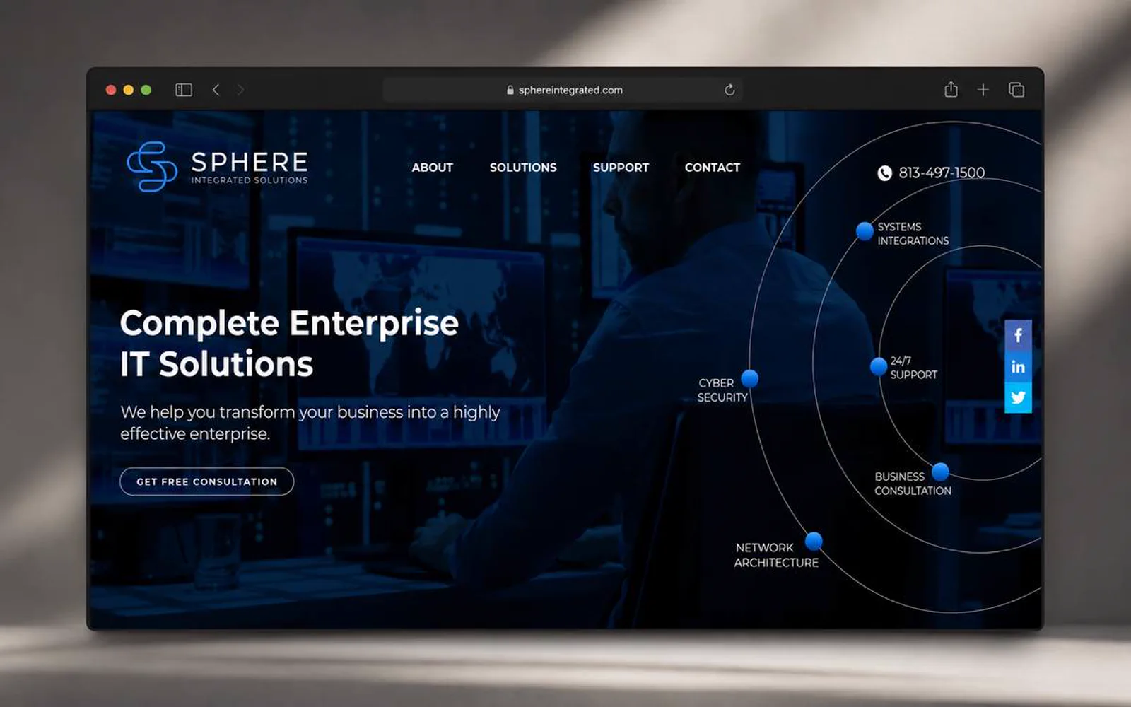
What the website had to do.
Technology-service buyers need a clean path from problem recognition to provider confidence.
LER Web Services shaped Sphere around solution categories, credible interface pacing, and clear consultation cues.
- 5Core pages, one hierarchy
- 4Workstreams in scope
- 1Primary path to contact
- 2007Launched
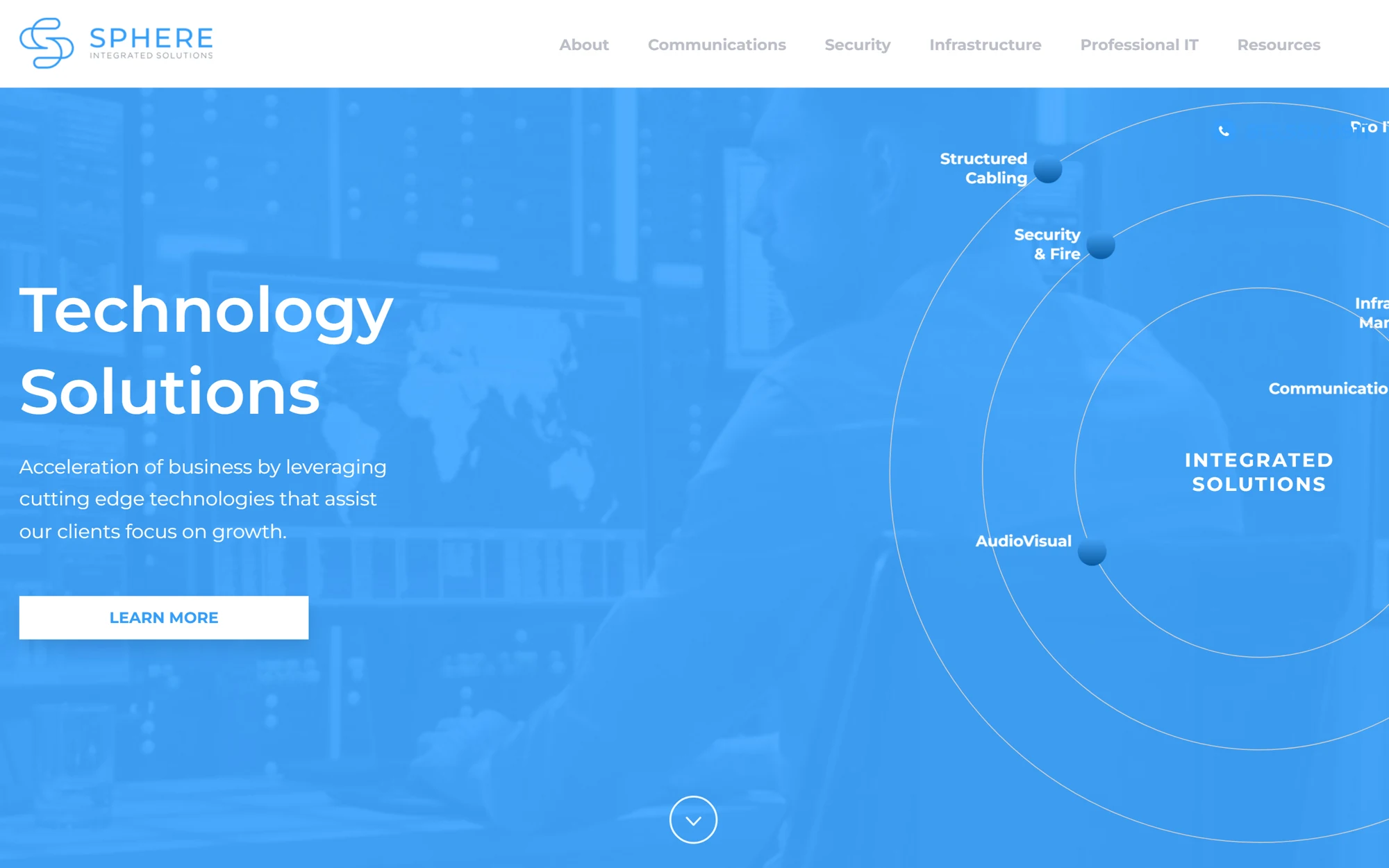
What had to change.
The service offer needed a stronger structure for mixed technical and business audiences.
The visual system had to feel polished without overcomplicating the message.
Contact prompts needed more confidence and less friction.
The site needed room for case proof, integrations, and service expansion.
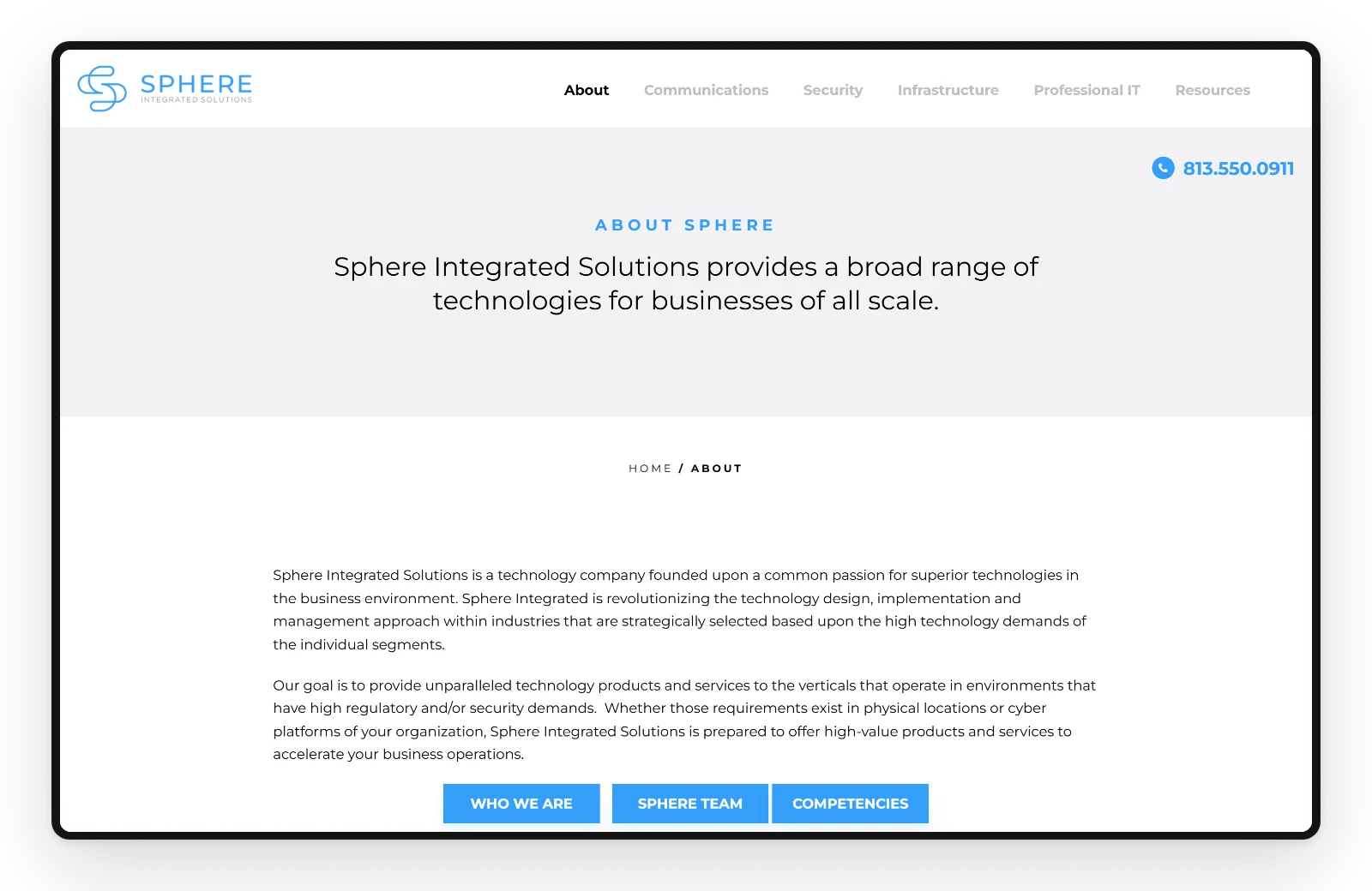
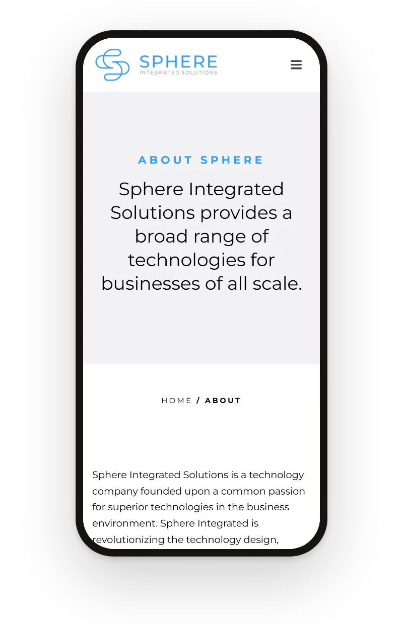
Screens
Every page, one system.
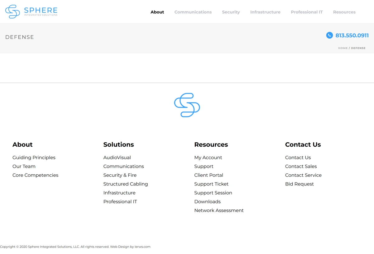
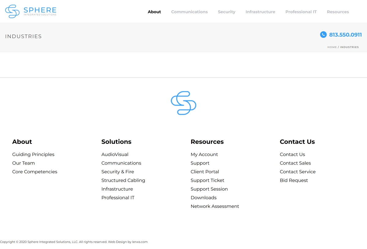
Home, about, industries, competencies, and defense share one hierarchy, so a visitor moves from the offer to the next step in a few scrolls.
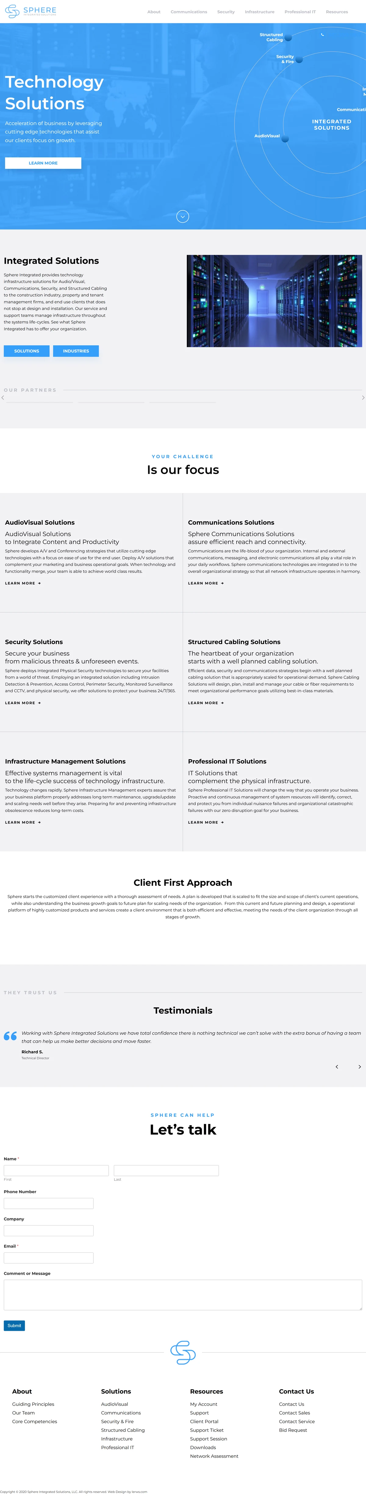
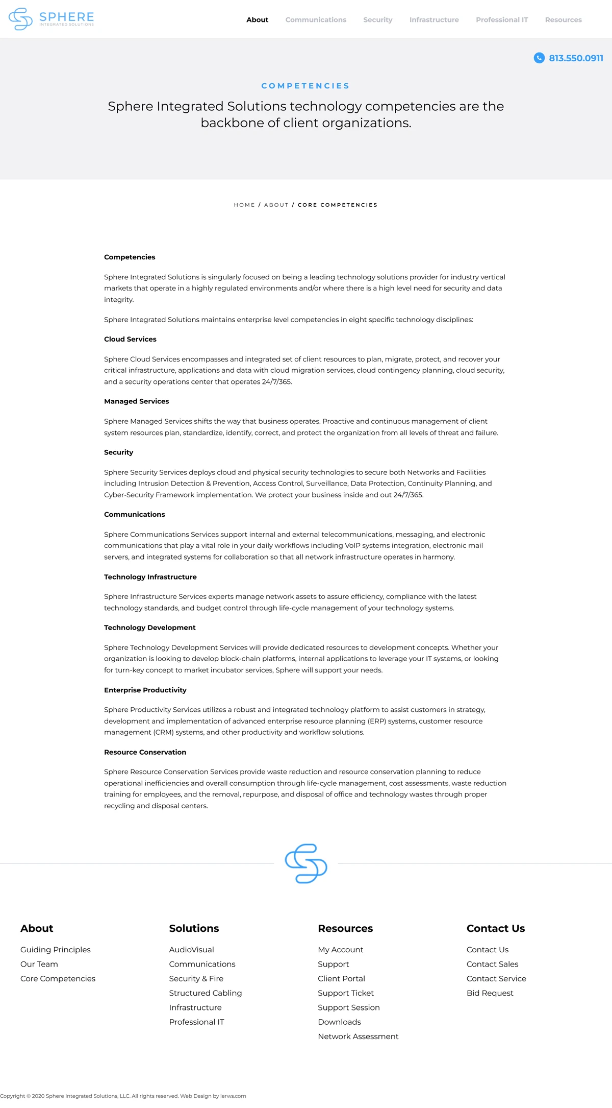
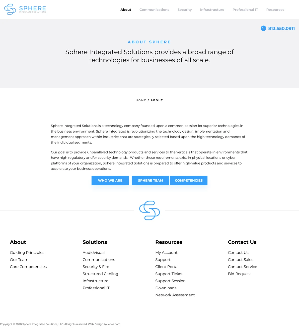
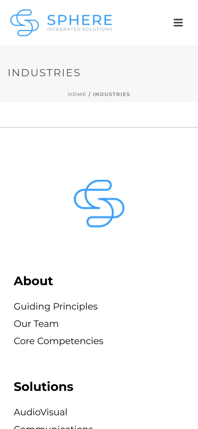
The same clarity on a phone.
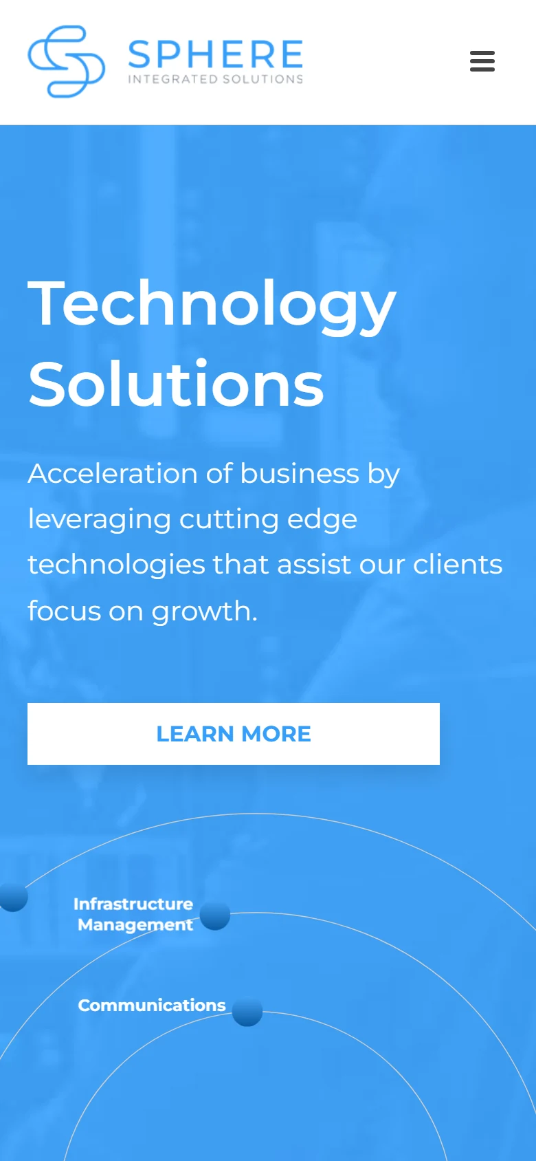
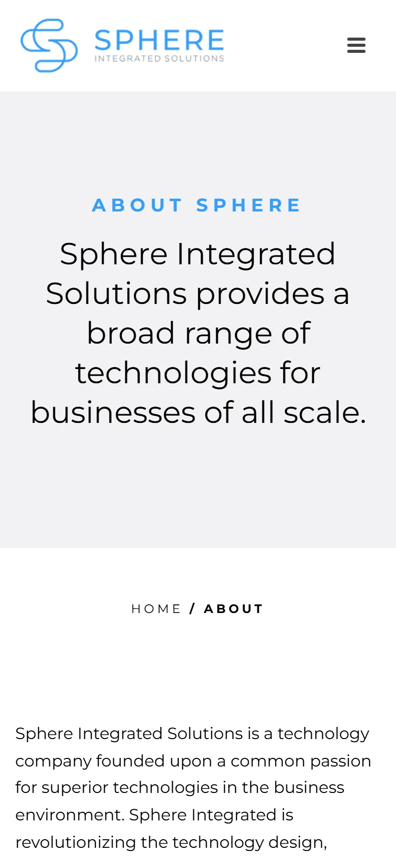
Most visitors arrive on a phone: the offer, the proof, and the contact action keep the same order on mobile.
Visual system.
The site's own palette over the LER paper, Montserrat for headings, and real screens of the live site instead of stock scenes.
Type · Montserrat
- #061429
- #0A63D8
- #28A7FF
- #405C84
- #EAF3FF
Outcome.
Sphere now has a clearer B2B web direction for presenting technology solutions and starting consultation conversations.
The project now gives business visitors a clearer route from solution evaluation to consultation.
How this one came together.
The four steps behind this build, and what each one had to settle.
Discovery
I clarified the audience, offer, and practical questions the website needed to answer.
Page structure
I organized the page flow around service clarity, proof, and the next action a qualified visitor should take.
Responsive design direction
I shaped the visual system and core screens so the experience could stay polished across devices.
QA and refinement
I reviewed the experience for visual consistency, responsive behavior, and clear paths to contact or purchase.