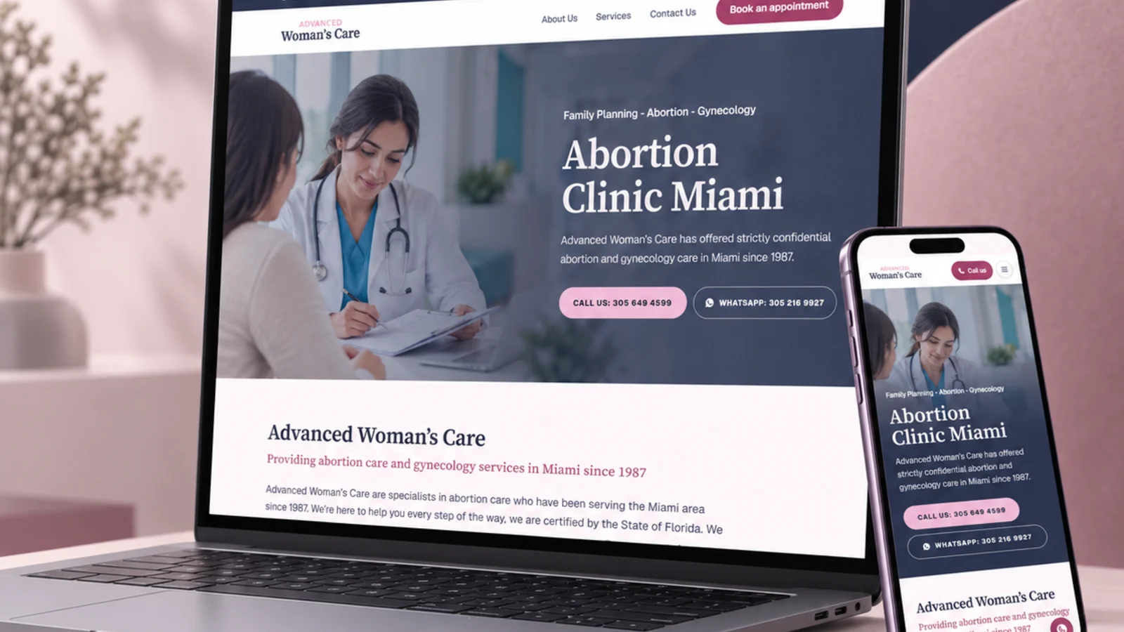
A Hialeah Woman’s Care Center · Case study
A page for every service, in two languages.

- Project overview
- A rebuild of ahialeahwomanscarecenter.com as a static Next.js site: the clinic’s eleven services, each on its own page in English and Spanish, with the phone number always one tap away.
- Services
- Maintain first
- Read the visit, not the page
- Rebuild with parity
- Cut over, then check
- Date
- January 2020
- Client
- A Hialeah Woman’s Care Center
- Location
- Hialeah, FL
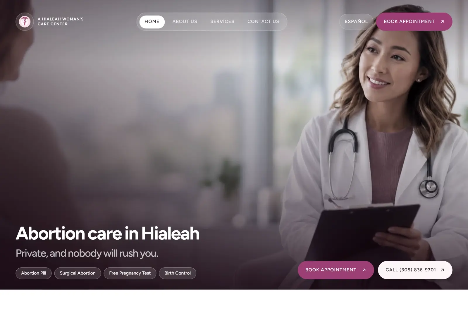
What the site had to do.
A Hialeah Woman’s Care Center has offered abortion and gynecology care in Hialeah since 1986. Its website ran on WordPress with a bought theme, on LER’s server.
Most visitors arrive on a phone, in Spanish as often as English, looking for one of two things: the number to call, or whether the clinic does what they need. The site keeps both within a thumb’s reach on every page and says plainly what happens next.
- 1986Caring for patients since
- 32Pages, all prerendered
- 11Services, each on its own page
- 2Languages, every page in both
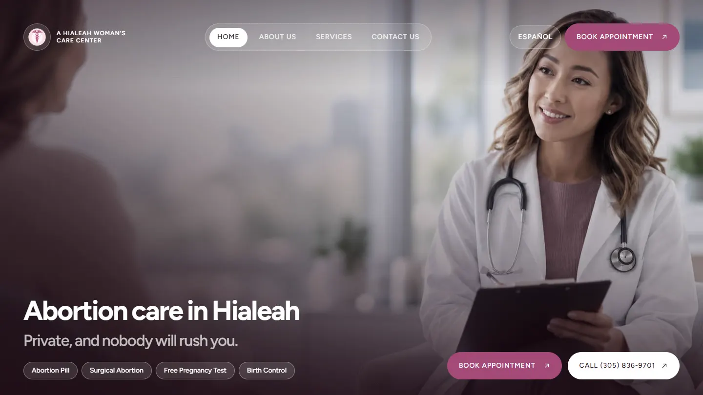
What changed, and what did not.
The old site was six pages. Every service the clinic offers was one line of text on a single services page, so none of them could rank for anything, and its uploads folder was empty: the logo, the hero and the clinic photographs all returned a 404.
The content and the conversion paths carried over: the phone links, the contact form, the three Google reviews. Four things were fixed rather than rewritten.
Every image, back
The originals were recovered from the client archive: the logo, the caduceus mark, the waiting room and the hallway. Visitors see the clinic again.
A page per service
Eleven service pages in each language, so a search for the abortion pill, an IUD or a pregnancy test lands on an answer rather than a list.
Two misspelled URLs
/schedule-appoinment/ and /es/nostros/ were visible in search results. Both are corrected, and the old addresses redirect to the new ones.
A booking request in two steps
The appointment page leads with the phone number and follows with a short two-step request form, delivered straight to the clinic’s inbox.
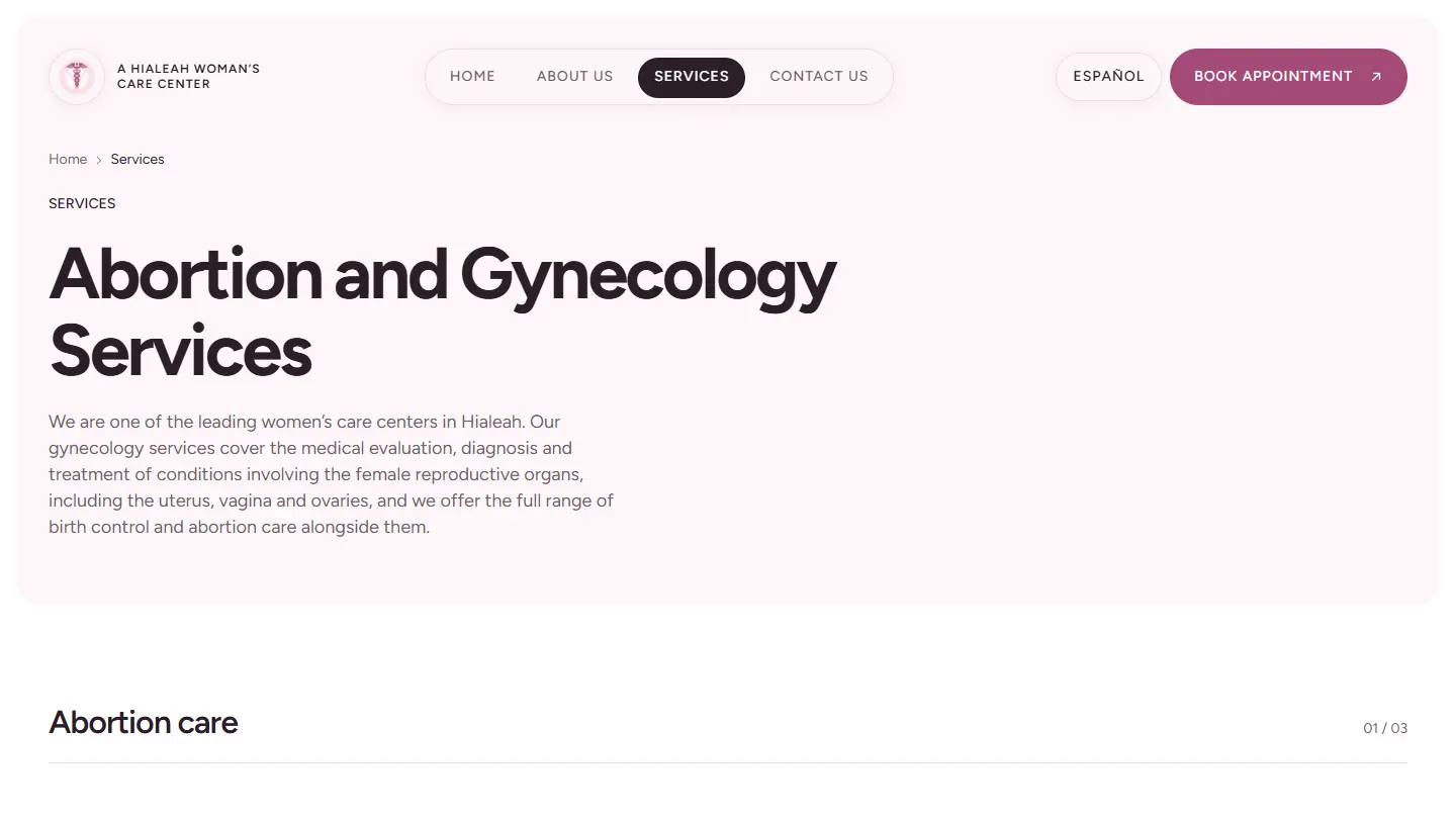
Screens
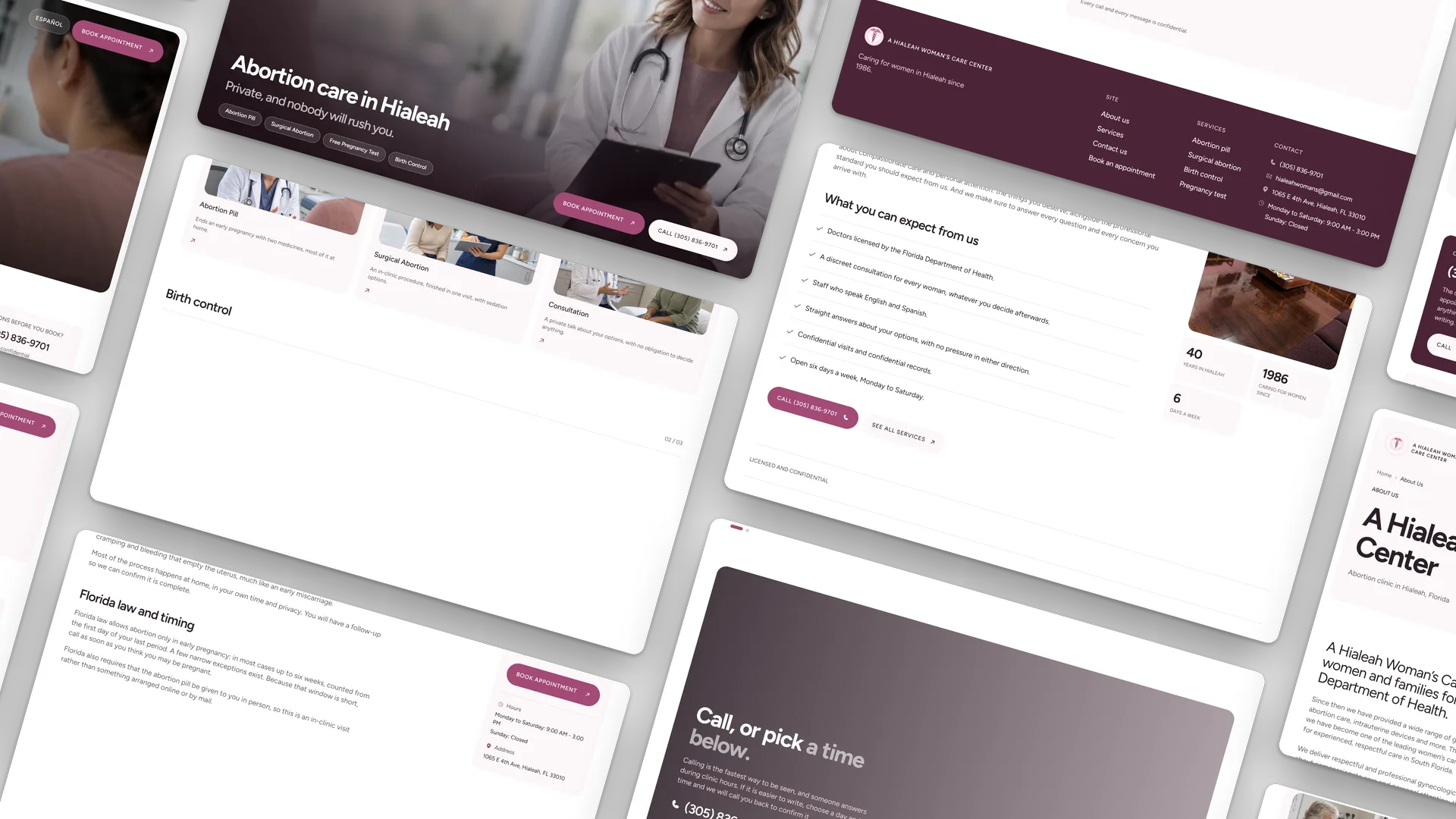
Every page, one system.
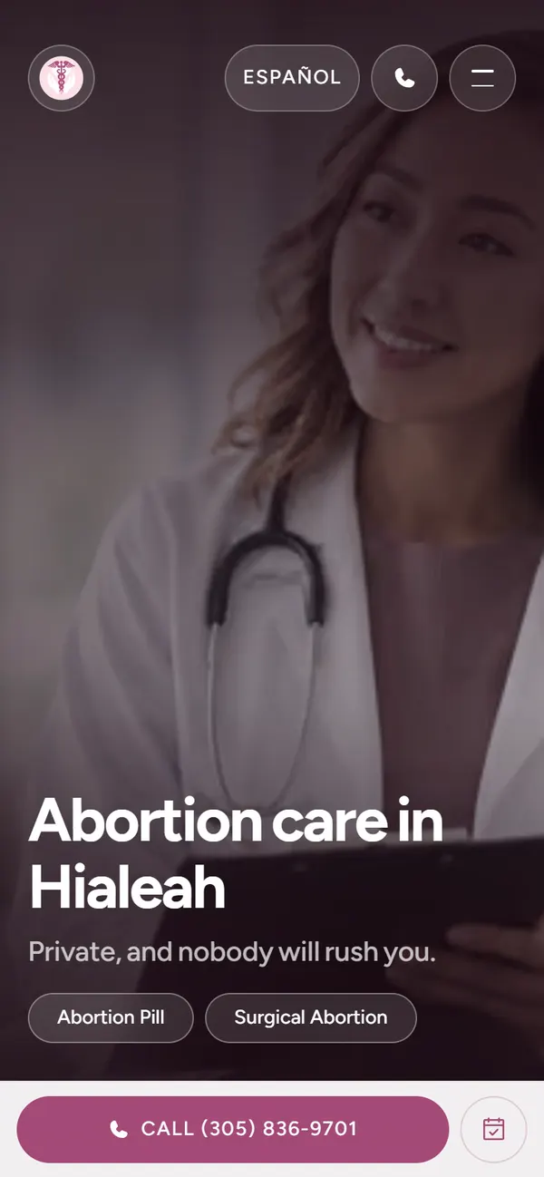
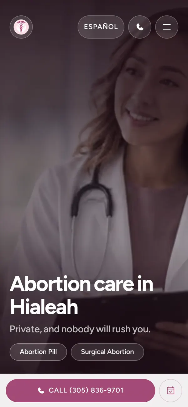
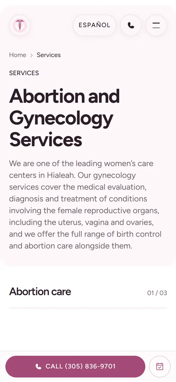
Home, services, the service pages, booking and the Spanish site share one grid and one type scale, so the difference between them is the words rather than a different website.
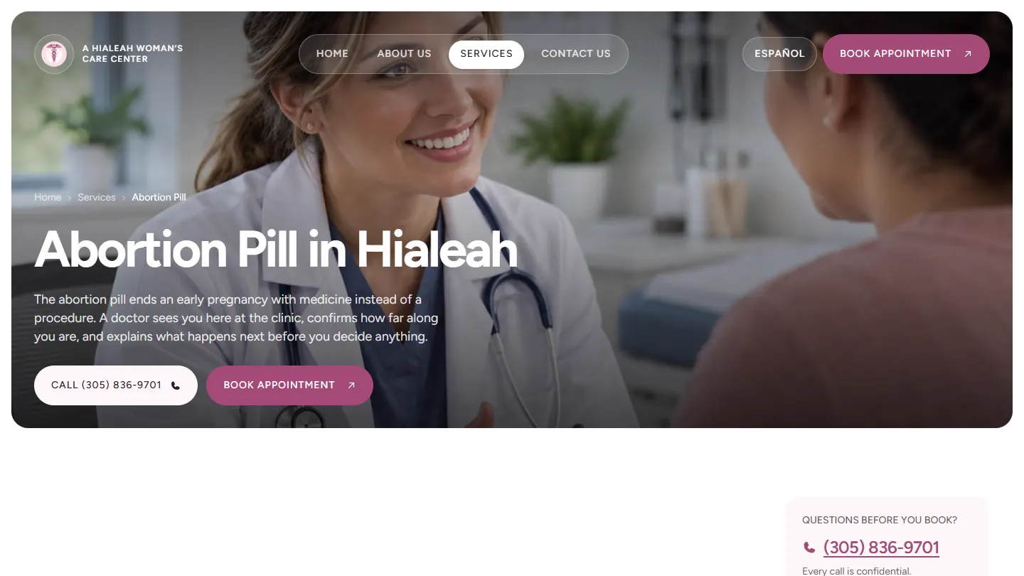
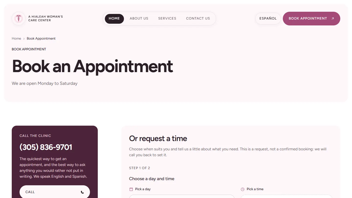
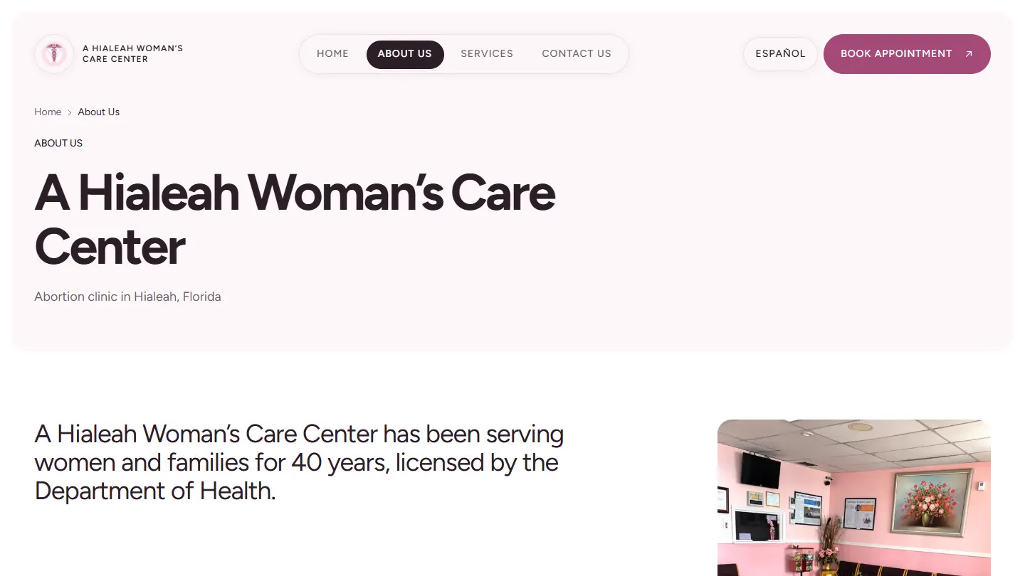
Built for a phone, in a hurry.
The call button and the booking button sit in the header on every page and in the hero on the first. A visitor who came for the number never has to scroll for it.
The booking page puts the phone first, then the hours, then the request form, because the phone is the quickest way to get an appointment and the best way to ask anything you would rather not put in writing.
Wireframes
The structure underneath.
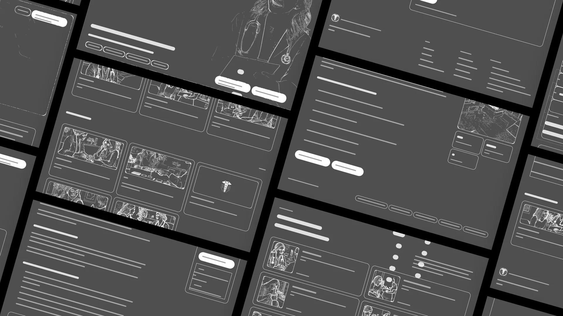
The same pages with the styling stripped away: one grid, one type scale, and the same set of components on every route.
Visual system.
The colours are sampled from the clinic’s own logo, not chosen: the plum of the caduceus for marks and buttons, the blush of the disc behind it for surfaces, a deep plum for the header strip and the footer. The interactive plum was deepened until it clears WCAG AA on white at 5.5:1. Instrument Sans carries the display and body text; Geist Mono, uppercase and tracked, marks every label and button, so it is clear at a glance what is prose and what is a control.
- #4C2439
- #AF547F
- #A34A76
- #FBE0E5
- #2A1F27
Where it stands.
The rebuild is live on the clinic’s domain: 32 static pages in both languages, the booking request and the contact form delivering to the clinic, and every old address landing on its replacement.
The service copy is with the clinic for review, and one service photograph still shows a brand panel in place of a picture.
How this one came together.
Four steps, and what each one had to settle.
Maintain first
LER took over the live WordPress site and kept it running while the replacement was built.
Read the visit, not the page
Who arrives, on what device, in which language, and what they need to decide in the first minute.
Rebuild with parity
A static Next.js build, 32 pages, every URL that ranked preserved and the two misspelled ones redirected.
Cut over, then check
Live on the clinic’s domain, with all 32 pages, both forms and every redirect checked the same morning.