Skinny Shot MD · Case study

A clearer path to weight-loss treatment inquiries.

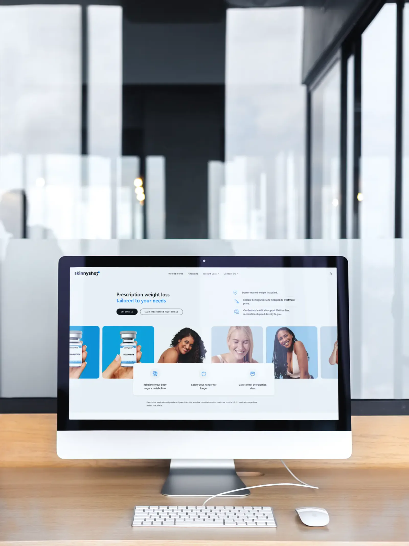
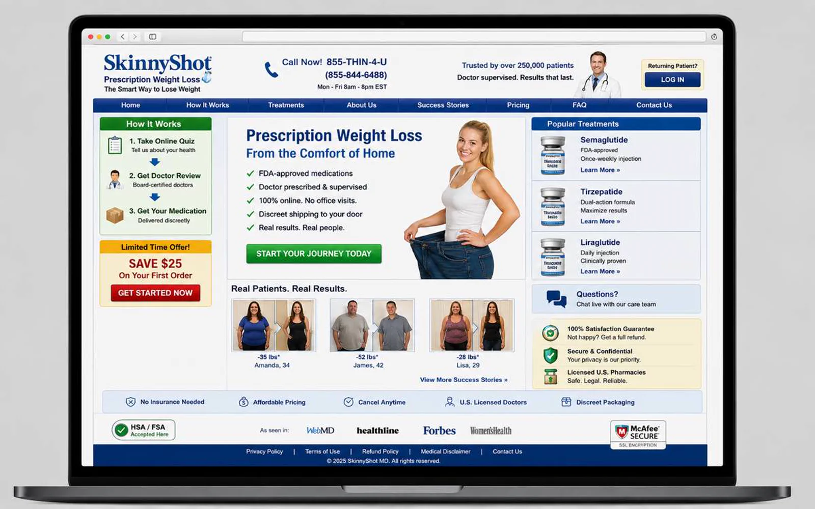
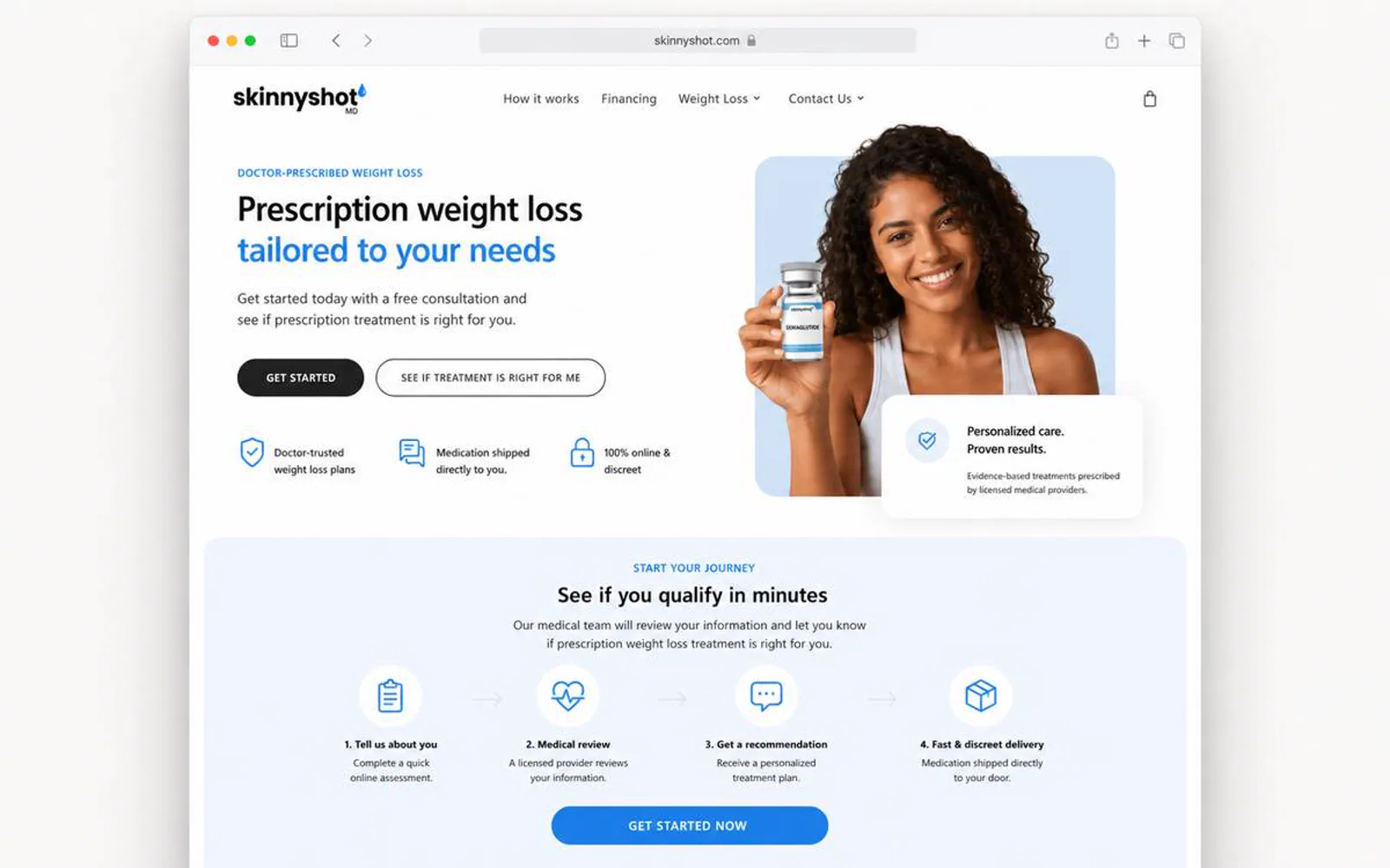
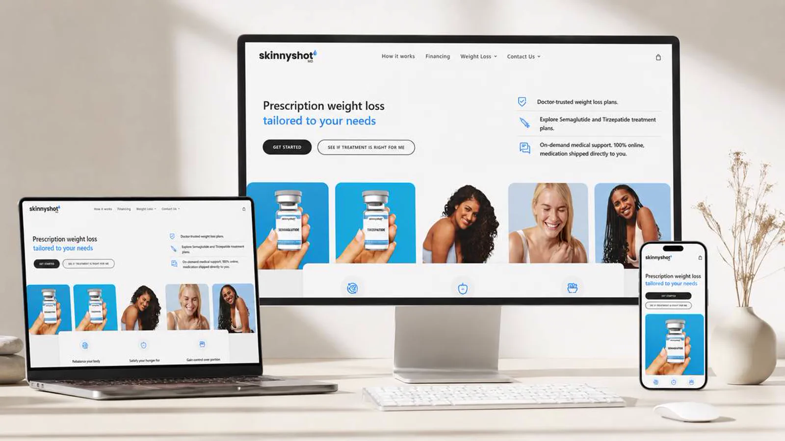
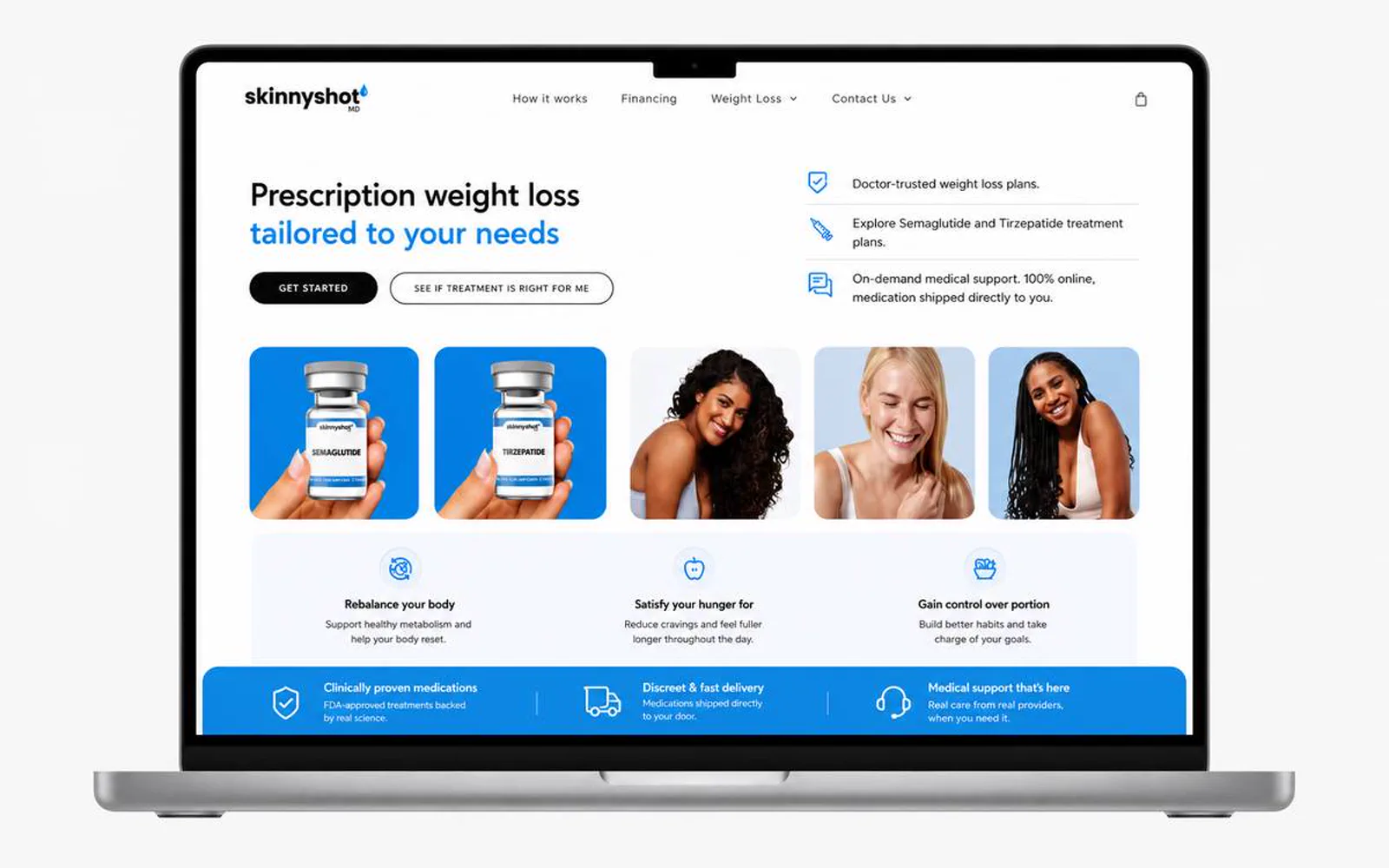
A more approachable treatment website for weight-loss inquiries, booking confidence, and follow-up-friendly workflows.

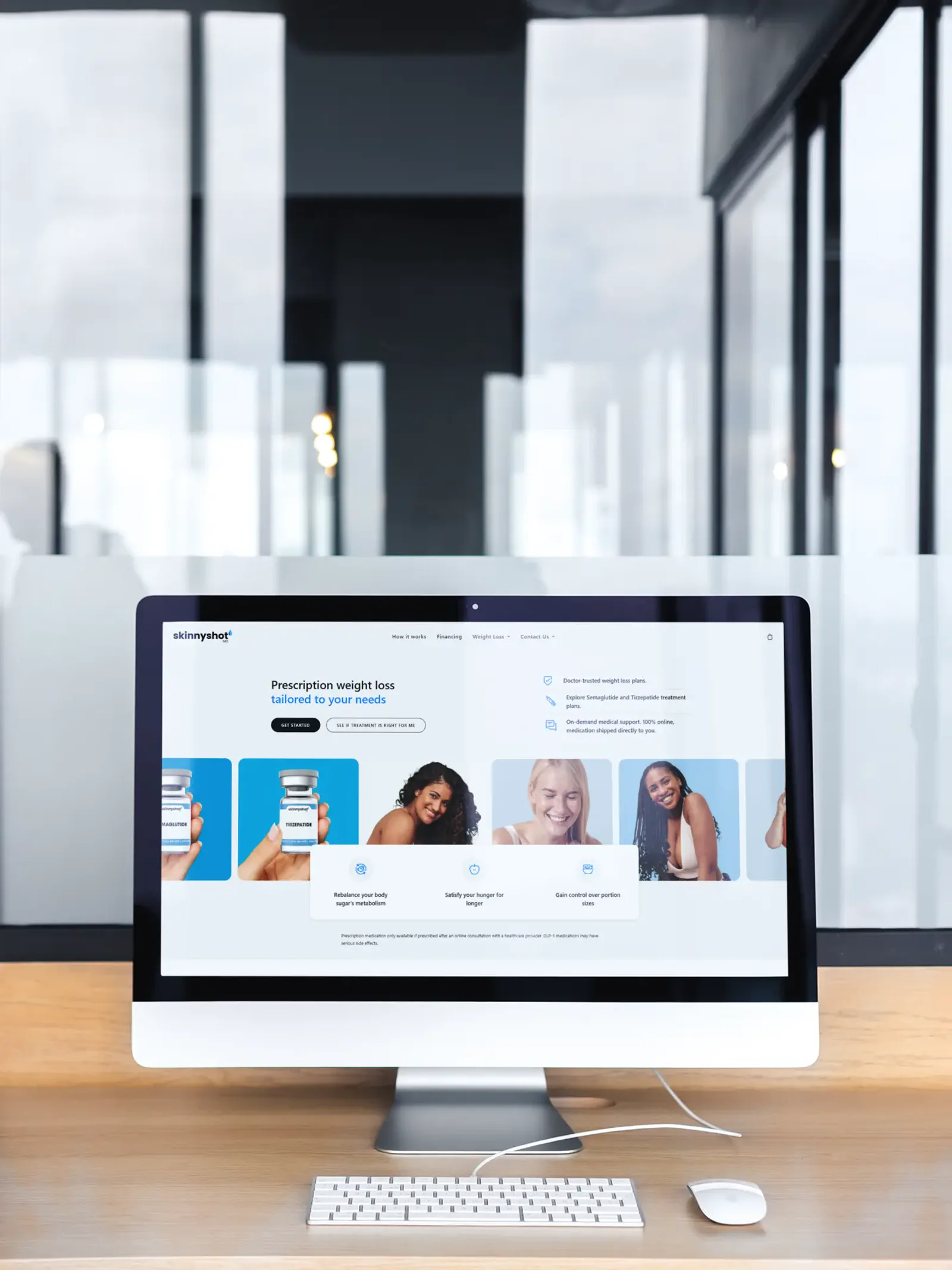
Skinny Shot MD project cover

Project story

The details behind the work.

Positioning, issues solved, scope, outcome, and the decisions behind the project.

  • Positioning

    Skinny Shot MD needed a website direction that made the business easier to understand before a prospect reached out.

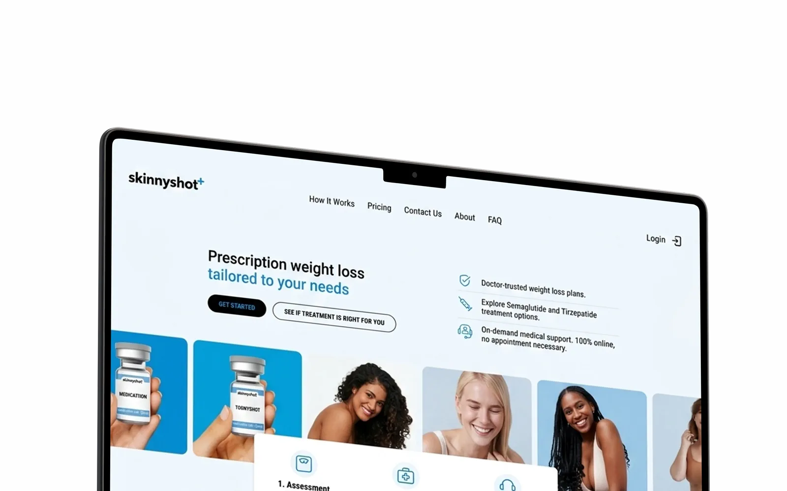
    LER Web Services shaped the experience around clearer hierarchy, stronger visual trust, and a more direct path to action.
  • Issues I solved

    • The offer needed to be easier to scan for first-time visitors.
    • The brand needed a sharper first impression without overcomplicating the experience.
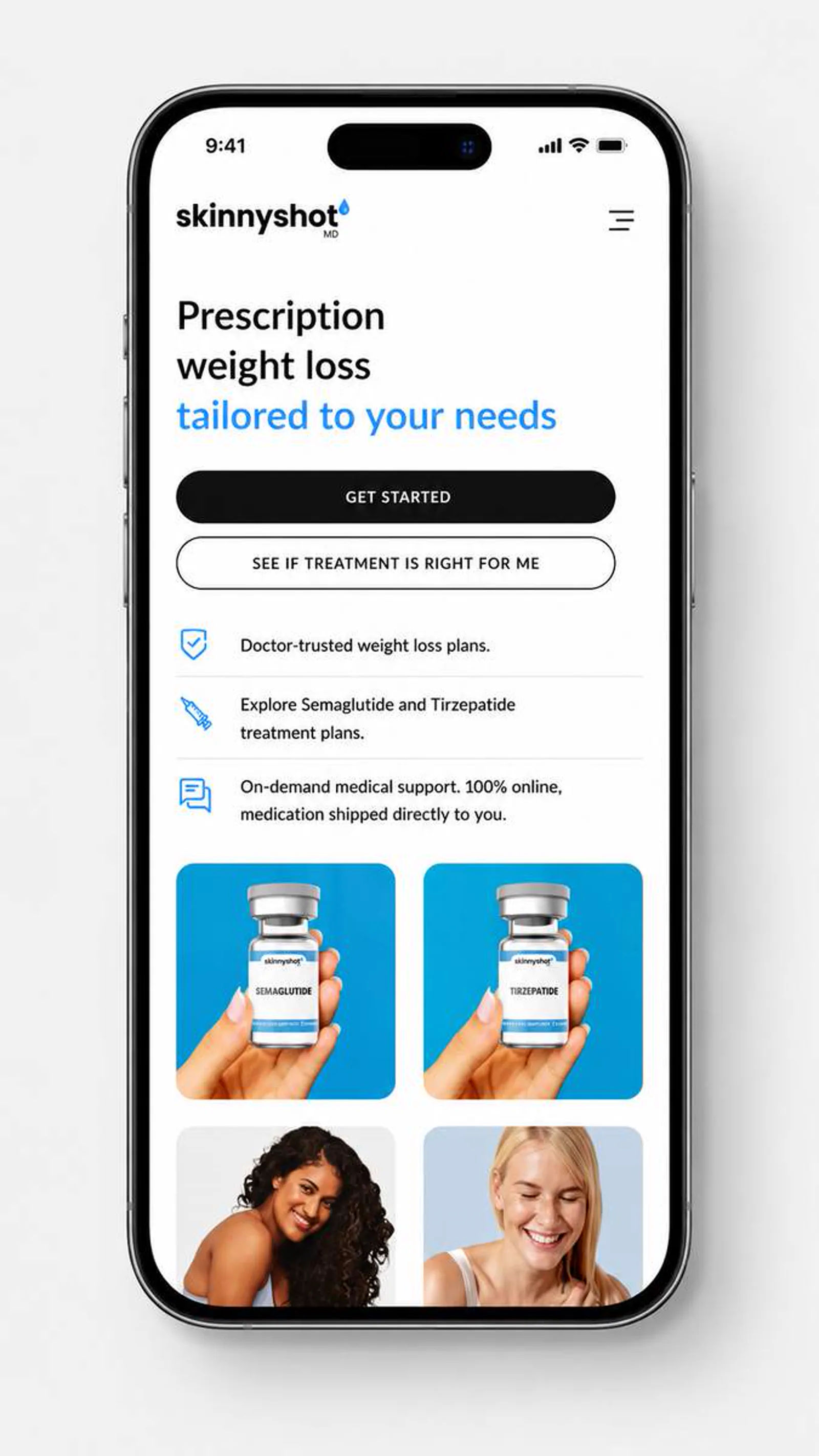
    • Mobile users needed the same clarity as desktop visitors.
    • The site needed a structure that could support future proof, content, and campaign updates.
  • Scope

    Skinny Shot MD needed to make medical weight-loss interest feel easier to understand, safer to act on, and simpler to follow up.

    • WordPress development
    • WooCommerce setup
    • Booking UX
    • CRM planning
  • Outcome

    Skinny Shot MD now has a clearer digital direction for explaining the offer and supporting better inquiry paths.

    Skinny Shot MD is presented with stronger hierarchy, clearer trust cues, and a more direct path for visitors to understand the next step.

  • Project takeaway

    Skinny Shot MD now presents the business with clearer positioning, cleaner responsive screens, stronger content structure, and a calmer path from interest to action. The work brought WordPress development, WooCommerce setup, and Booking UX into one consistent public-facing experience.

Visual system

Palette and type cues.

A concise record of the visual direction behind the project.

Color palette

  • #0E2135
  • #1EA7E1
  • #6CC8F0
  • #587389
  • #EEF8FD

Typography

Editorial sans + practical hierarchy

The visual direction keeps the project clear, polished, and usable across desktop and mobile screens.

The copy direction stays direct: explain the value, reduce uncertainty, and make the next step easier to take.

How the project moved.

A standard LER project path, adapted to the scope and available client material.

  1. Discover

    Discovery and content review

    I clarified the audience, offer, and practical questions the website needed to answer.

    • Audience
    • Offer
    • Priorities
  2. Structure

    Page structure

    I organized the page flow around service clarity, proof, and the next action a qualified visitor should take.

    • Hierarchy
    • Messaging
    • CTAs
  3. Design

    Responsive design direction

    I shaped the visual system and core screens so the experience could stay polished across devices.

    • UI direction
    • Responsive
    • Visual polish
  4. Review

    QA and refinement

    I reviewed the experience for visual consistency, responsive behavior, and clear paths to contact or purchase.

    • QA
    • Refinement
    • Launch prep