Veluna · Case study
A streamlined experience for modern weight loss.
A streamlined telehealth experience for modern weight loss, designed to make treatment education feel clear, legitimate, and human.
What the website had to do.
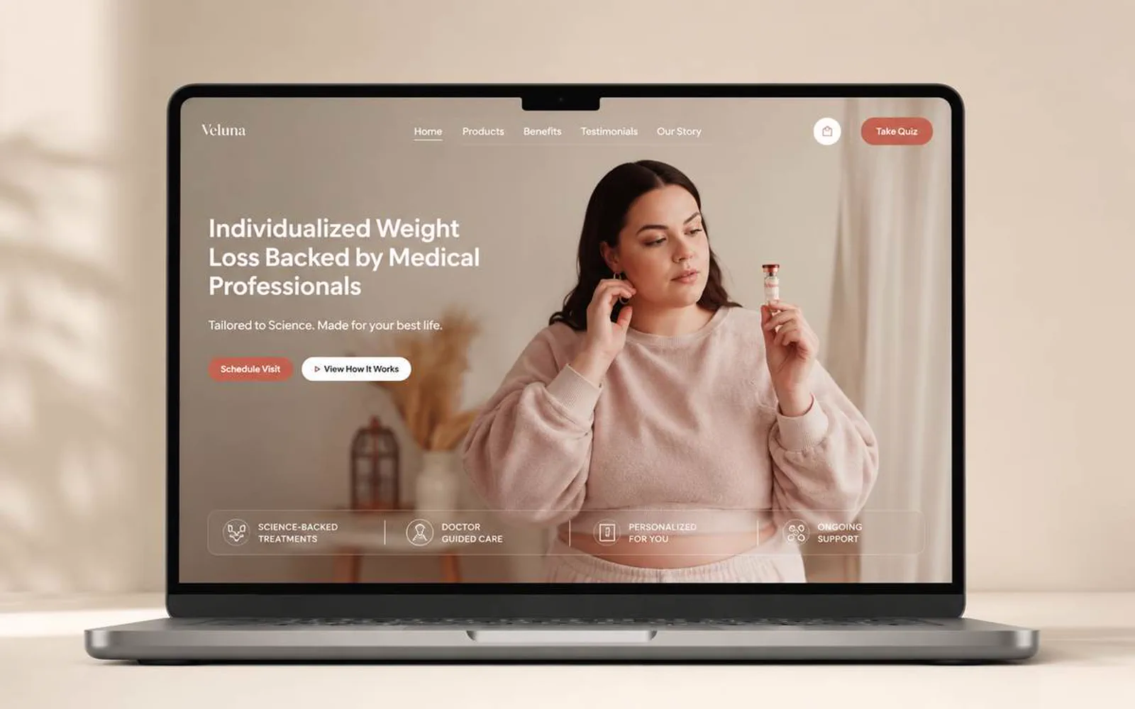
Veluna needed a website direction that made the business easier to understand before a prospect reached out.
LER Web Services shaped the experience around clearer hierarchy, stronger visual trust, and a more direct path to action.
- 1Core pages, one hierarchy
- 4Workstreams in scope
- 1Primary path to contact
- 2025Concept direction
What had to change.
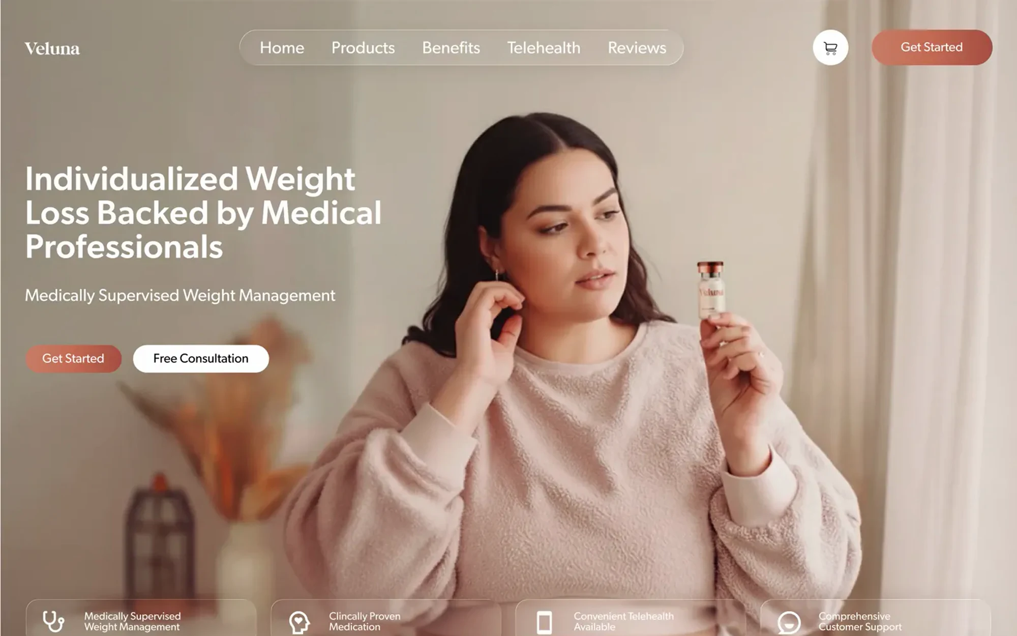
The offer needed to be easier to scan for first-time visitors.
The brand needed a sharper first impression without overcomplicating the experience.
Mobile users needed the same clarity as desktop visitors.
The site needed a structure that could support future proof, content, and campaign updates.
Visual system.
The site's own palette over the LER paper, and real screens of the design instead of stock scenes.
- #332621
- #D88A72
- #F0C3B4
- #7A665D
- #F8EFEA
Outcome.
Veluna now has a clearer digital direction for explaining the offer and supporting better inquiry paths.
Veluna is presented with stronger hierarchy, clearer trust cues, and a more direct path for visitors to understand the next step.
How this one came together.
The four steps behind this build, and what each one had to settle.
Discovery
I clarified the audience, offer, and practical questions the website needed to answer.
Page structure
I organized the page flow around service clarity, proof, and the next action a qualified visitor should take.
Responsive design direction
I shaped the visual system and core screens so the experience could stay polished across devices.
QA and refinement
I reviewed the experience for visual consistency, responsive behavior, and clear paths to contact or purchase.