
Advanced Woman’s Care · Case study
A calmer path to care for a Miami clinic.
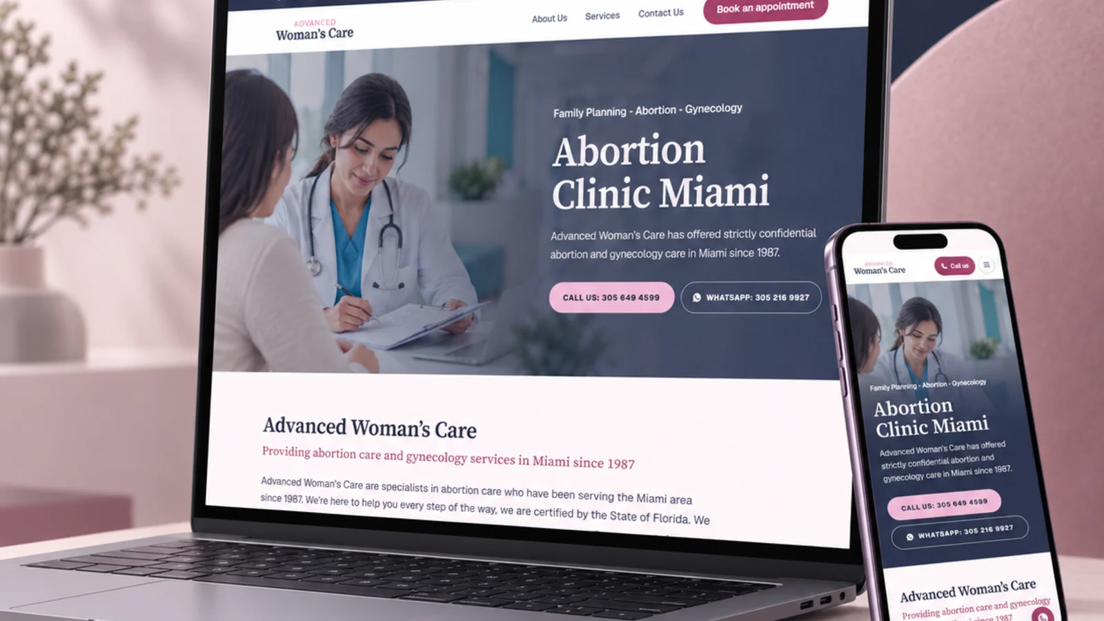
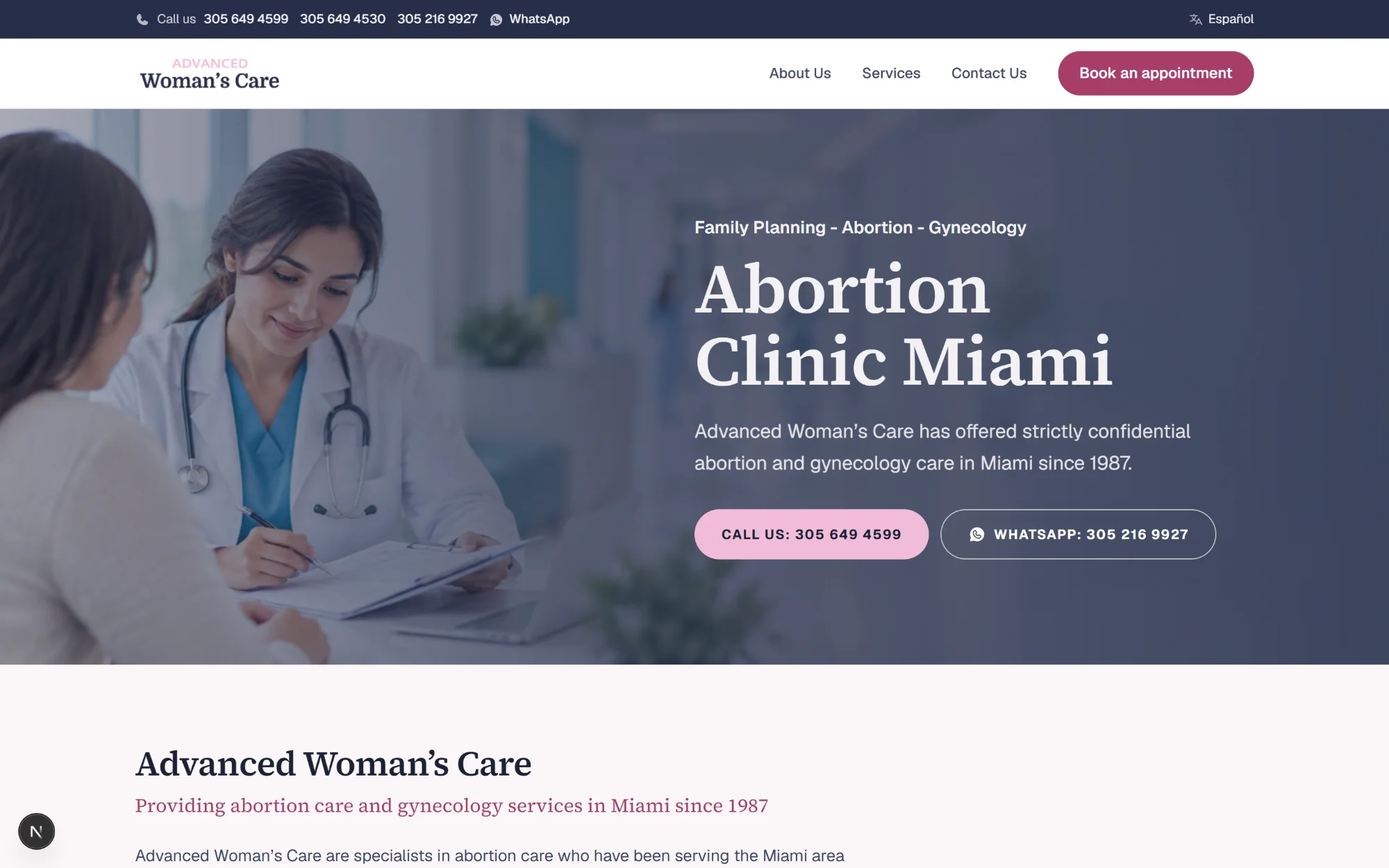
A staging rebuild of advancedwomanscare.com as a custom Next.js site: the same content and the same URLs, in both languages, carrying the clinic's own brand instead of a bought theme.
What the rebuild had to do.
Advanced Woman’s Care has offered abortion and gynecology care in Miami since 1987. Its website runs on WordPress with a bought theme, and LER maintains it.
People arrive here in difficulty, usually on a phone, often in a hurry, sometimes needing privacy. That reading of the brief drove the whole rebuild: nothing moves on the page, the phone number is the first action everywhere, and the clinic's own words are carried across unchanged.
- 1987Caring for patients since
- 39Pages, all prerendered
- 2Languages, paired URL for URL
- 6.0:1Contrast on the accent colour
What changed, and what did not.
Every live URL is reproduced exactly, trailing slash included, so this build could replace the WordPress site without a single redirect and without losing a page that already ranks.
The copy is carried across verbatim. Four things were fixed rather than rewritten, and each one was a factual error on the live site.
Years of experience, computed
The live site says 32 years. That line was written in 2019 and never updated, so it understates the practice by seven years. It is now computed from the 1987 founding date.
Footer year, computed
The live copyright is frozen at 2023 in English and 2019 in Spanish.
A mistranslated service
The Spanish home page listed “Pastilla Abortiva”, the abortion pill, above a description of contraception. It now reads “Control de la Natalidad”, matching its own description and the English page. This one is for the clinic to confirm.
A booking page that works
The live /book-online/ prints a raw Bookly shortcode as visible text, because the plugin is not active. It is now a call-first page with an appointment request form.
Screens
Every page, one system.
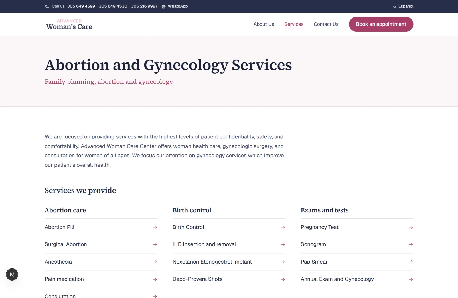
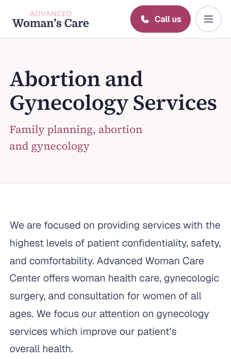
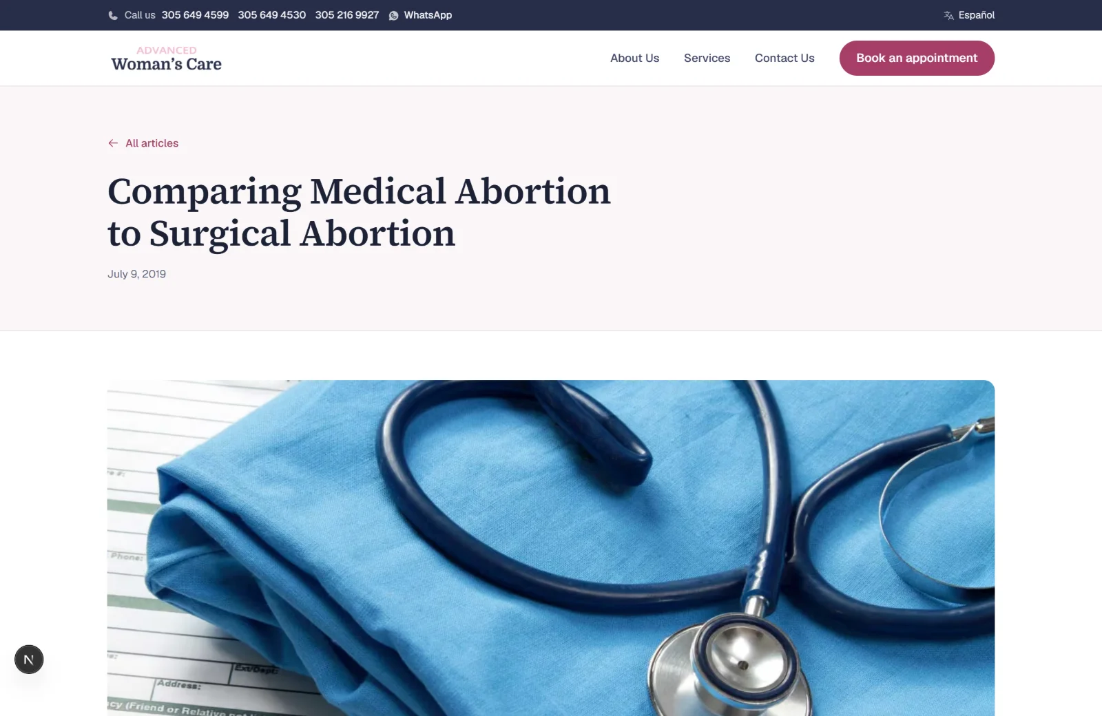
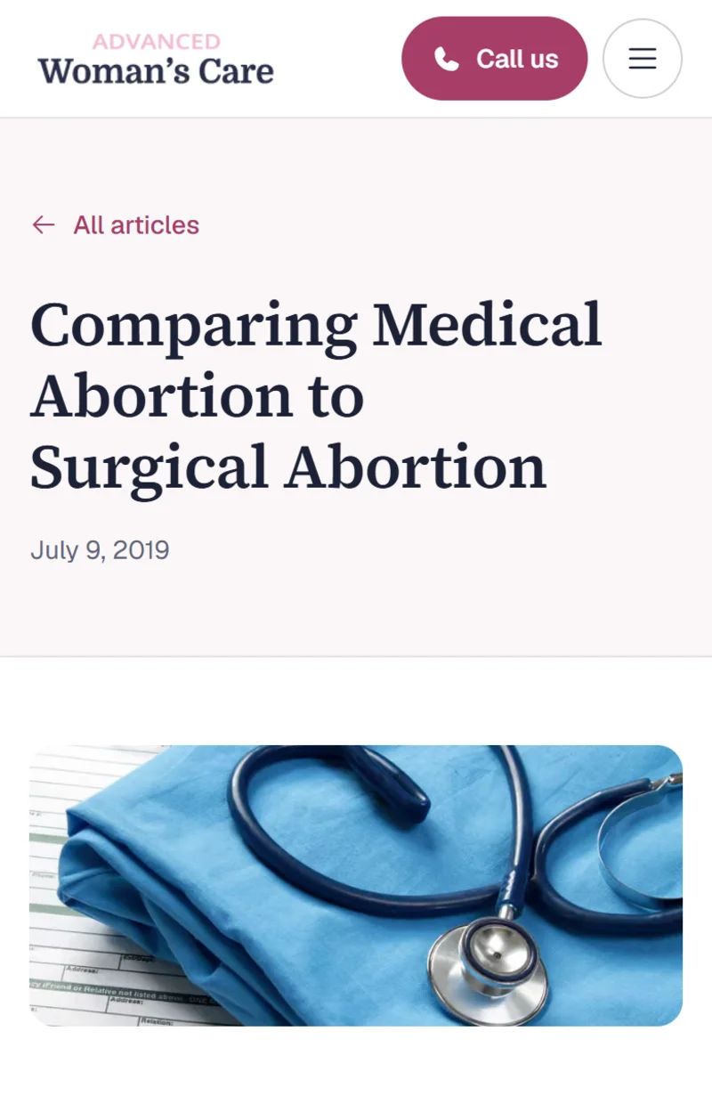
Home, services, the service pages, the comparison article and the Spanish site share one grid and one type scale, so the difference between them is the words rather than a different website.
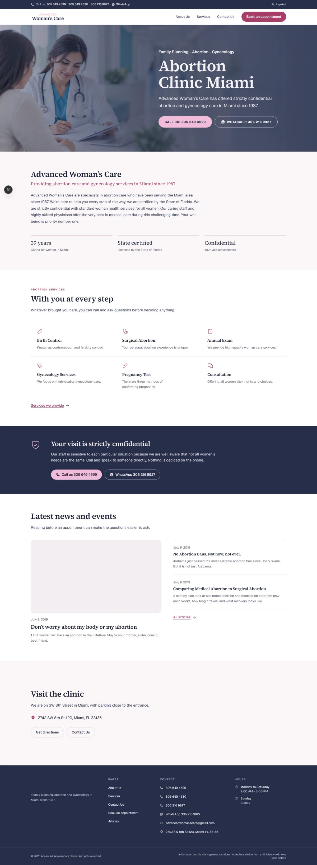
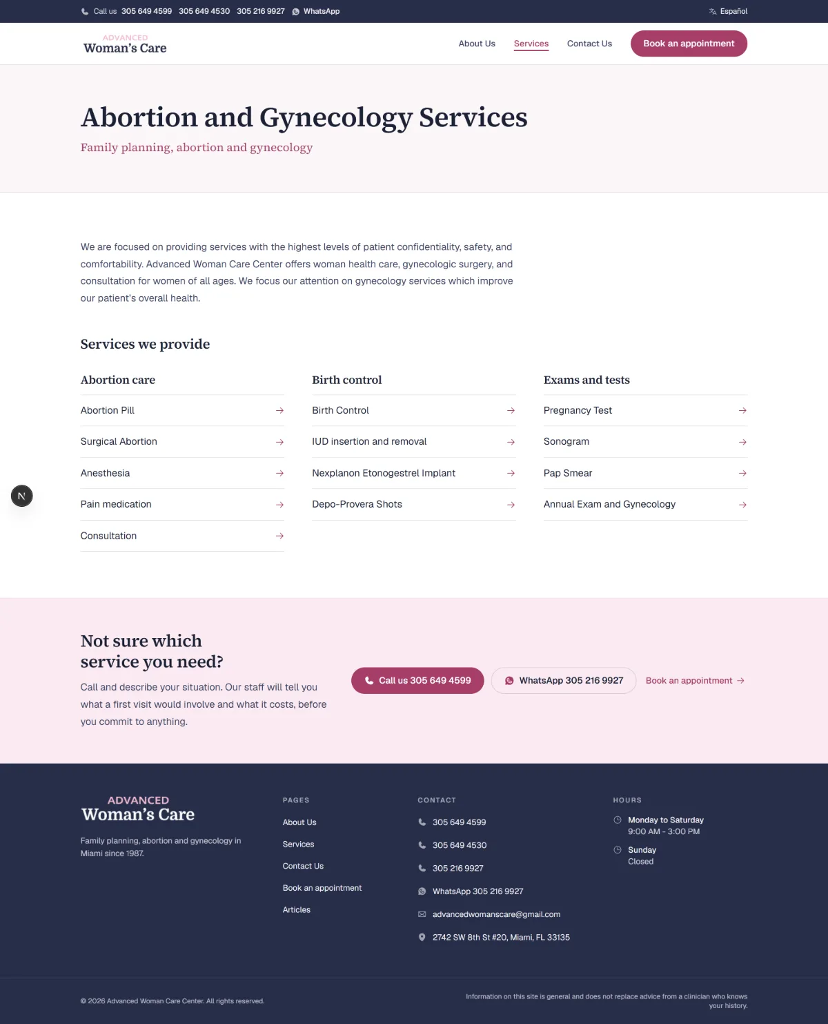
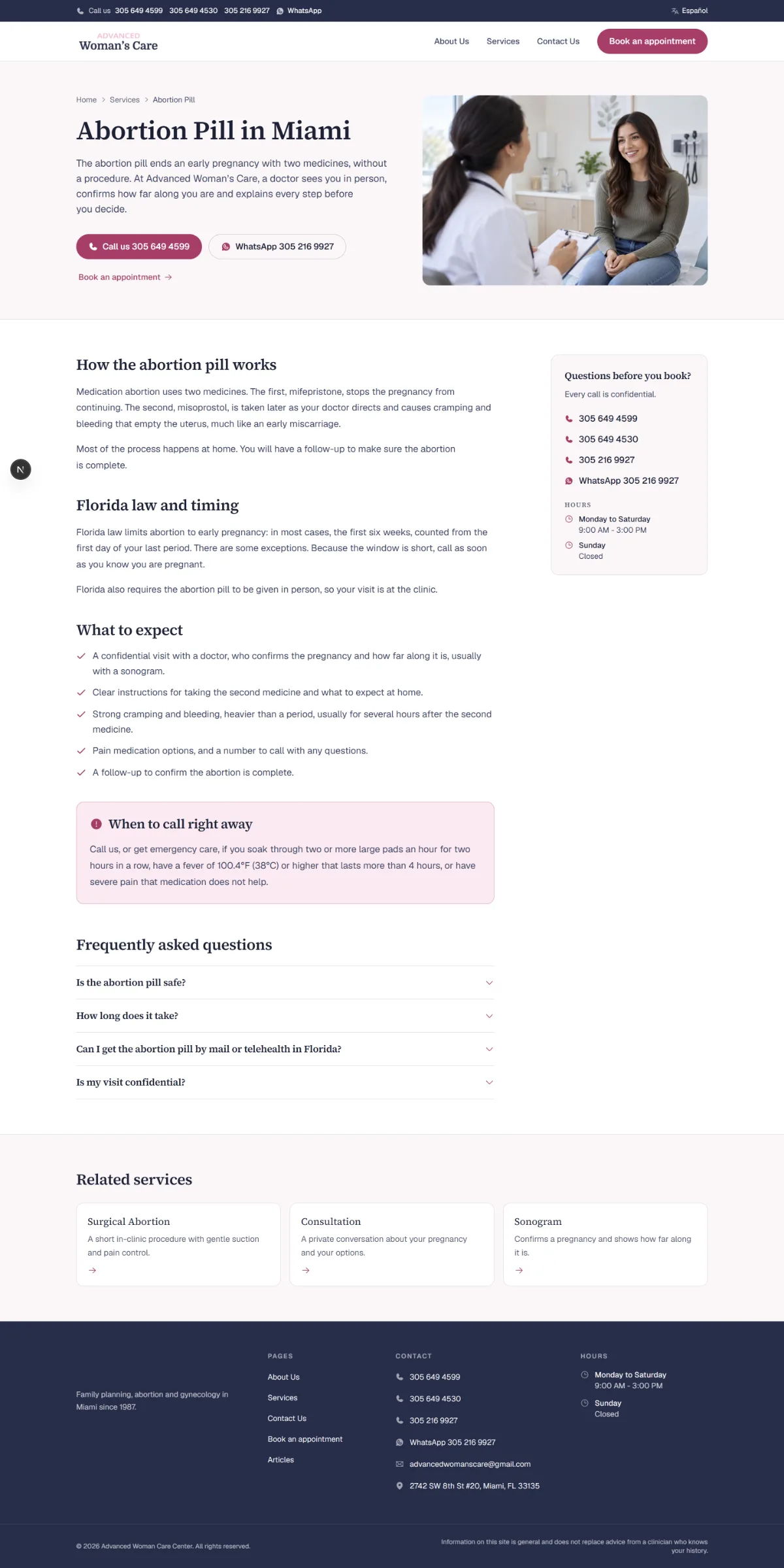
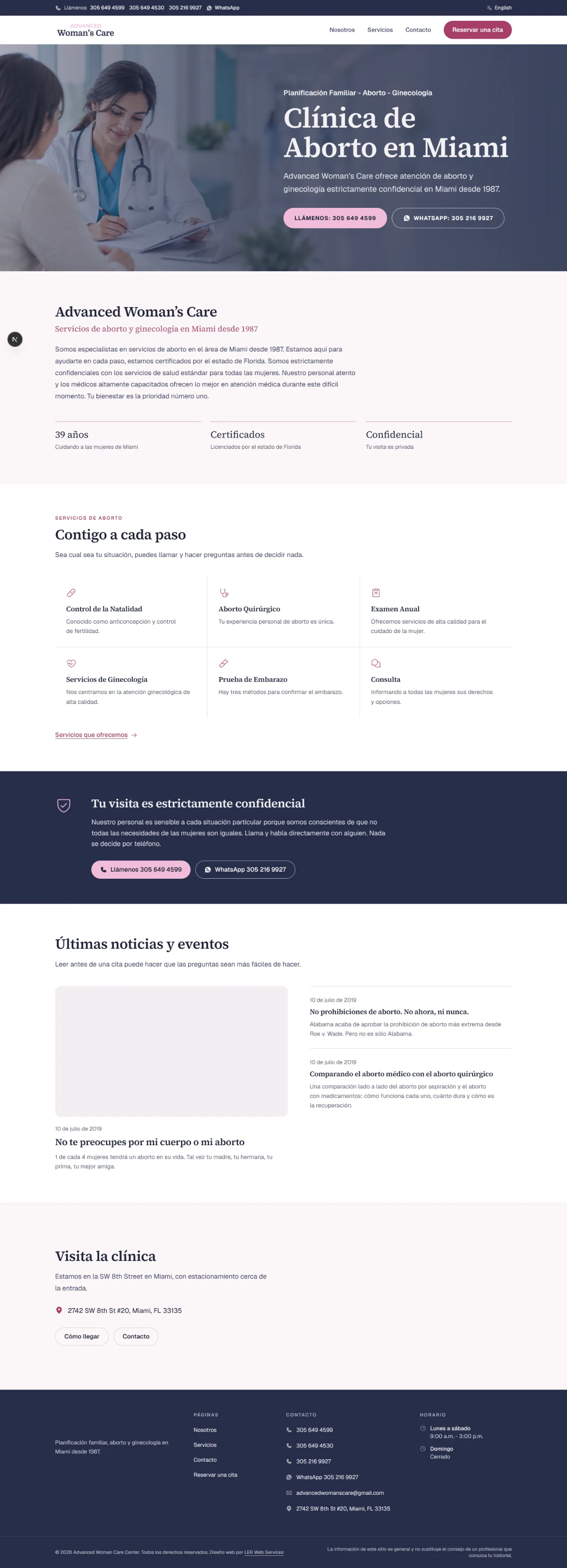
Built for a phone, on a bad day.
No scroll effects, no reveals, no parallax: hover and focus transitions only. Nothing moves under someone who is trying to read a medical comparison.
The comparison article is the clearest example. On the live site it is a two-column table that cannot be read on a phone. Here each question is a heading with its two answers beneath it, side by side only when there is room, and the method names stay pinned while you scroll.
Visual system.
The colours are sampled from the clinic's own wordmark, not from the old theme. The brand rose is far too light to carry text, so it was deepened until it cleared WCAG AA on white at 6.0:1. The theme purple was never brand, and it is gone.
- #272E4A
- #A63D68
- #F1BCD8
- #FAF7F8
- #15120F
Where it stands.
The rebuild is complete and reviewed locally: 39 pages, both languages, the booking request path and the contact form end to end. It has never been deployed, and the clinic's live site is unchanged.
Two things are waiting on the clinic rather than on the build: the eleven service pages need their review before launch, and some medical copy carried over from the live site predates Florida's current limits.
How this one came together.
Four steps, and what each one had to settle.
Maintain first
LER took over the live WordPress site, recovered the images lost in an earlier host migration, and made the content corrections the clinic asked for.
Read the visit, not the page
Who arrives, on what device, in what state, and what they need to decide in the first minute.
Rebuild with parity
A static Next.js build, one route table, every live URL reproduced exactly, with 22 service pages added that the live site never had.
Hand it back honestly
Staging only, with the open questions written down: service copy to confirm, medical detail to update, hosting still to decide.