Ed Home Renovations · Case study

Local renovation work, presented with trust and clarity.

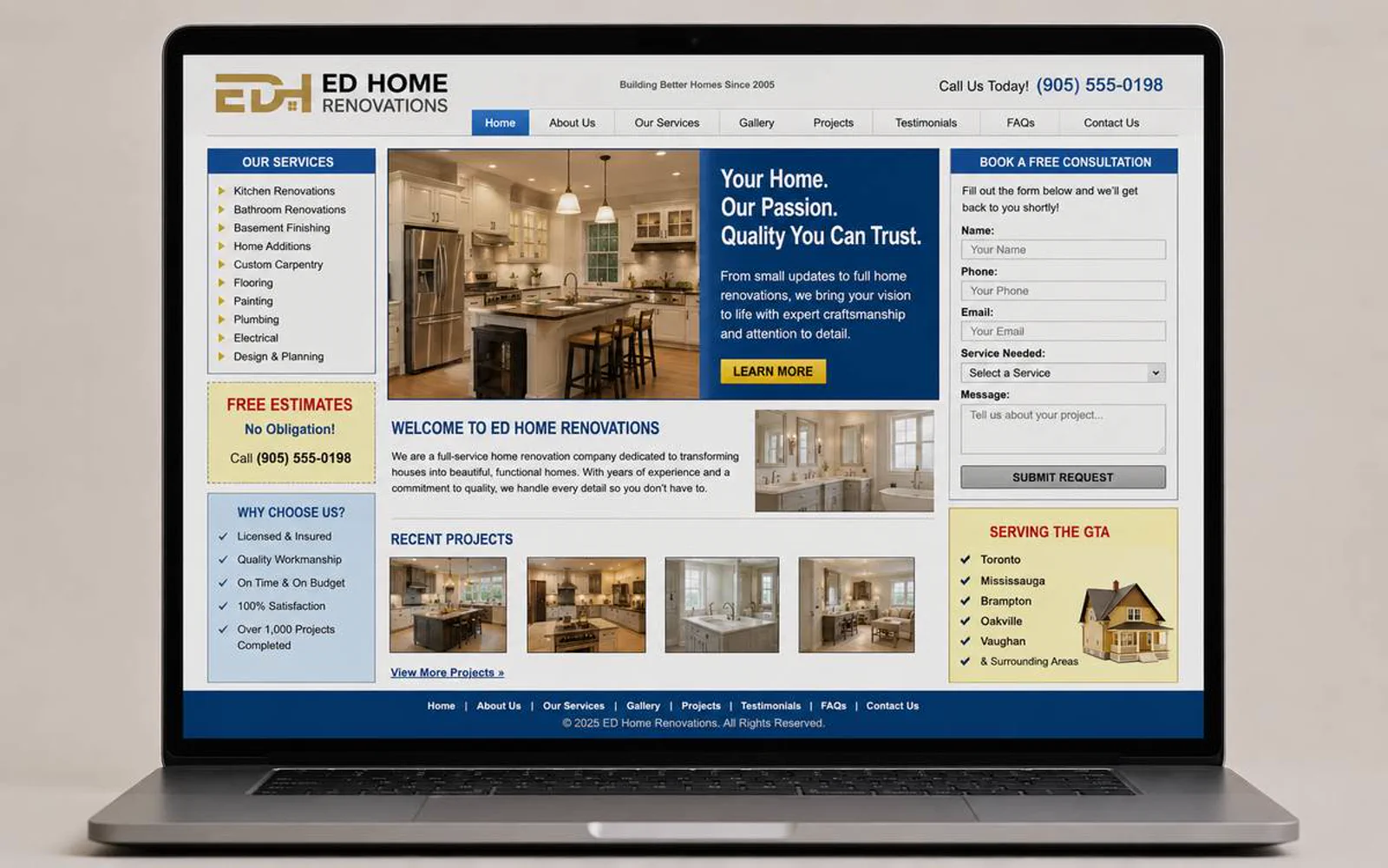
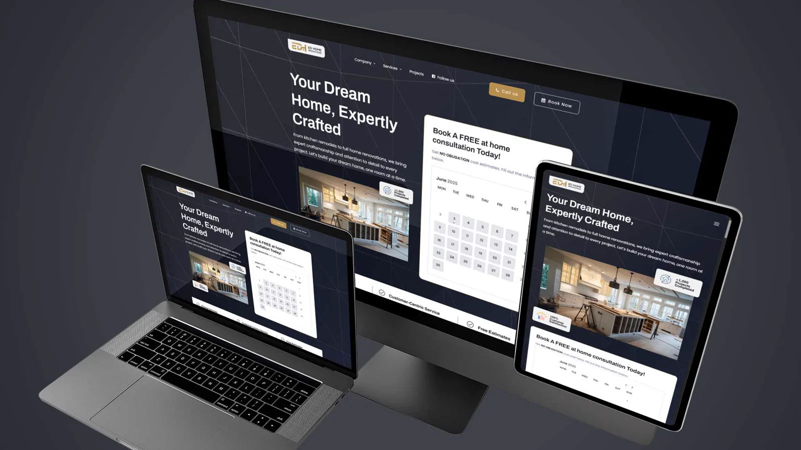
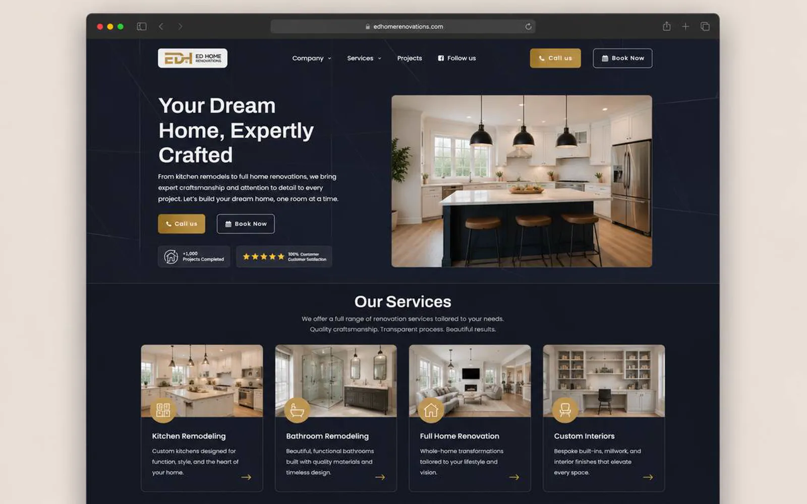
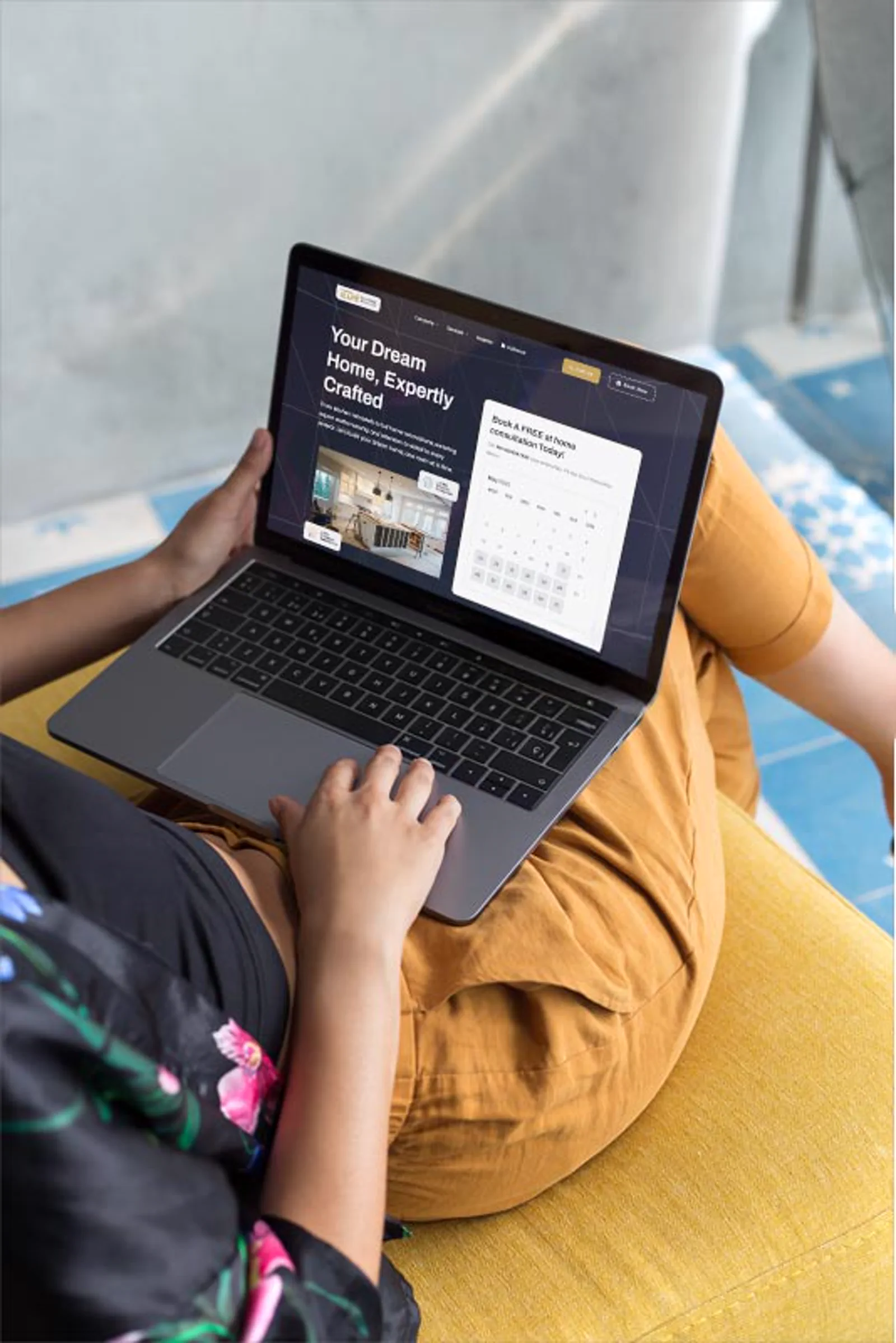
A local renovation website built to show workmanship, strengthen homeowner trust, and make quote requests easier to start.

Ed Home Renovation project cover

Project story

The details behind the work.

Positioning, issues solved, scope, outcome, and the decisions behind the project.

  • Positioning

    Ed Home Renovation needed a website direction that made the business easier to understand before a prospect reached out.

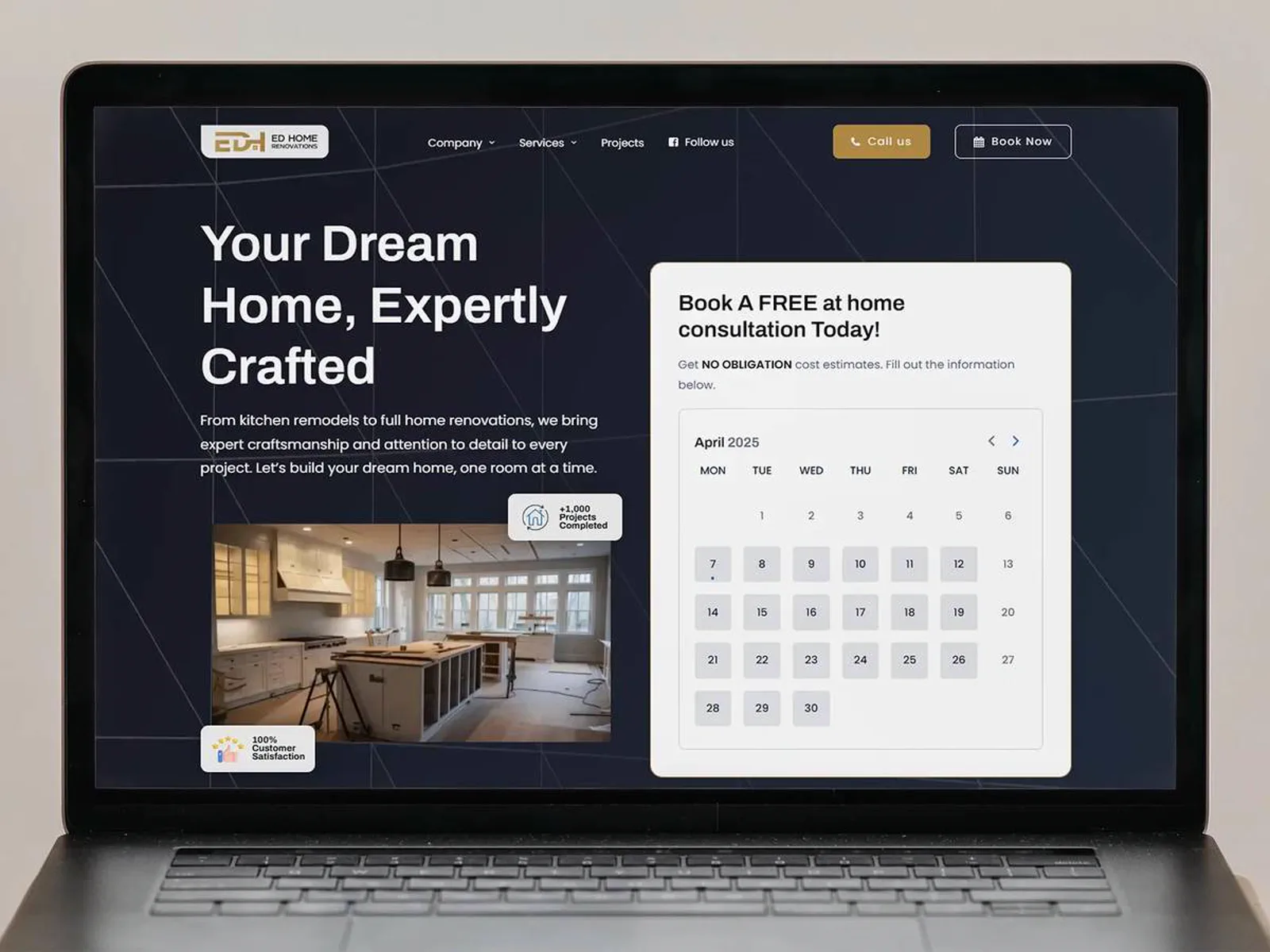
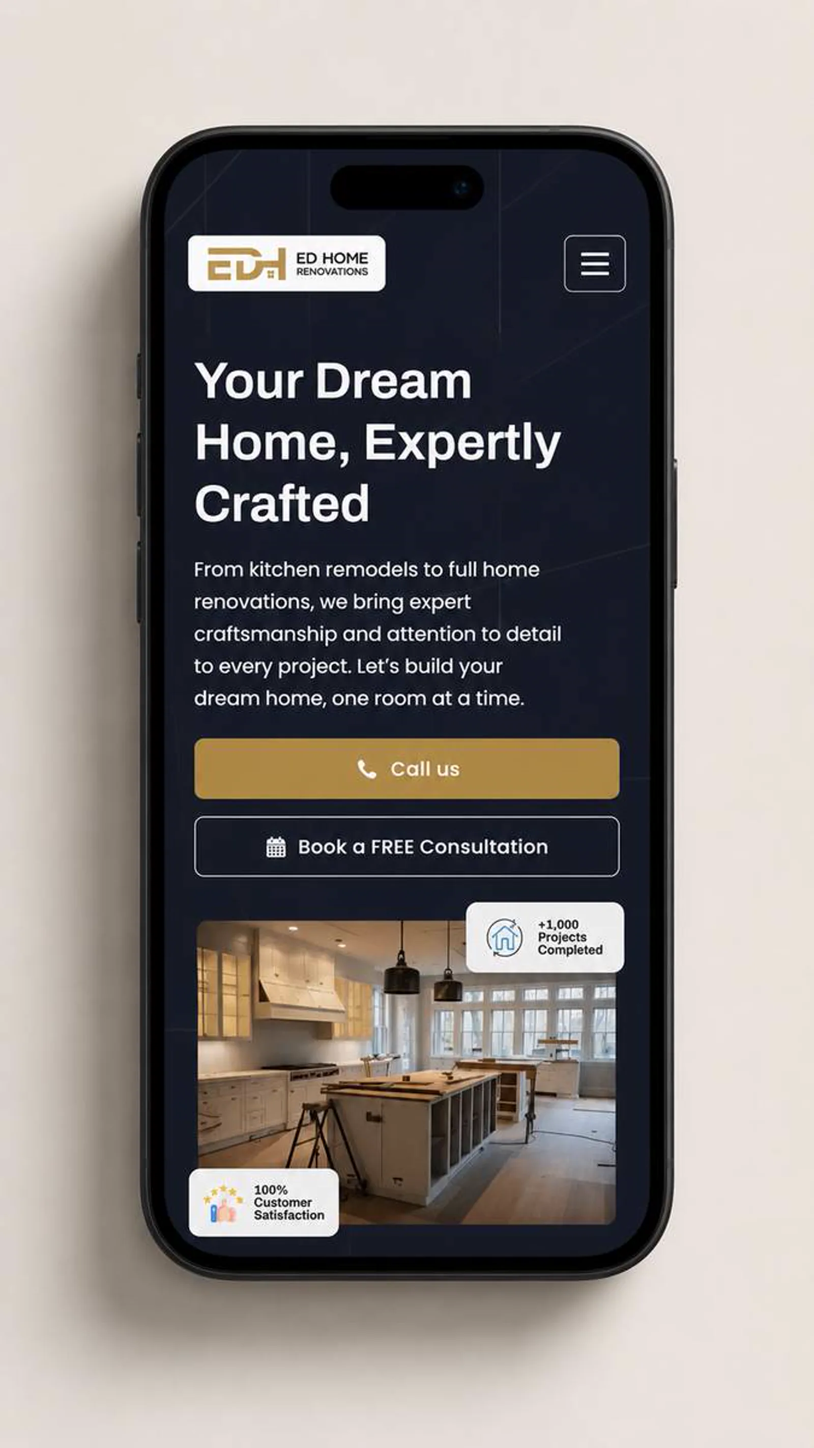
    LER Web Services shaped the experience around clearer hierarchy, stronger visual trust, and a more direct path to action.
  • Issues I solved

    • The offer needed to be easier to scan for first-time visitors.
    • The brand needed a sharper first impression without overcomplicating the experience.
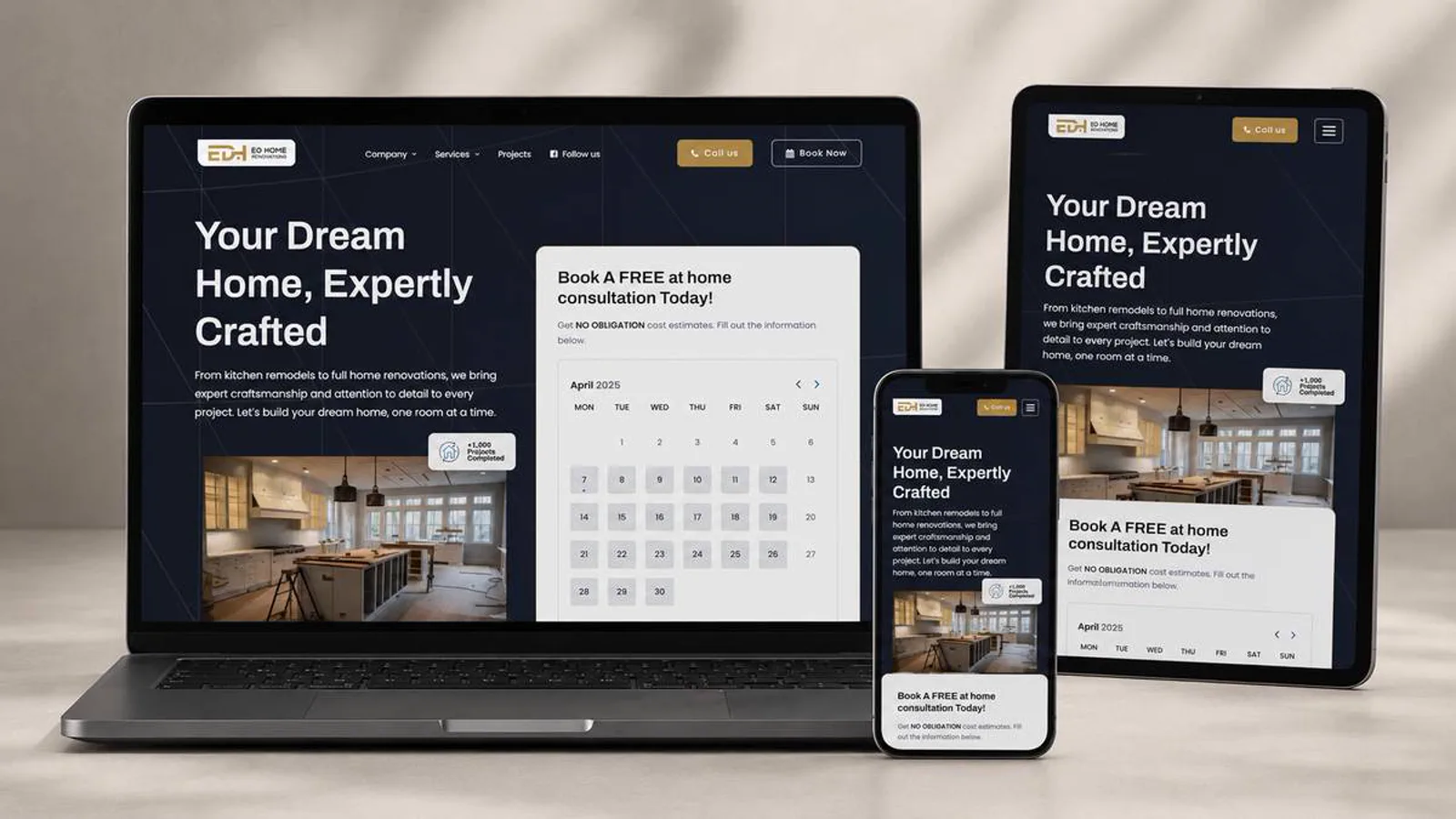
    • Mobile users needed the same clarity as desktop visitors.
    • The site needed a structure that could support future proof, content, and campaign updates.
  • Scope

    Ed Home Renovations needed proof-led presentation for completed work, testimonials, and direct project inquiries.

    • WordPress development
    • Project galleries
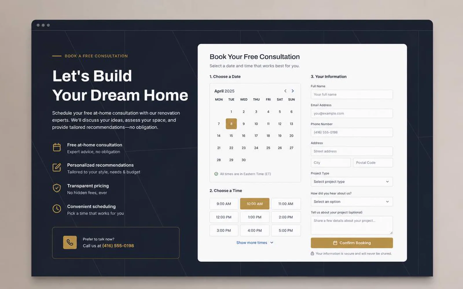
    • Quote request flow
    • Local-service UX
  • Outcome

    Ed Home Renovation now has a clearer digital direction for explaining the offer and supporting better inquiry paths.

    Ed Home Renovation is presented with stronger hierarchy, clearer trust cues, and a more direct path for visitors to understand the next step.

  • Project takeaway

    Ed Home Renovation now presents the business with clearer positioning, cleaner responsive screens, stronger content structure, and a calmer path from interest to action. The work brought WordPress development, Project galleries, and Quote request flow into one consistent public-facing experience.

From the client.

5/5 · Google review

“Great Experience with Lerws – Thanks Edson!

I'm very happy with the website Lerws created for ED Home Renovations. Edson was professional, easy to work with, and truly brought my vision to life. The site looks clean and professional — exactly what I needed. Highly recommend their work!”

Elvis CáceresED Home RenovationsRead original on Google

Visual system

Palette and type cues.

A concise record of the visual direction behind the project.

Color palette

  • #0D1522
  • #D8A21B
  • #F1C84B
  • #4C5966
  • #F6F0E4

Typography

Editorial sans + practical hierarchy

The visual direction keeps the project clear, polished, and usable across desktop and mobile screens.

The copy direction stays direct: explain the value, reduce uncertainty, and make the next step easier to take.

How the project moved.

A standard LER project path, adapted to the scope and available client material.

  1. Discover

    Discovery and content review

    I clarified the audience, offer, and practical questions the website needed to answer.

    • Audience
    • Offer
    • Priorities
  2. Structure

    Page structure

    I organized the page flow around service clarity, proof, and the next action a qualified visitor should take.

    • Hierarchy
    • Messaging
    • CTAs
  3. Design

    Responsive design direction

    I shaped the visual system and core screens so the experience could stay polished across devices.

    • UI direction
    • Responsive
    • Visual polish
  4. Review

    QA and refinement

    I reviewed the experience for visual consistency, responsive behavior, and clear paths to contact or purchase.

    • QA
    • Refinement
    • Launch prep