
FutureFrame · Case study
Refined edge for the bold.
A luxury street eyewear brand and storefront concept built for limited drops, product desire, and an editorial first impression.
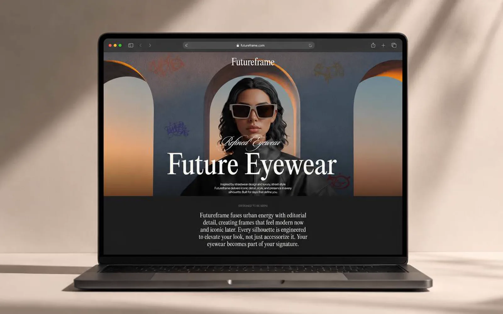
Launch with a point of view.
FutureFrame needed to arrive distinctive enough for fashion, disciplined enough for e-commerce, and flexible enough for future collections. I shaped the concept around an editorial first screen, a strong serif voice, and drops framed as limited releases.
Urban texture and studio photography carry the attitude; the structure underneath stays simple so product pages and collections can follow without redesign.
- 1Editorial launch page
- 4Disciplines: brand, UX, storytelling, responsive
- 5Palette tones, ember on ink and bone
- 2025Concept direction
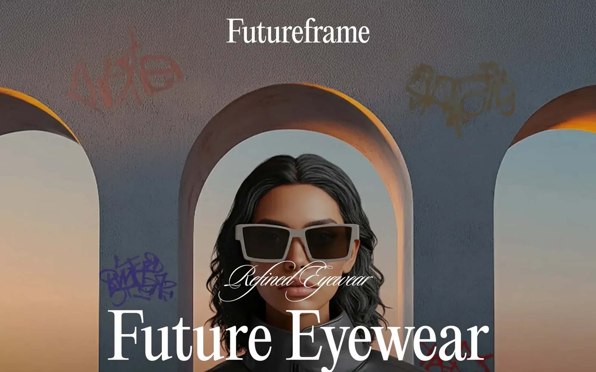
What the concept had to carry.
A first impression that reads as fashion, not as a template store.
A serif-led voice that stays legible at storefront sizes.
Room for limited drops and seasonal collections without a redesign.
A structure that converts to product and collection pages when the brand launches.
Visual system.
Ink, ember, and bone with an editorial serif for headlines; texture and photography do the talking while the grid stays disciplined.
Type · Editorial serif display
- #15110F
- #C05A2B
- #E0A36C
- #4F3A32
- #F6EAE1
Outcome.
FutureFrame has a launch-ready direction: a brand voice, a homepage that sells the attitude, and a structure that can grow into a full storefront.
The work brought brand identity, e-commerce UX, and product storytelling into one consistent concept.
How this one came together.
The four steps behind this build, and what each one had to settle.
Discovery and positioning
I defined the audience, the tone, and what a limited-drop brand needs from its first page.
Brand direction
I set the serif voice, the ember-on-ink palette, and the texture language.
Launch page design
I designed the editorial homepage and the collection and drop modules it is built from.
Handoff
I documented the system so product and collection pages can follow the same rules.
