


Make Creati · Dashboard case study

One product. Two sides of the work.

View all work
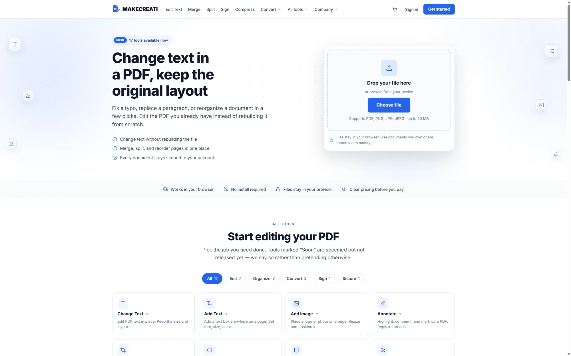
Makecreati Dashboard project view
  • Customer and business workflows connected

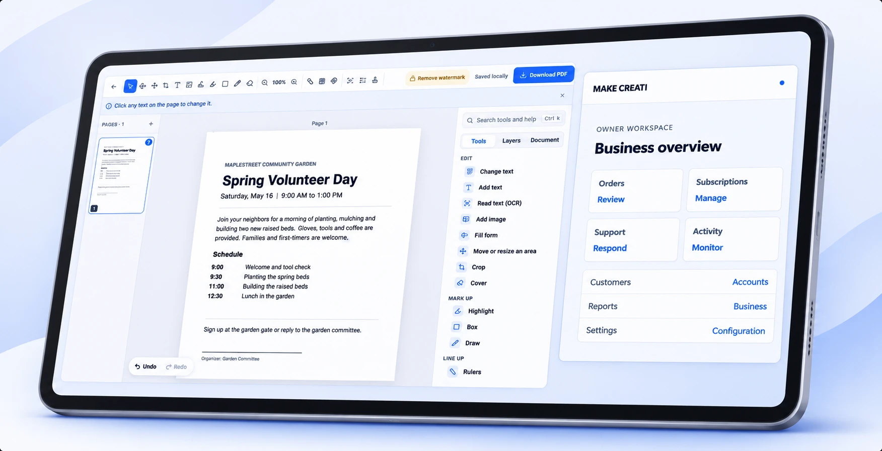
    The product connects customer tasks and business operations while giving each audience its own place to work.

  • A more consistent workspace across key tasks

    Shared interface patterns make documents, account information, and operational tools easier to follow.

  • Two perspectives, one product

    The workspace brings related tasks together without losing the distinction between customer and business needs.

Overview

One workspace for customers and the business

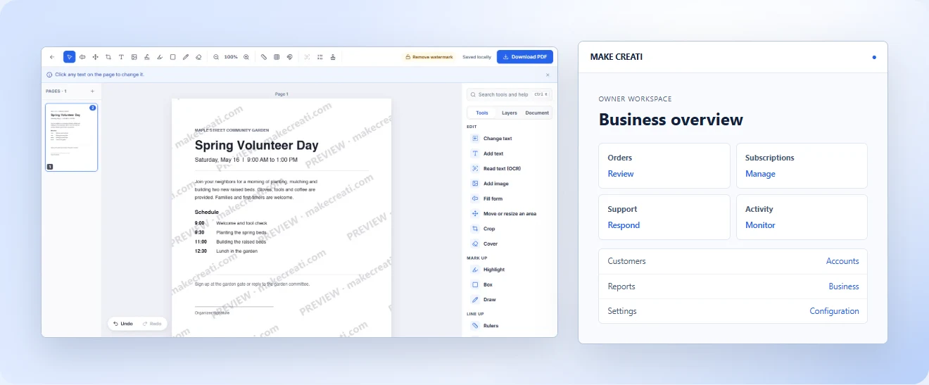
The Make Creati dashboard connects the customer’s document workflow with the operational tools behind the product. Each side has its own priorities, brought together through a clear and consistent interface.

Client
  • Make Creati
Technologies
  • Figma
  • Next.js
  • React
  • JavaScript

Review

A project reflection

LER Web ServicesProject review

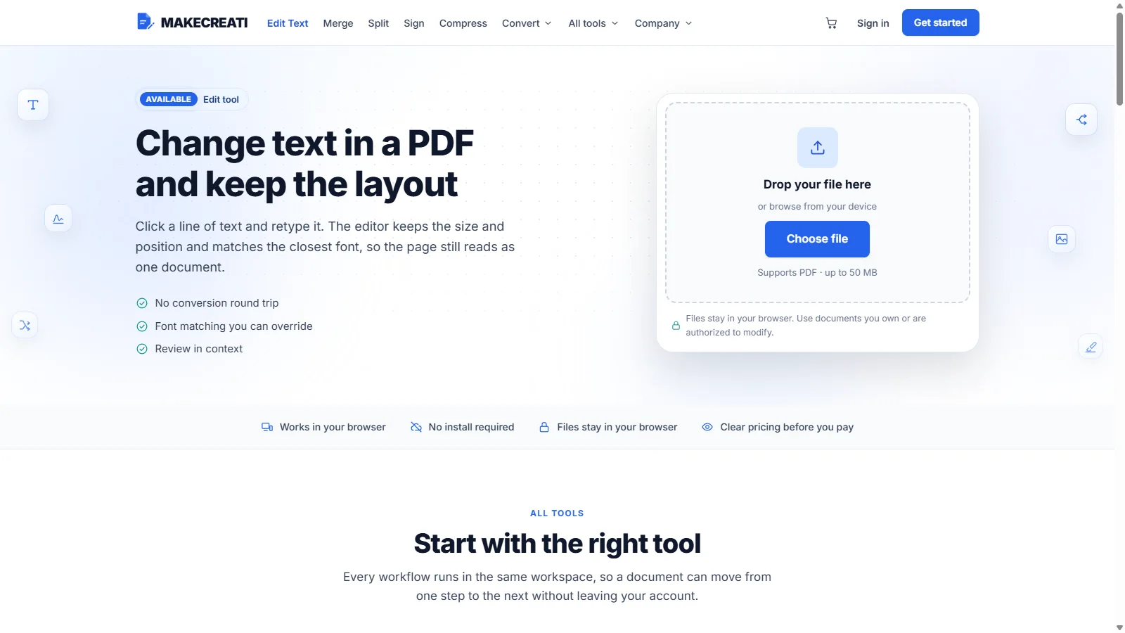
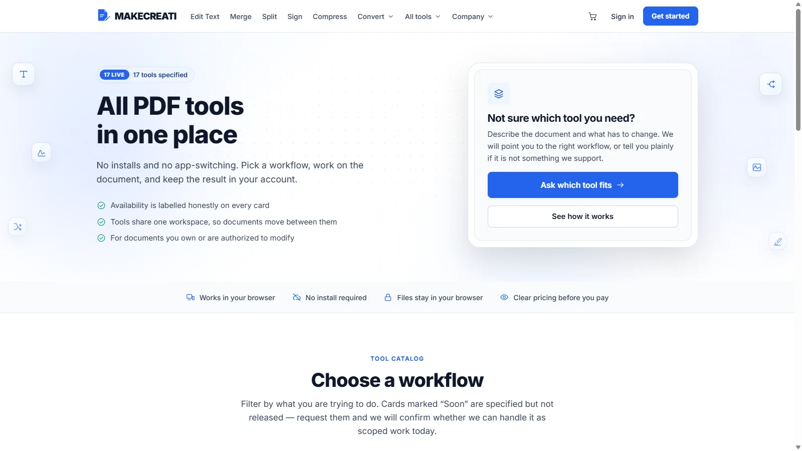
The public website helps people find the right PDF tool. Once they begin, the experience needs to shift from browsing to doing: open a document, make a change and know what comes next.

Client request and project goals

The public website helps people find the right PDF tool. Once they begin, the experience needs to shift from browsing to doing: open a document, make a change and know what comes next.

Behind the scenes, the business needs its own view of orders, customers and support. These two audiences have different jobs, but both depend on clear paths and useful information.

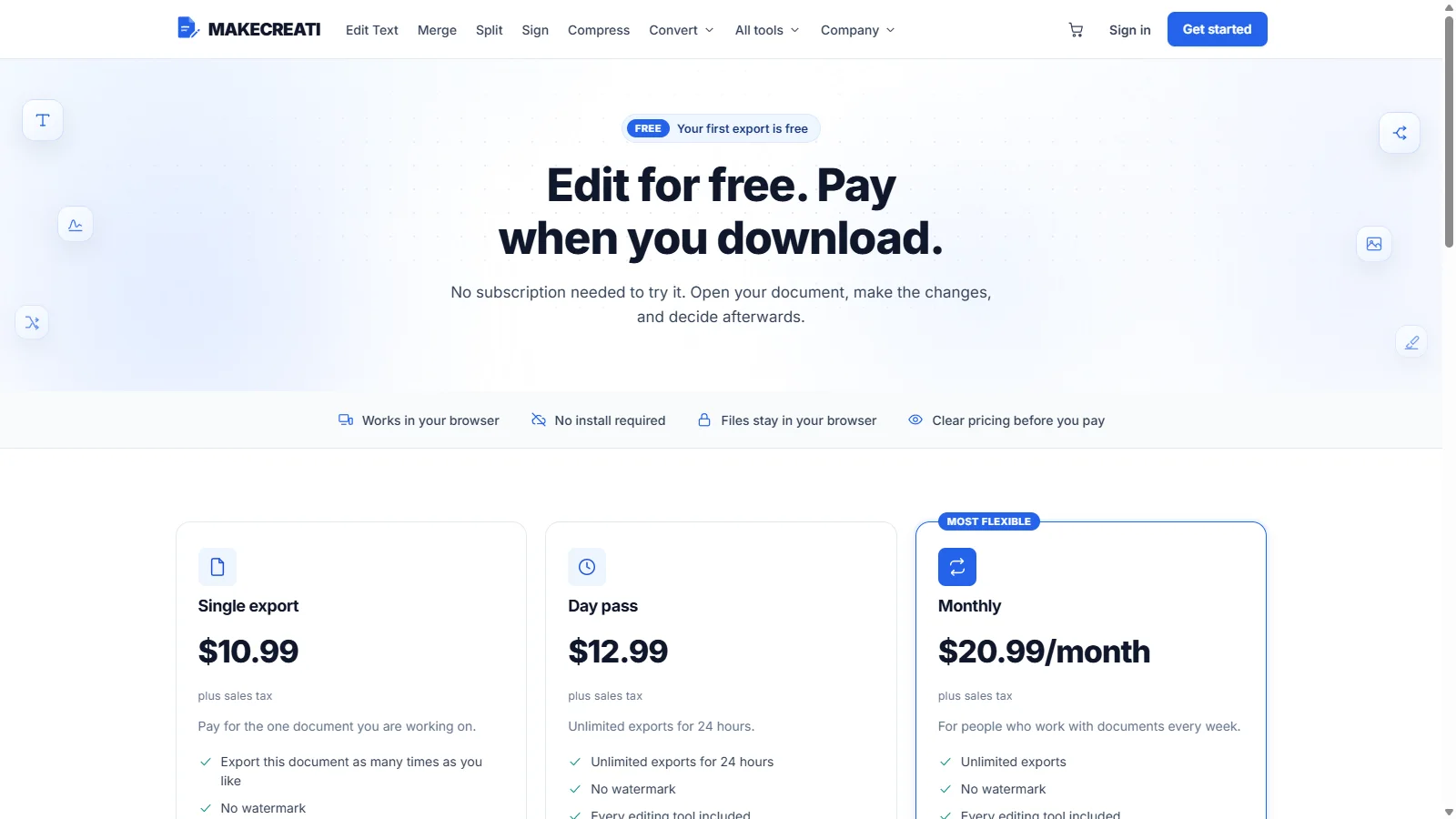
Makecreati Dashboard project view

Problems & solutions

  • Problem

    The offer needed a clearer structure for first-time visitors.

  • Solution

    The content was organized around the information visitors need first.

  • Problem

    The identity needed to feel consistent throughout the experience.

  • Solution

    A consistent visual system was applied across the main screens and components.

  • Problem

    Navigation and the next step needed to work across screen sizes.

  • Solution

    The key journeys were simplified and adapted to different screen sizes.

Research, structure and design

The customer workspace brings documents, account access and orders together, with a direct path into the PDF editor.

The structure and visual hierarchy were shaped to make the content and next steps clear across screen sizes.

MakeCreati Dashboard: editor and sample workspace
MakeCreati Dashboard: mobile website view
MakeCreati Dashboard: website screen
MakeCreati Dashboard: mobile website view
MakeCreati Dashboard: website screen

Turning the idea into an experience

Behind the scenes, the business needs its own view of orders, customers and support. These two audiences have different jobs, but both depend on clear paths and useful information.

The experience was organized to keep the key pages and journeys consistent.

Selected technologies

  • Figma
  • Next.js
  • React
  • JavaScript
Makecreati Dashboard project screen
Makecreati Dashboard project screenMakecreati Dashboard project screen
Makecreati Dashboard project screen

Conclusion

Results

  • A place to pick up the work.

    The customer workspace brings documents, account access and orders together, with a direct path into the PDF editor.

  • The operation in one place.

    The owner console organizes business tasks into focused areas for orders, subscriptions, customers, reports and support.

  • The project

    The public website helps people find the right PDF tool. Once they begin, the experience needs to shift from browsing to doing: open a document, make a change and know what comes next.

The public website helps people find the right PDF tool. Once they begin, the experience needs to shift from browsing to doing: open a document, make a change and know what comes next.

Behind the scenes, the business needs its own view of orders, customers and support. These two audiences have different jobs, but both depend on clear paths and useful information.

Our cases

See what we’ve built

  • #Product design #UX/UI design

    Prime Pharma — Product information with a more confident presence

    Prime Pharma
    Tech stack
    Figma, WordPress, HTML5, CSS
    Timeline
    8 weeks

    Results

    • Product information with a more confident presence
    • Product information made easier to navigate
    • A more confident scientific presentation
    Explore
  • #Product design #UX/UI design

    Zenova — A calmer workspace for creative collaboration

    Zenova
    Tech stack
    Figma, React, Next.js, JavaScript
    Timeline
    8 weeks

    Results

    • A calmer workspace for creative collaboration
    • Creative work brought into one workspace
    • A clearer view of projects and collaboration
    Explore
  • #Product design #UX/UI design

    HTMP Biotechnology — Explaining advanced biology with clarity

    HTMP BiotechnologyLos Angeles, CA
    Tech stack
    Figma, WordPress, HTML5, CSS
    Timeline
    12 weeks

    Results

    • Explaining advanced biology with clarity
    • Research technology explained more clearly
    • Product applications organized for exploration
    Explore
    Dominick HellenHTMP Biotechnology

    Ed is a fantastic web designer, and truly cares about the vision of the company.