HTMP Bio · Case study
Clear product storytelling for high-throughput biology.
A sharper storefront and a refined mark for HTMP Biotechnology, built so technical buyers understand the platform before they reach out.
Make the science easy to understand before the first call.
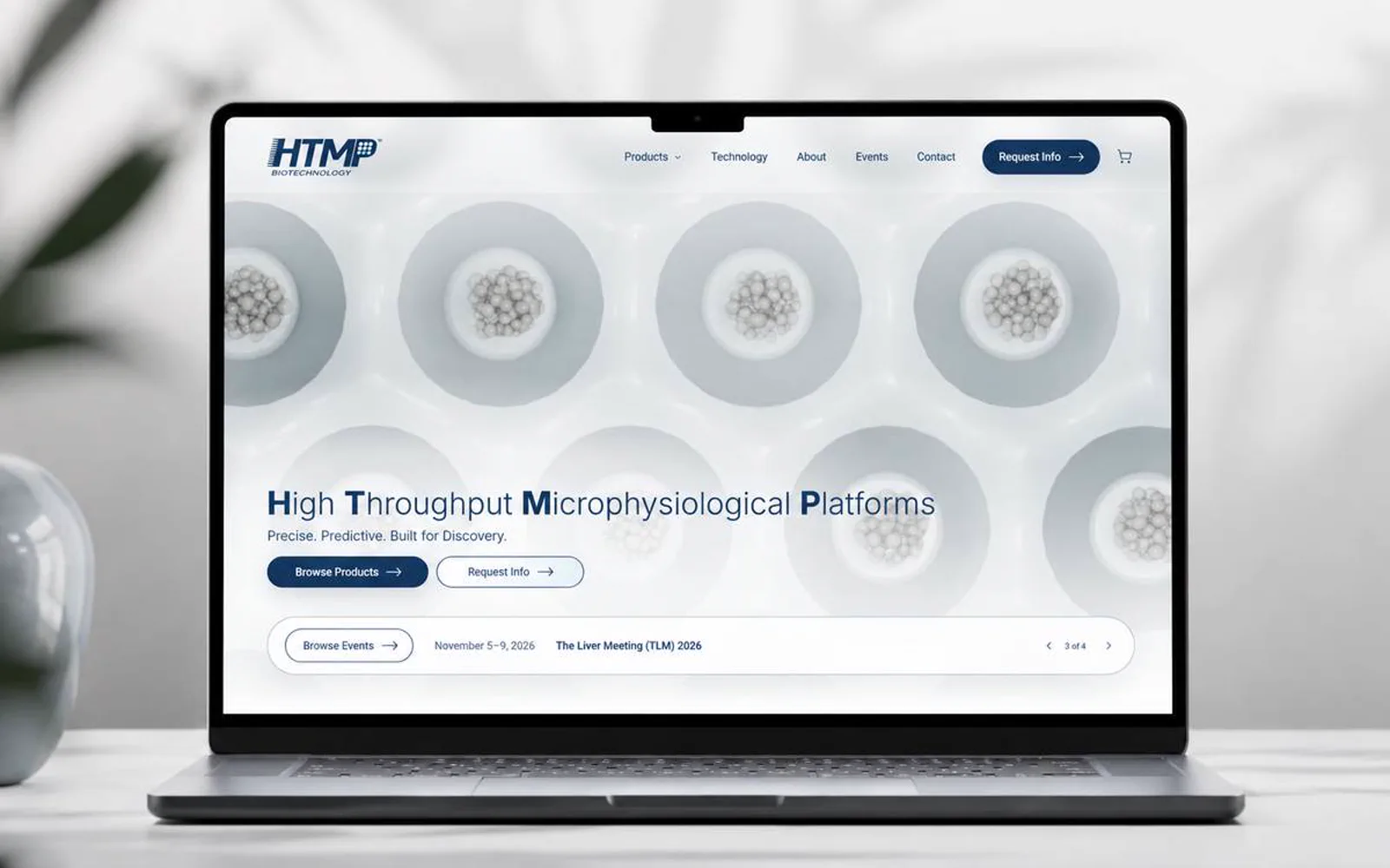
HTMP Bio needed a website direction that made the business easier to understand before a prospect reached out. I shaped the experience around clearer hierarchy, stronger visual trust, and a more direct path to action.
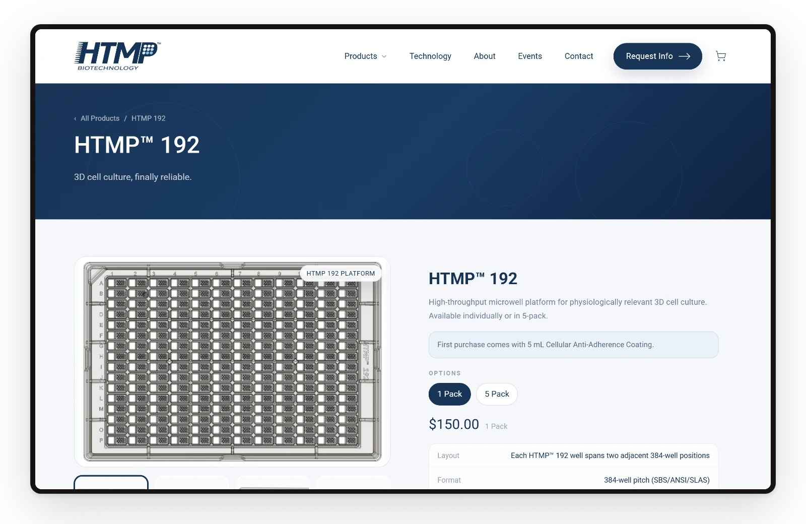
Product and science information was organized so technical audiences can understand the offer without digging through scattered details.
- 4 moFrom kickoff to launch
- 5Core pages, one hierarchy
- 3Product pages with specifications
- 1Refined mark and icon system
What had to change.
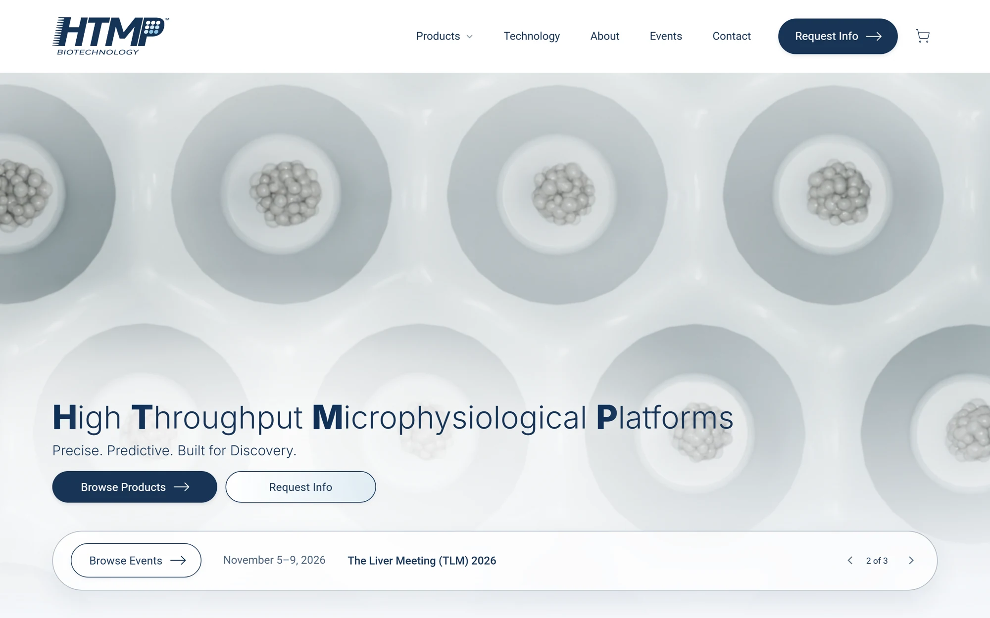
The offer needed to be easier to scan for first-time visitors.
The brand needed a sharper first impression without overcomplicating the experience.
Mobile users needed the same clarity as desktop visitors.
The site needed a structure that could support future proof, content, and campaign updates.
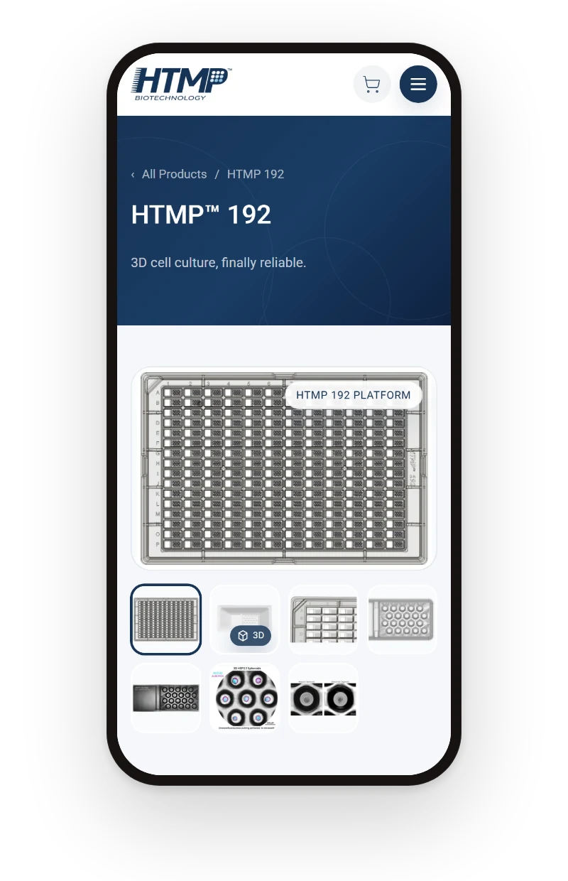
Screens
Every page, one system.
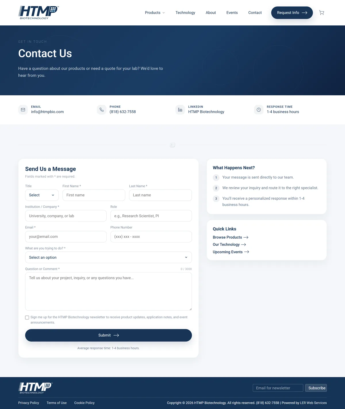
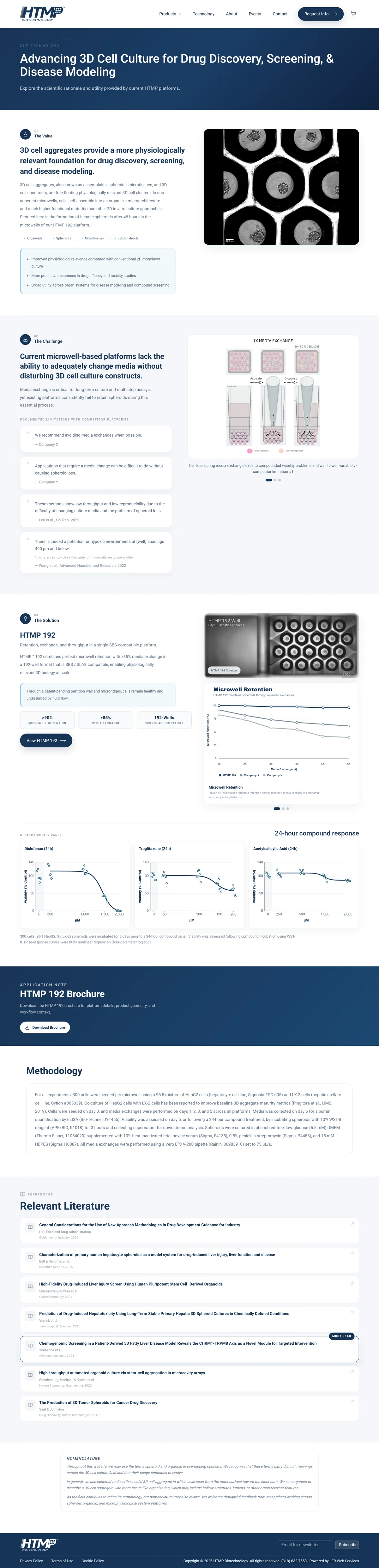
Home, product, technology, about, and contact share one hierarchy, so a researcher can move from the platform promise to specifications and a request in a few scrolls.
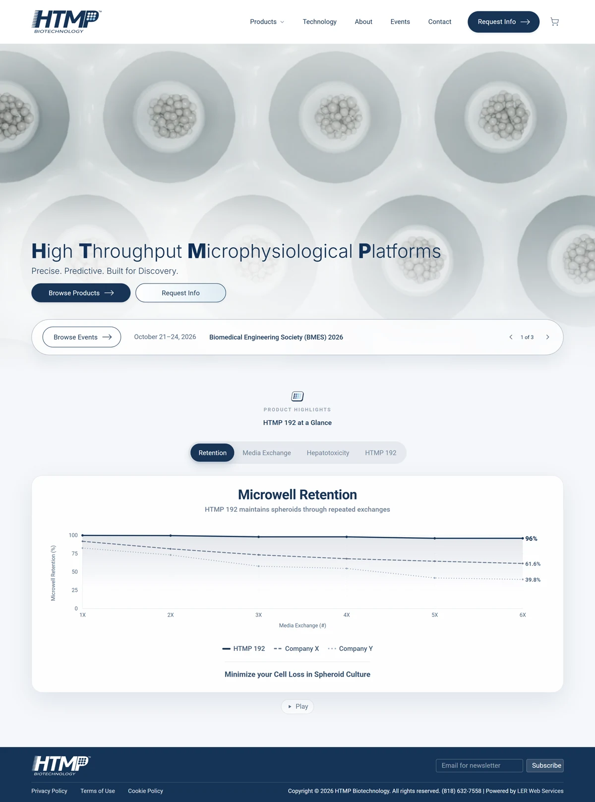
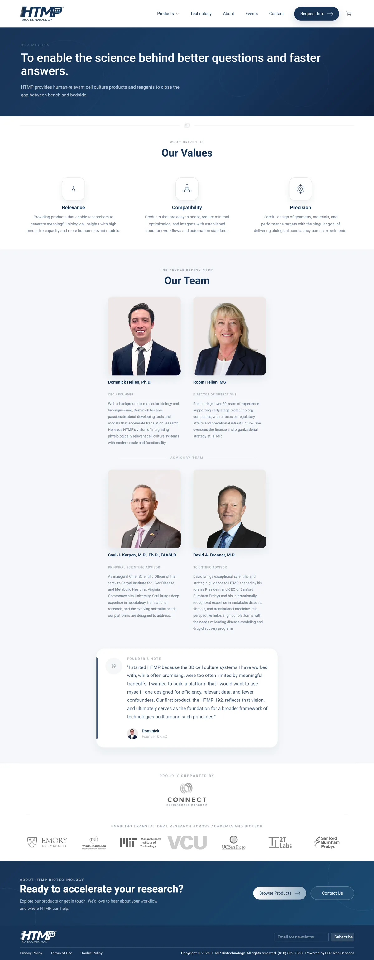
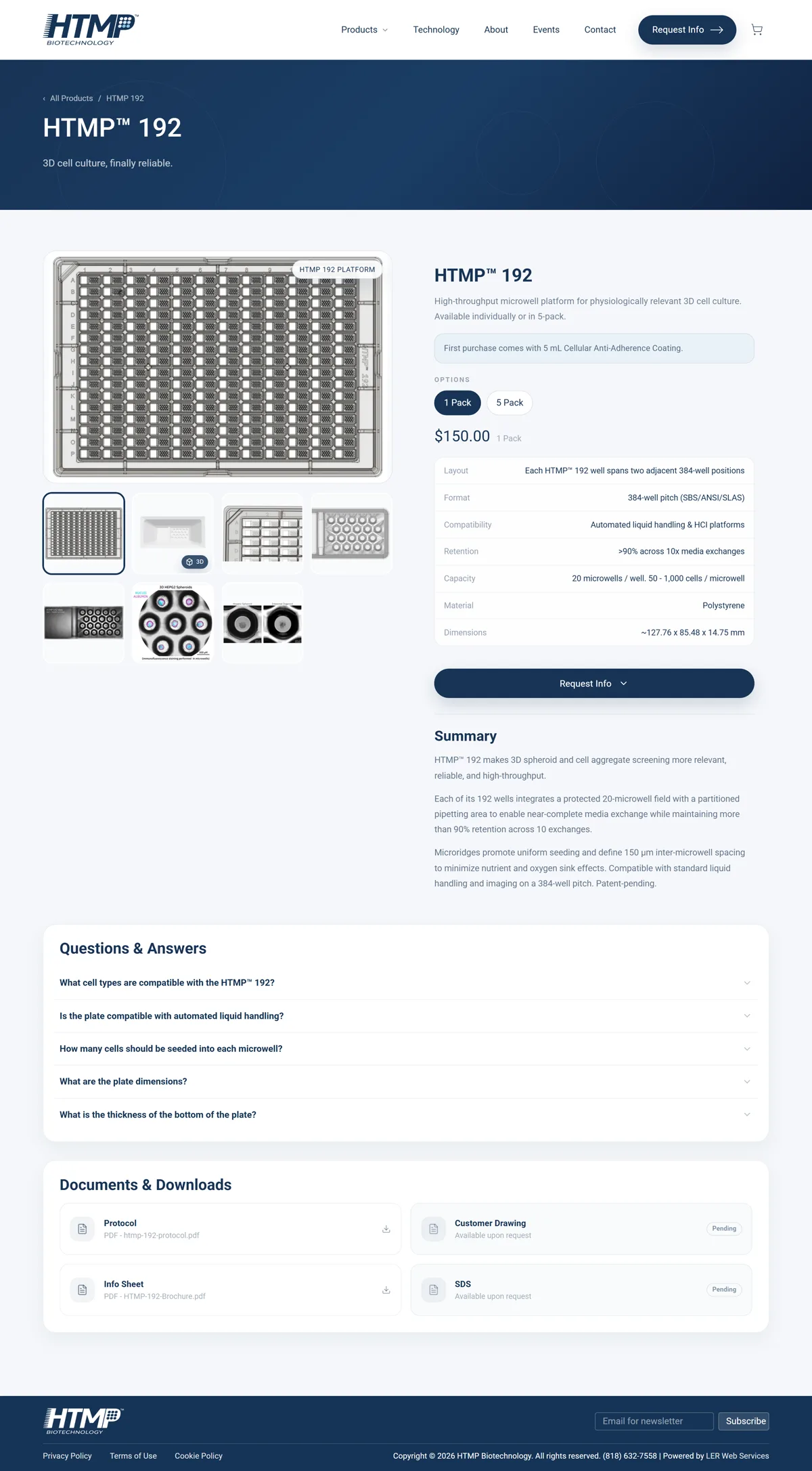
The same clarity on a phone.
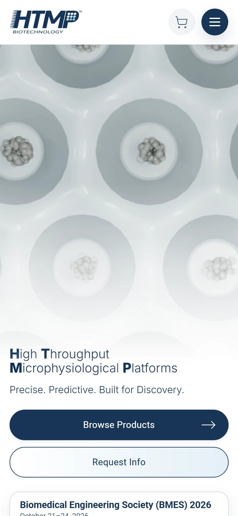
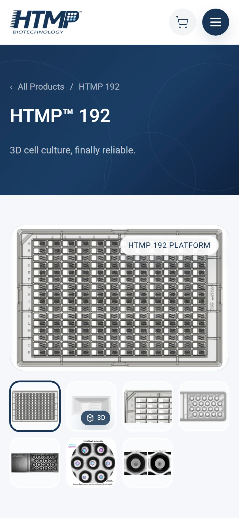
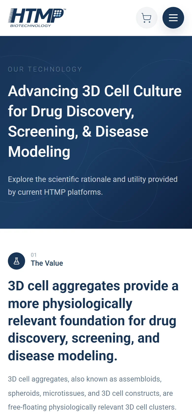
Mobile users get the same hierarchy as desktop visitors: the platform promise first, then specifications, then a direct way to request information.
A sharper HTMP mark.
The existing mark was refined rather than replaced: tighter letterforms, balanced speed lines, and the microplate dot grid set into the P, plus a clear-space rule and an icon system for favicons and app tiles.





Type · Roboto, thin to extra bold
- #183456
- #64748B
- #9AA9BC
- #EEF4F8
- #F8FAFC
Outcome.
HTMP Bio now presents the business with clearer positioning, cleaner responsive screens, stronger content structure, and a calmer path from interest to action.
The work brought UX/UI design, frontend development, and product storytelling into one consistent public-facing experience.
From the client.
“Ed is a fantastic web designer, and truly cares about the vision of the company. Beyond that, he has an adept understanding for building a UI around the end-user. Very happy we chose to work with LER.”
How this one came together.
The four steps behind this build, and what each one had to settle.
Discovery
I clarified the audience, offer, and practical questions the website needed to answer.
Page structure
I organized the page flow around service clarity, proof, and the next action a qualified visitor should take.
Responsive design direction
I shaped the layout system and core screens so the experience holds up across desktop and mobile.
QA and refinement
I reviewed consistency, responsive behavior, and clear paths to contact before handoff.