
TAMPA WEB DESIGN & DEVELOPMENT

A pharmacy rebuilt around the medication people came for.

View all work
Peakcompoundingpharmacy project view
  • Pharmacy information organized around patients

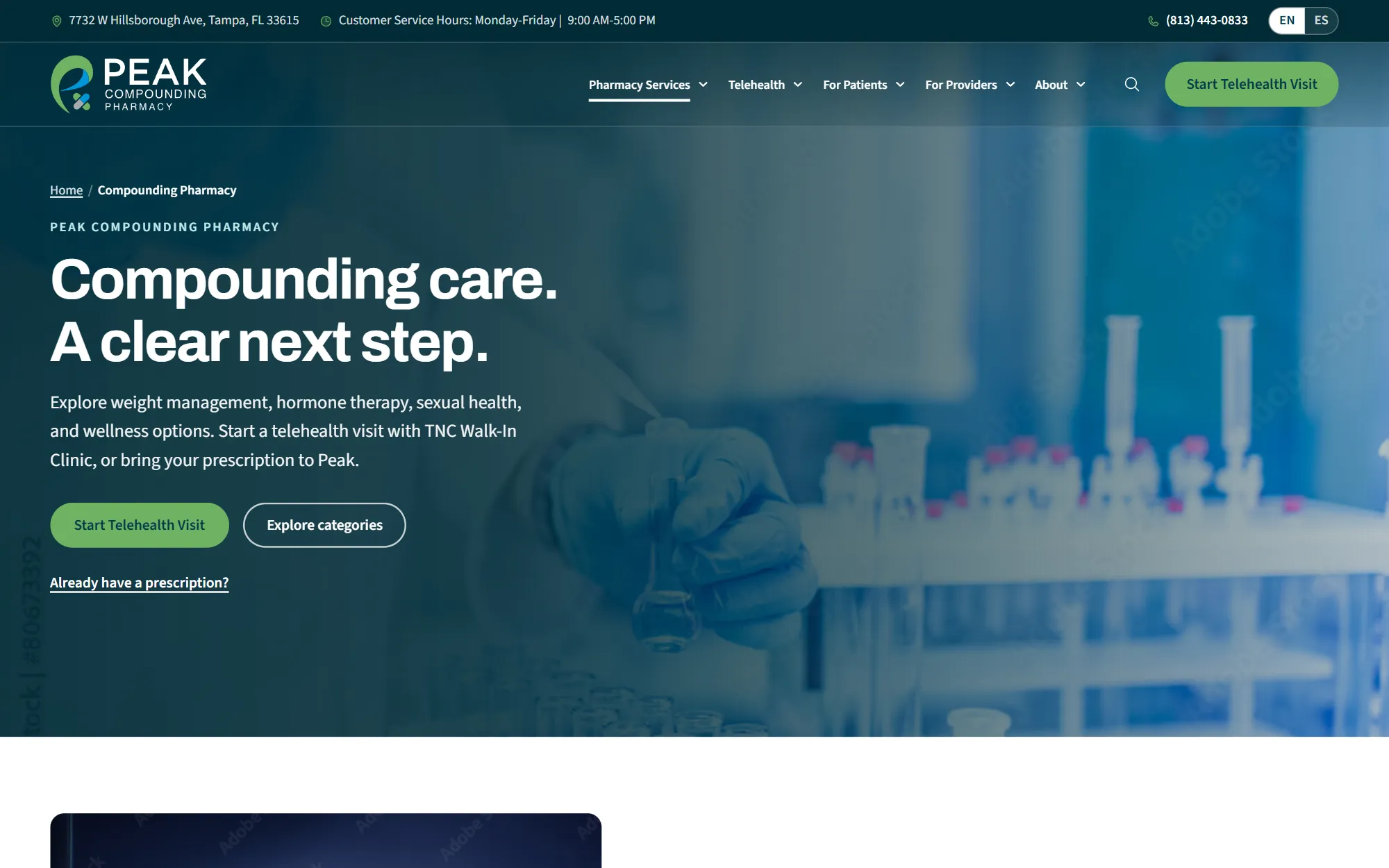
    Pharmacy information is organized around the questions patients may have when exploring compounded care.

  • A clearer path to learn about compounded care

    The experience gives visitors a clearer route from learning about services to contacting the pharmacy.

  • Care information with clarity

    A consistent visual hierarchy helps the pharmacy present a complex service in an approachable way.

Overview

A pharmacy experience built around the patient

Peak Compounding Pharmacy needed a clearer way to explain its medications and care journey in two languages. The project connects education, pharmacy services, and the handoff to a provider in one more understandable experience.

Client
  • Peak Compounding Pharmacy
  • Tampa, FL
Technologies
  • Figma
  • WordPress
  • HTML5
  • CSS
Date
  • September 2026

Review

A project reflection

LER Web ServicesProject review

Peak went live at peakcompoundingpharmacy.com on October 26, 2026: 73 pages across both languages, a search that reads them all, and the telehealth handoff drawn step by step.

Client request and project goals

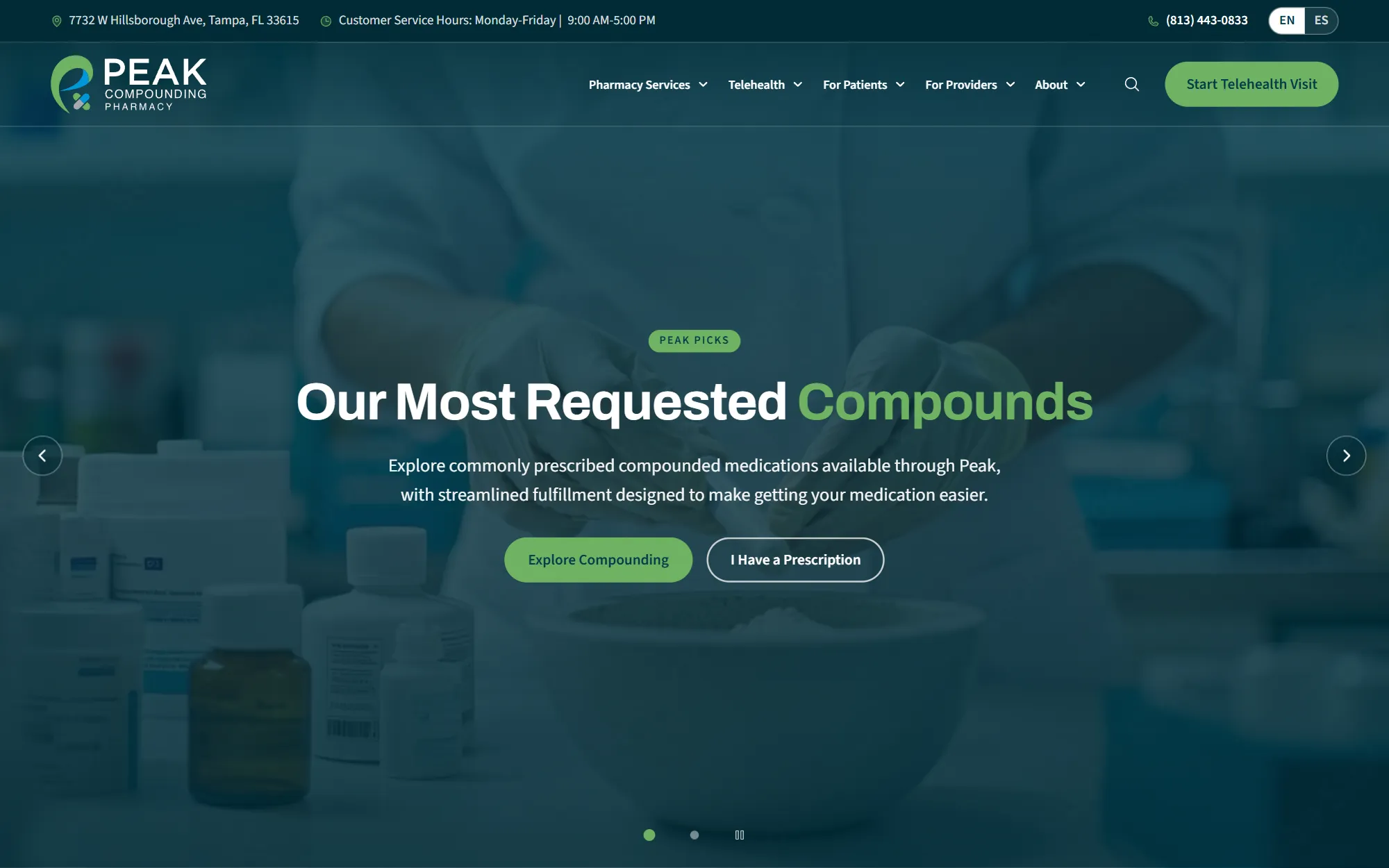
Peak makes medication to order: hormone therapy, peptides, weight management, sexual health, skin and general health. The old site sold none of it. The new one had to explain what a compounding pharmacy does in the words patients use, then get out of the way of the two things they came for, which are starting a prescription and asking a question.

A large part of Peak's neighbourhood speaks Spanish, so the site is built twice, page for page, rather than machine-translated on the fly.

Peakcompoundingpharmacy project view

Problems & solutions

  • Problem

    The compounds needed a page each, by category, not a paragraph on a services list.

  • Solution

    The content was organized around the information visitors need first.

  • Problem

    Spanish needed to be a real side of the site, with its own pages and its own search.

  • Solution

    A consistent visual system was applied across the main screens and components.

  • Problem

    The telehealth visit needed a plain handoff, so nobody is left guessing whether they are talking to the clinic or the pharmacy.

  • Solution

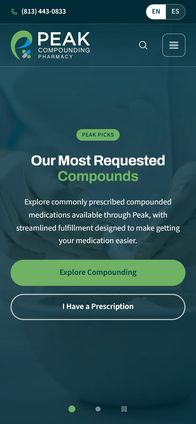
    The key journeys were simplified and adapted to different screen sizes.

Research, structure and design

English and Spanish share a grid, a type scale and a palette, so a page that exists on one side exists on the other with the same weight.

The structure and visual hierarchy were shaped to make the content and next steps clear across screen sizes.

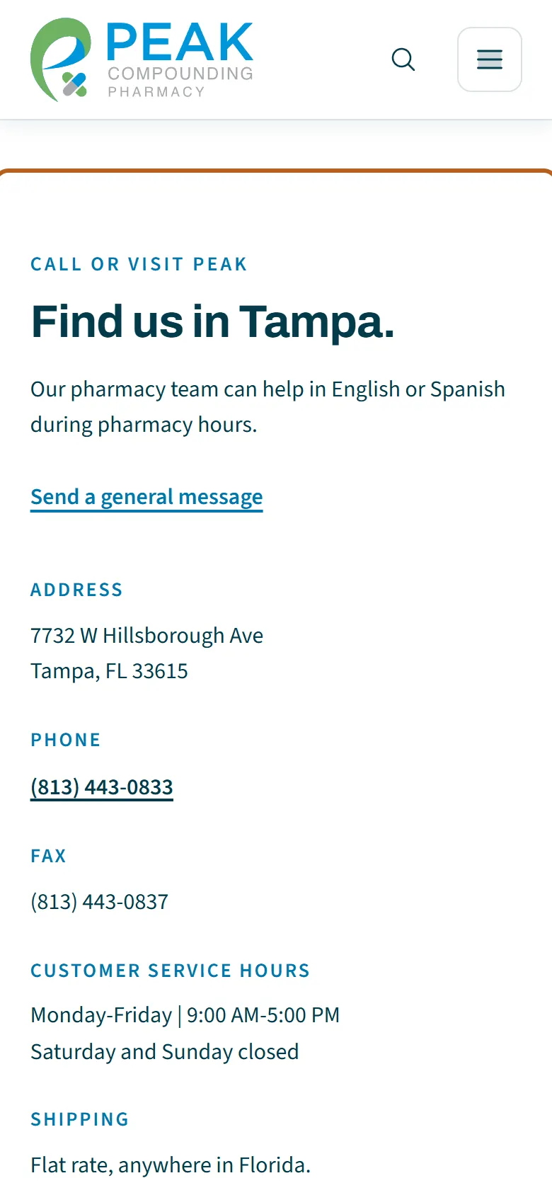
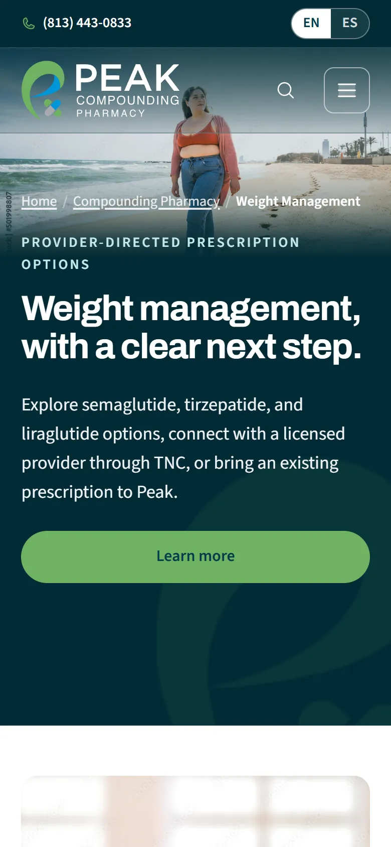
Peak Compounding Pharmacy: website screen
Peak Compounding Pharmacy: mobile website view
Peak Compounding Pharmacy: website screen
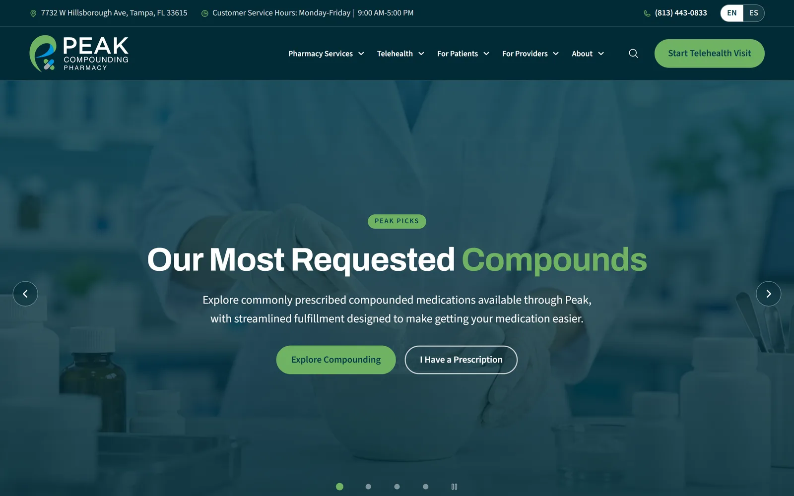
Peak Compounding Pharmacy: project mockup
Peak Compounding Pharmacy: mobile website view

Turning the idea into an experience

The old addresses forward to the matching new pages, so the links and search results patients already had still land in the right place.

The experience was organized to keep the key pages and journeys consistent.

Selected technologies

  • Figma
  • WordPress
  • HTML5
  • CSS
Peakcompoundingpharmacy project screen
Peakcompoundingpharmacy project screenPeakcompoundingpharmacy project screen
Peakcompoundingpharmacy project screen

Conclusion

Results

  • Naming the work

    I mapped what Peak actually compounds into six categories a patient would recognise, and gave each one a page instead of a line on a list.

  • Two languages, equally

    I built the Spanish side page for page with the English one, including its own search index, so neither side is a translation bolted on afterwards.

  • The handoff

    I drew the telehealth path as steps that say plainly which part is the clinic and which part is the pharmacy, so a patient always knows who holds their prescription.

Peak went live at peakcompoundingpharmacy.com on October 26, 2026: 73 pages across both languages, a search that reads them all, and the telehealth handoff drawn step by step.

The old addresses forward to the matching new pages, so the links and search results patients already had still land in the right place.

View live (Opens in a new tab)

Our cases

See what we’ve built

  • #UX/UI design #Website design

    Skinny Shot MD — A more approachable treatment journey

    Skinny Shot MD
    Tech stack
    Figma, WordPress, HTML5, CSS
    Timeline
    6 weeks

    Results

    • A more approachable treatment journey
    • Treatment information presented more clearly
    • A more approachable way to begin care
    Explore
  • #UX/UI design #Website design

    TNC Walk In Clinic — Three ways to get care, one clear starting point

    TNC Walk In ClinicTampa, FL
    Tech stack
    Figma, WordPress, HTML5, CSS
    Timeline
    8 weeks

    Results

    • Three ways to get care, one clear starting point
    • Care options brought into one starting point
    • A clearer route to the right visit
    Explore
    TNC Walk In Clinic

    Fantastic job on our new website! It's easy to use, looks great, and has helped streamline patient bookings.

  • #UX/UI design #Website design

    Vella Med Spa — A digital presence that balances care and confidence

    Vella Med Spa
    Tech stack
    Figma, Webflow, HTML5, CSS
    Timeline
    6 weeks

    Results

    • A digital presence that balances care and confidence
    • A more reassuring introduction to care
    • Services presented with a refined visual identity
    Explore