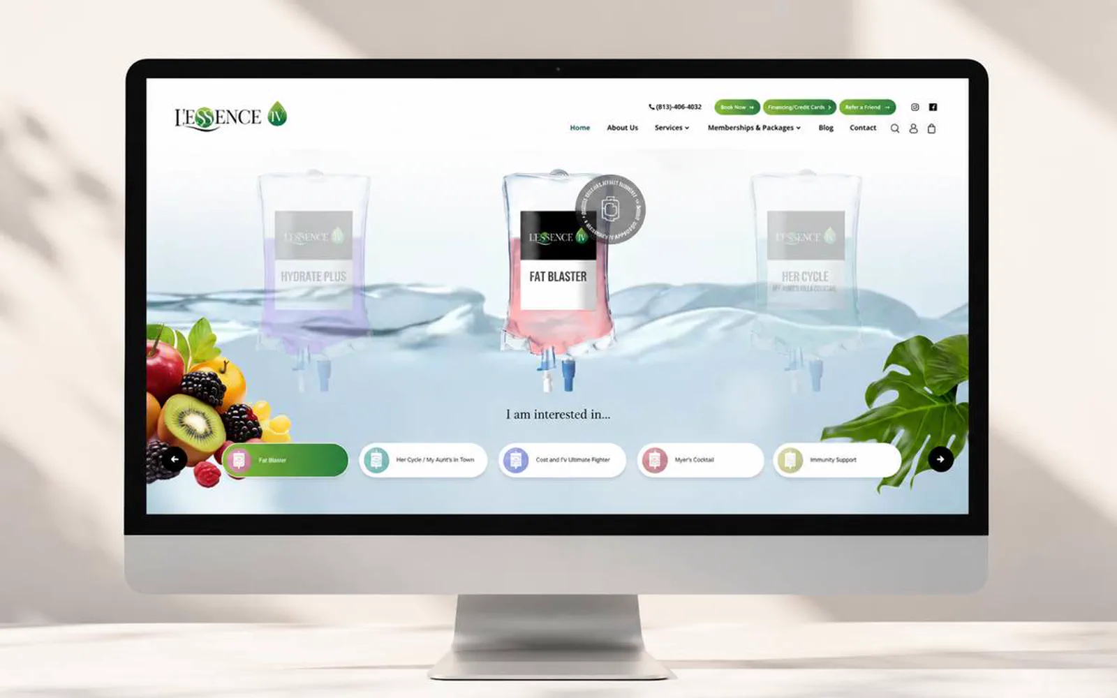
Weight & Body Solutions · Case study
A landing page built for the first consultation.
A wellness landing-page and brand direction for Weight & Body Solutions, built around treatment clarity and a stronger first impression.

What the website had to do.
Weight & Body Solutions needed a website direction that made the business easier to understand before a prospect reached out.
LER Web Services shaped the experience around clearer hierarchy, stronger visual trust, and a more direct path to action.
- 5Core pages, one hierarchy
- 4Workstreams in scope
- 1Primary path to contact
- 2025Launched
What had to change.
The offer needed to be easier to scan for first-time visitors.
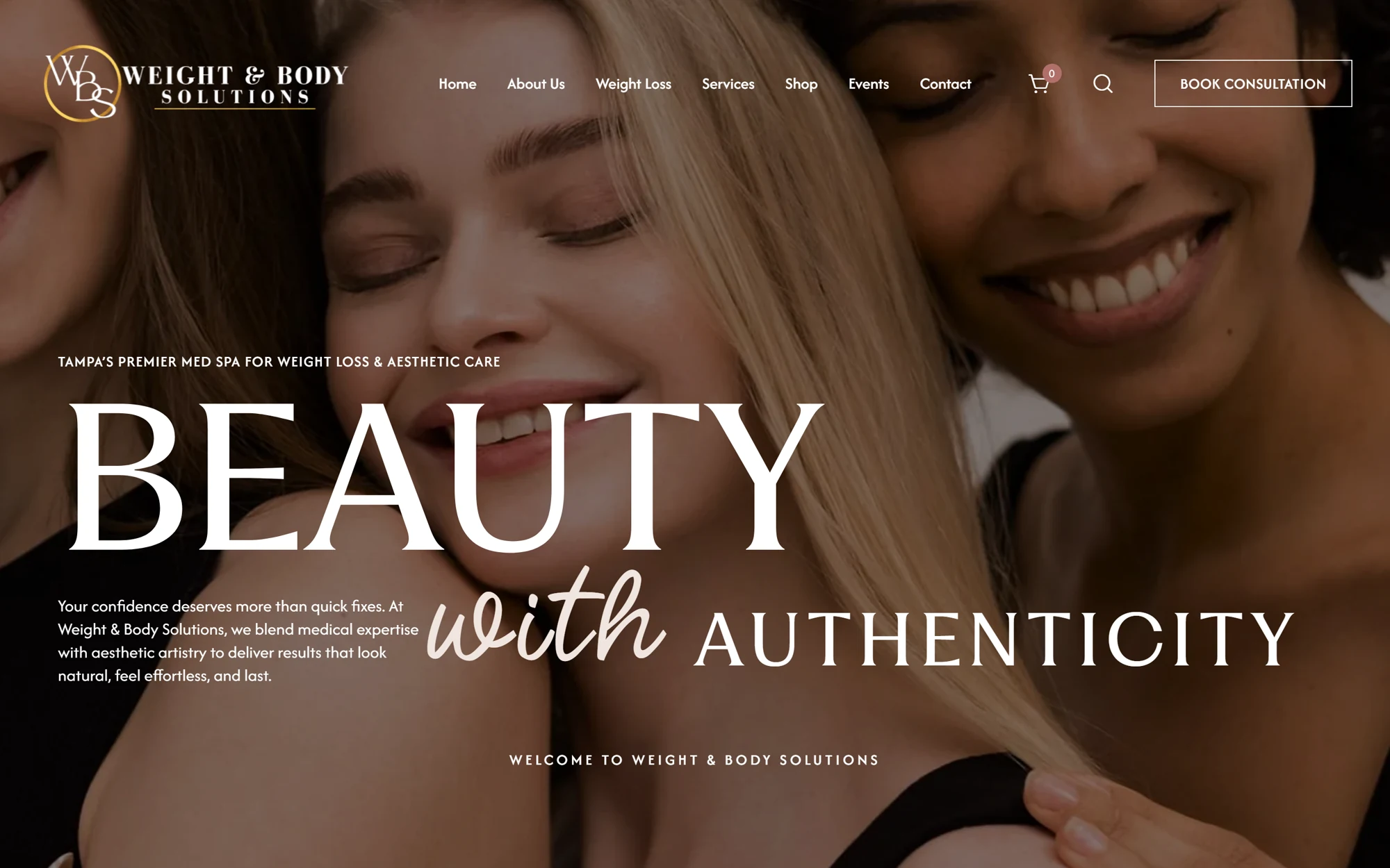
The brand needed a sharper first impression without overcomplicating the experience.
Mobile users needed the same clarity as desktop visitors.
The site needed a structure that could support future proof, content, and campaign updates.
Screens
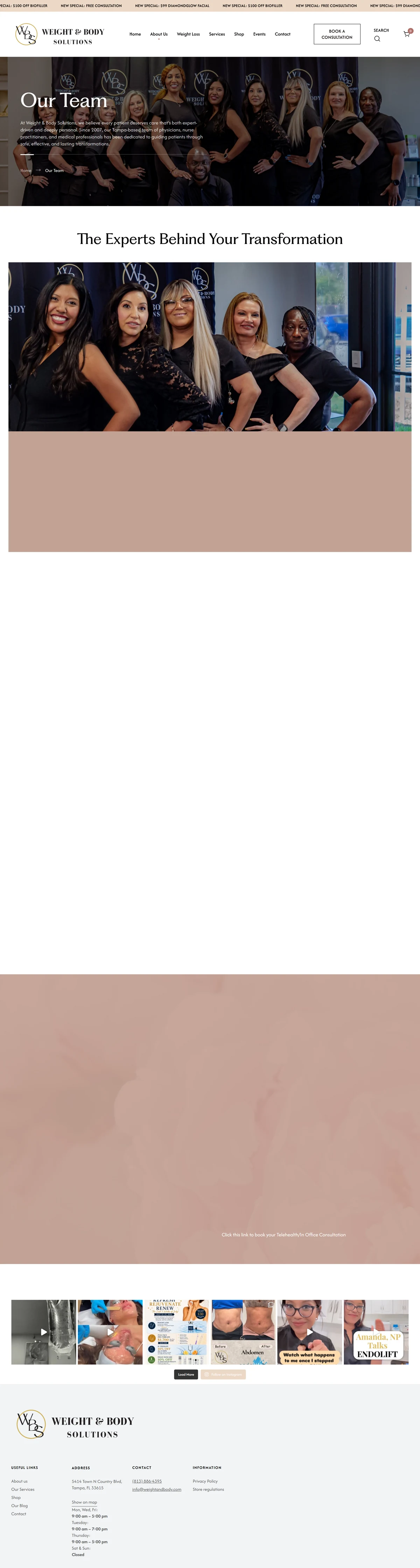
Every page, one system.
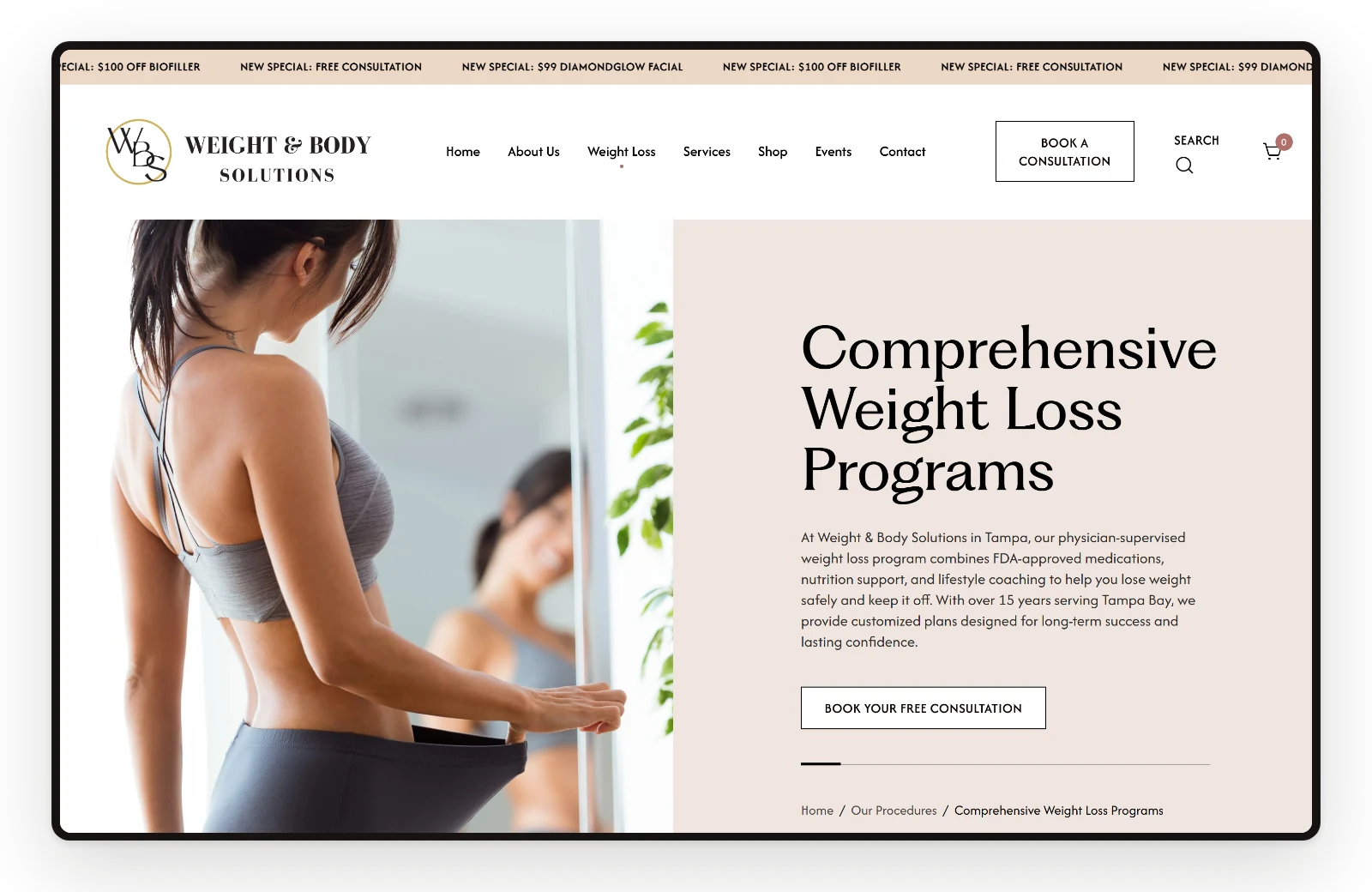
Home, programs, medication, team, and financing share one hierarchy, so a visitor moves from the offer to the next step in a few scrolls.




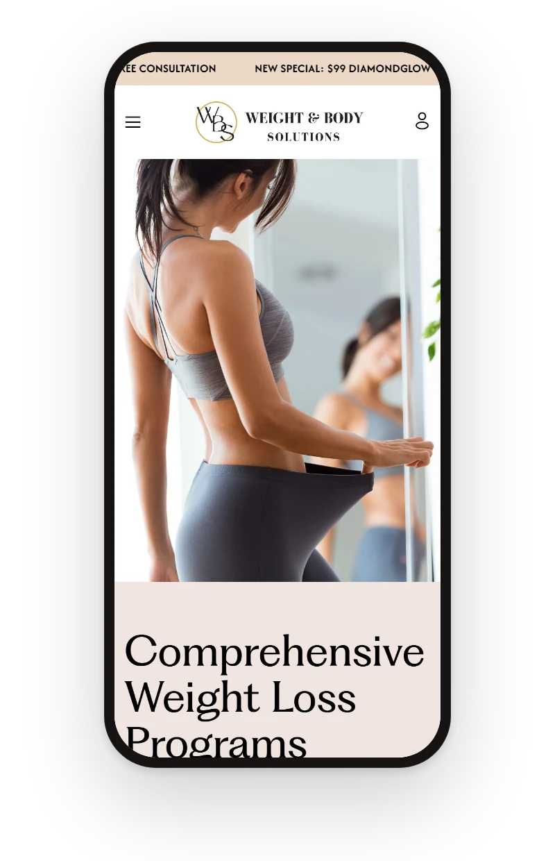
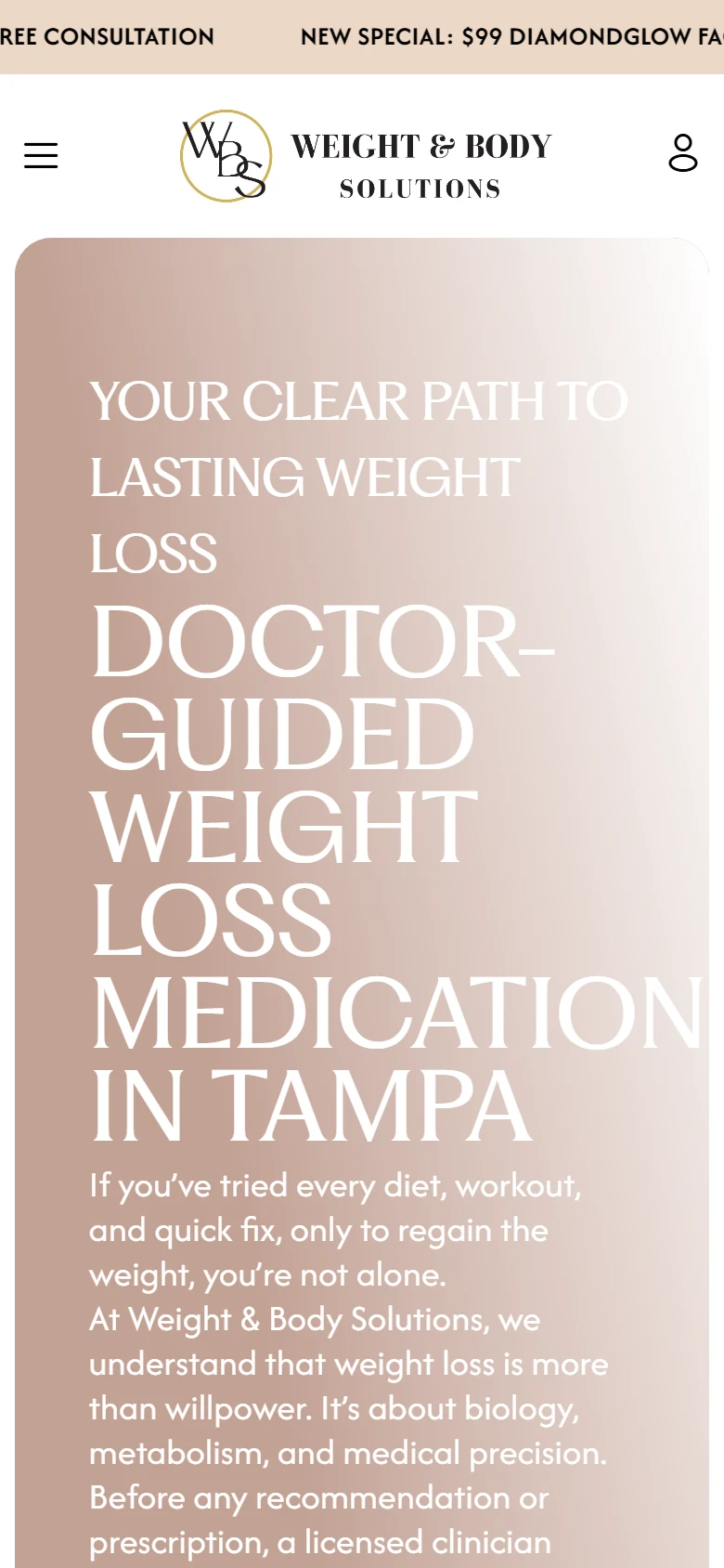
The same clarity on a phone.
Most visitors arrive on a phone: the offer, the proof, and the contact action keep the same order on mobile.


Visual system.
The site's own palette over the LER paper, PP Fragment for headings, and real screens of the live site instead of stock scenes.
- #17110F
- #D96A4E
- #E8B39B
- #73584C
- #F9EFEA
Outcome.
Weight & Body Solutions now has a clearer digital direction for explaining the offer and supporting better inquiry paths.
Weight & Body Solutions is presented with stronger hierarchy, clearer trust cues, and a more direct path for visitors to understand the next step.
From the client.
“Working with Ed was a game-changer for us. He made the whole process seamless and created a website that truly represents our brand. Highly recommend”
How this one came together.
The four steps behind this build, and what each one had to settle.
Discovery
I clarified the audience, offer, and practical questions the website needed to answer.
Page structure
I organized the page flow around service clarity, proof, and the next action a qualified visitor should take.
Responsive design direction
I shaped the visual system and core screens so the experience could stay polished across devices.
QA and refinement
I reviewed the experience for visual consistency, responsive behavior, and clear paths to contact or purchase.