Cadence Community Management · Case study
A steadier digital presence for association support.
A professional services website direction for community management, built around service clarity, board-level trust, and a calmer route to inquiry.
What the website had to do.
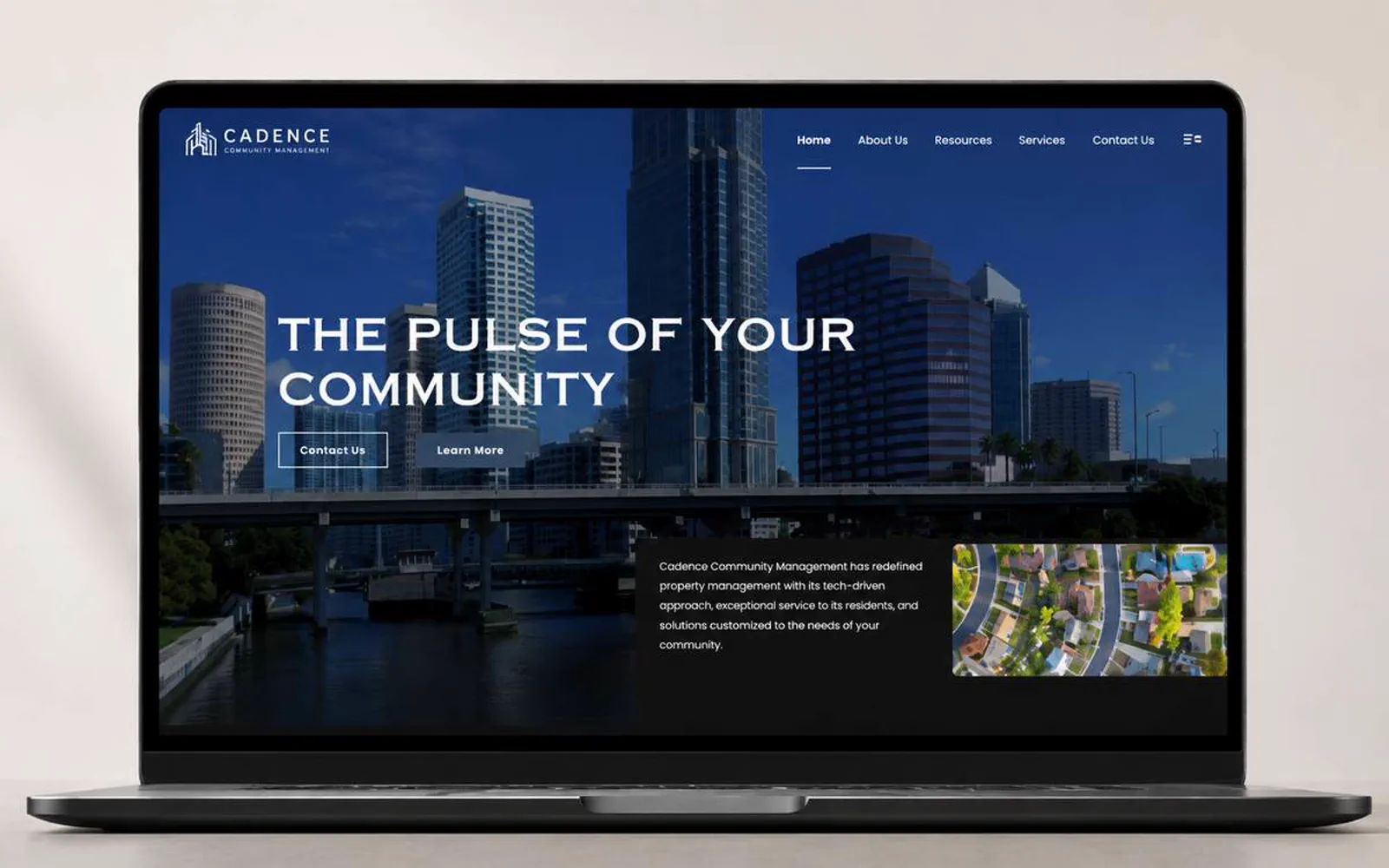
Community-management buyers are often comparing reliability before they compare design. Cadence needed a site that could make services easier to understand and the company easier to trust.
LER Web Services shaped the page direction around practical service hierarchy, responsive layouts, and a professional first impression for boards and property stakeholders.
- 5Core pages, one hierarchy
- 4Workstreams in scope
- 1Primary path to contact
- 2026Launched
What had to change.
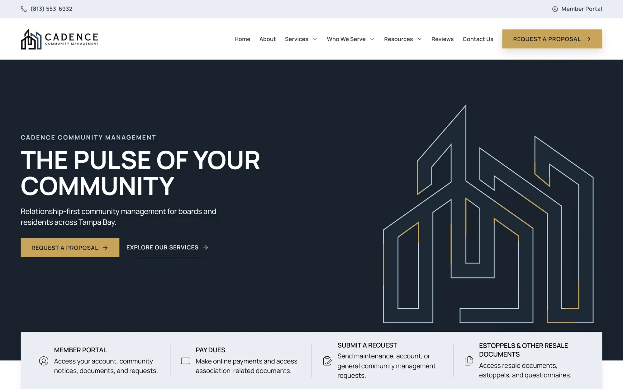
Service categories needed clearer organization for different visitor intents.
The brand needed to feel established without becoming corporate or cold.
Inquiry paths had to support practical questions from boards, owners, and residents.
The website needed room for future proof, testimonials, and service-area content.
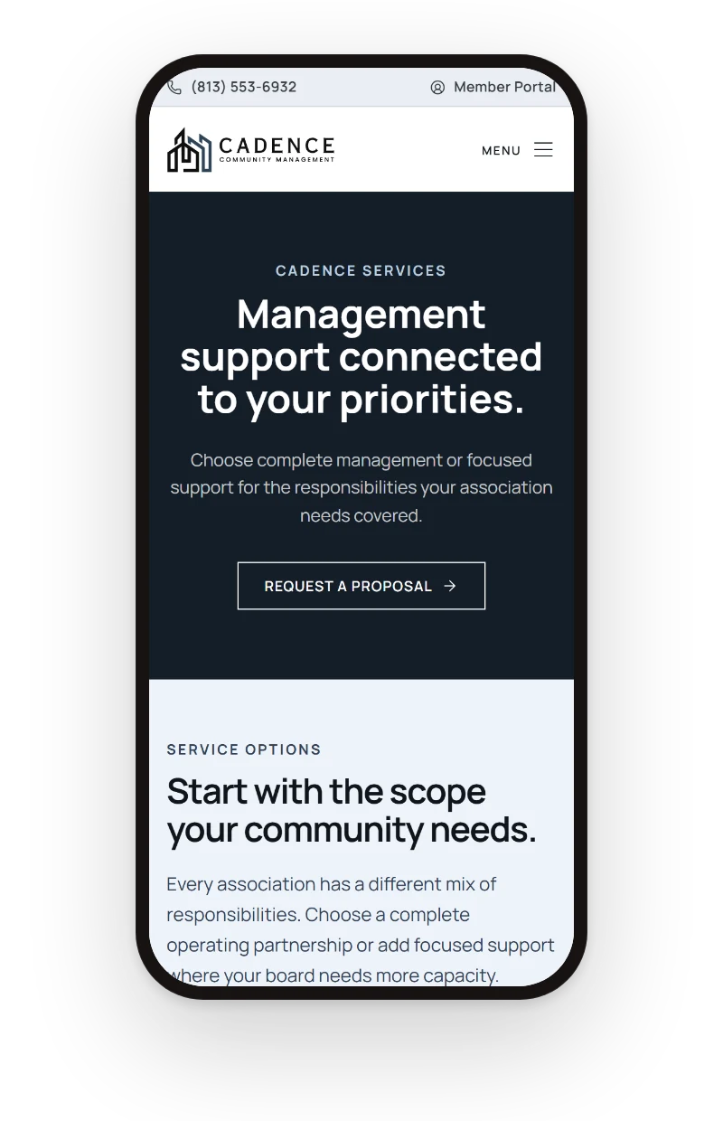
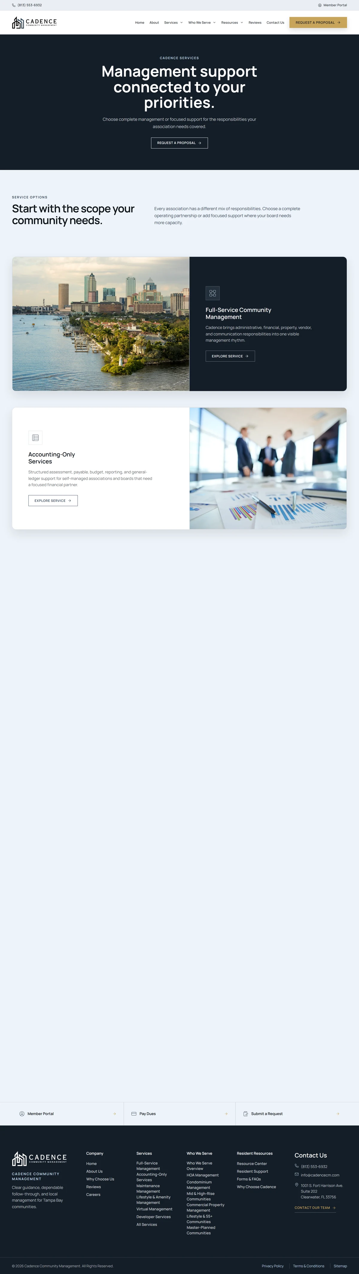
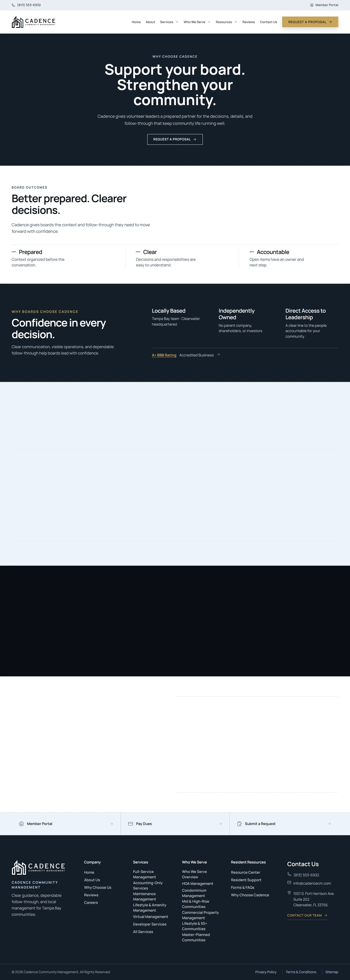
Screens
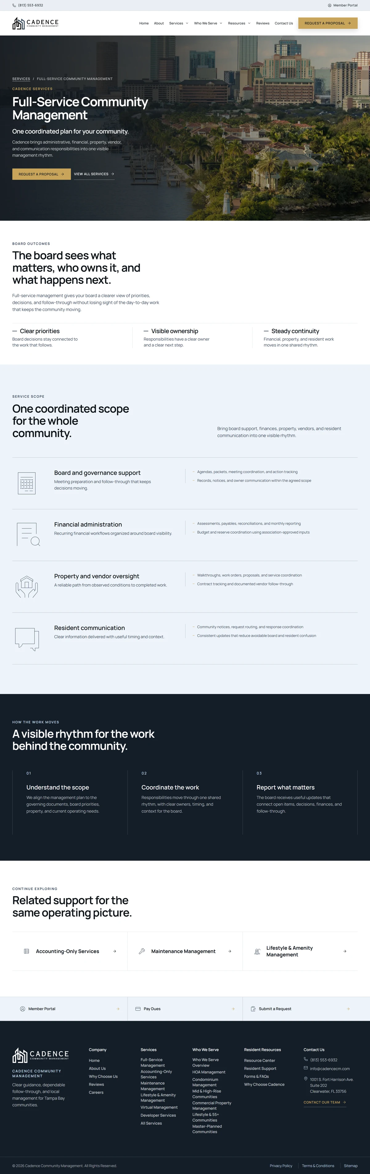
Every page, one system.
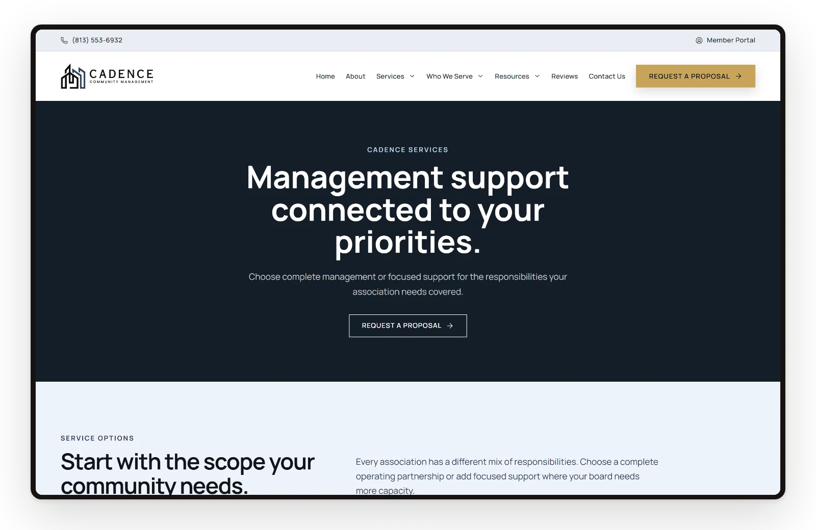
Home, services, full service, hoa, and why share one hierarchy, so a visitor moves from the offer to the next step in a few scrolls.

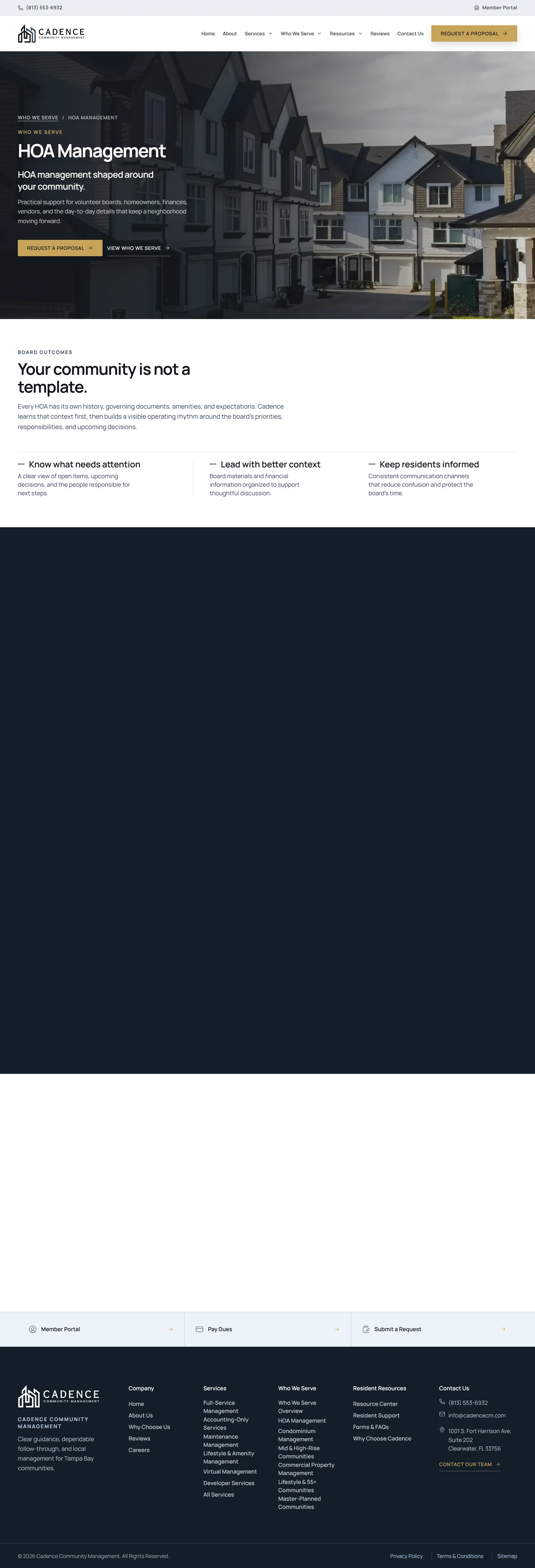
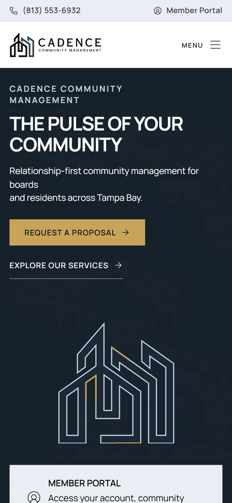
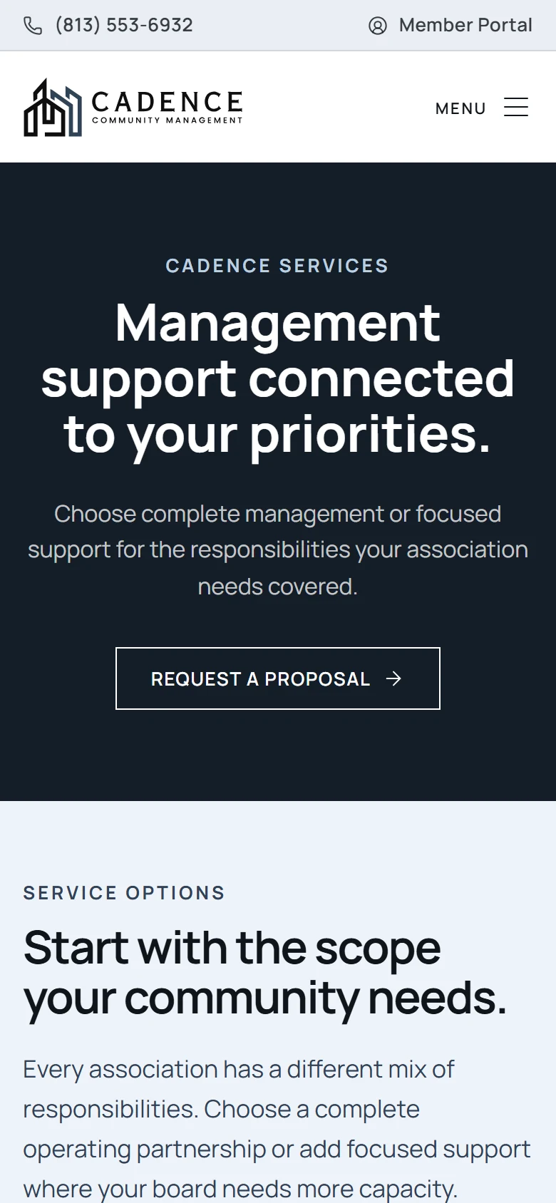
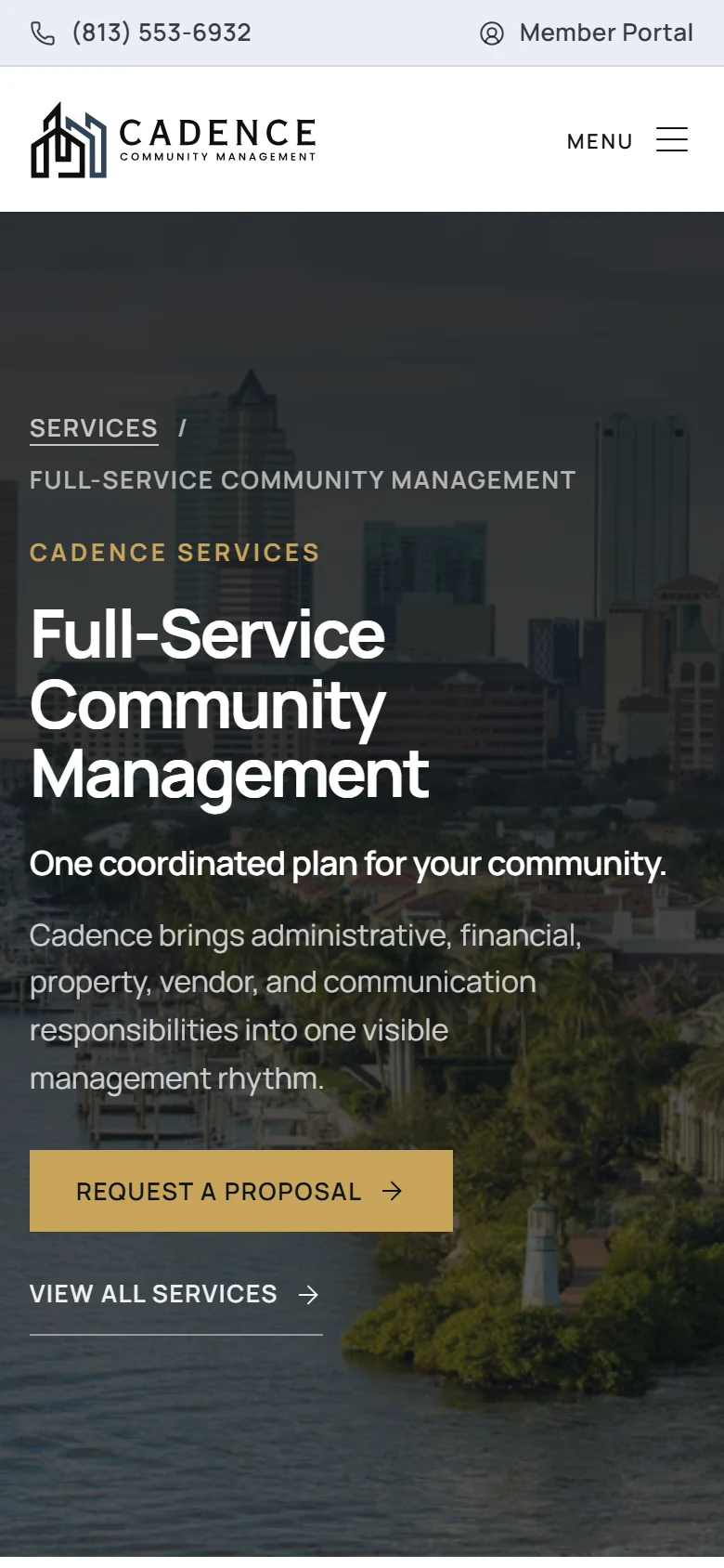
The same clarity on a phone.
Most visitors arrive on a phone: the offer, the proof, and the contact action keep the same order on mobile.
Visual system.
The site's own palette over the LER paper, Manrope for headings, and real screens of the live site instead of stock scenes.
- #071A2E
- #1C5D99
- #4D8BC8
- #7FA7C7
- #EAF2F8
Outcome.
Cadence now has a clearer digital direction for explaining community-management support and earning early trust.
The project now supports clearer service evaluation for board members, property owners, and residents.
From the client.
“I am extremely impressed with LER Web Services and Edson's exceptional work on my project. From start to finish, everything turned out brilliantly. Edson's responsiveness and dedication to completing the project were truly remarkable.
First and foremost, the quality of the web design provided by LER Web Services is outstanding. The website they designed for my small business exceeded my expectations in every way. The attention to detail, aesthetics, and functionality are exceptional. It is evident that Edson possess a deep understanding of web development and design.
Throughout the project, Edson's responsiveness was commendable. He promptly addressed all of my inquiries, concerns, and requests. His ability to understand and incorporate my vision into the final product was truly impressive. I felt valued as a client, and Edson's professionalism and clear communication made the entire process smooth and enjoyable.
Furthermore, Edson's commitment to completing the project within the agreed-upon timeline was exemplary. He consistently met deadlines and kept me updated on the progress. This level of reliability and efficiency is a testament to his strong work ethic and dedication to customer satisfaction.
I highly recommend LER Web Services and Edson to anyone seeking top-notch web design services.”
How this one came together.
The four steps behind this build, and what each one had to settle.
Discovery
I clarified the audience, offer, and practical questions the website needed to answer.
Page structure
I organized the page flow around service clarity, proof, and the next action a qualified visitor should take.
Responsive design direction
I shaped the visual system and core screens so the experience could stay polished across devices.
QA and refinement
I reviewed the experience for visual consistency, responsive behavior, and clear paths to contact or purchase.