Positioning
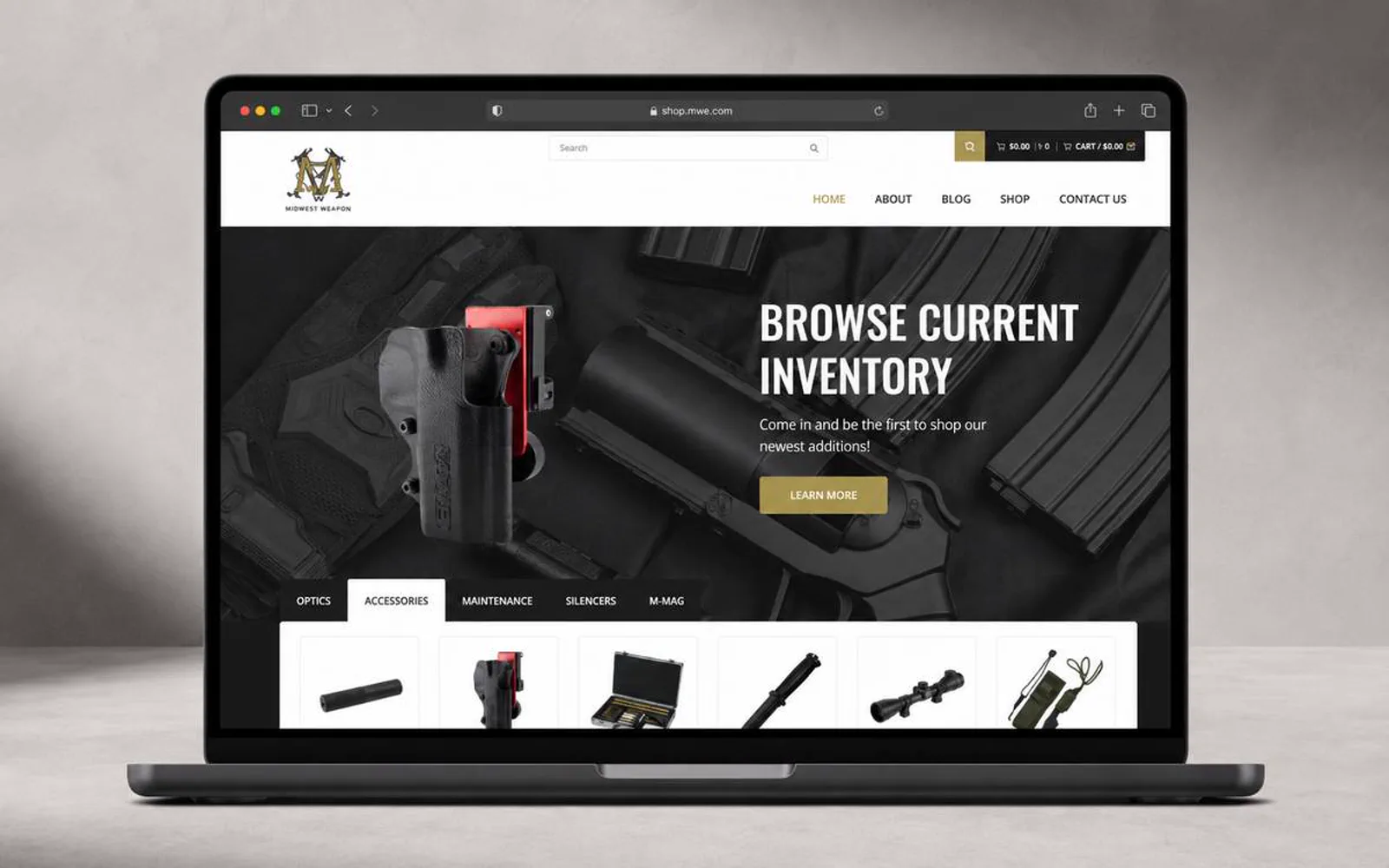
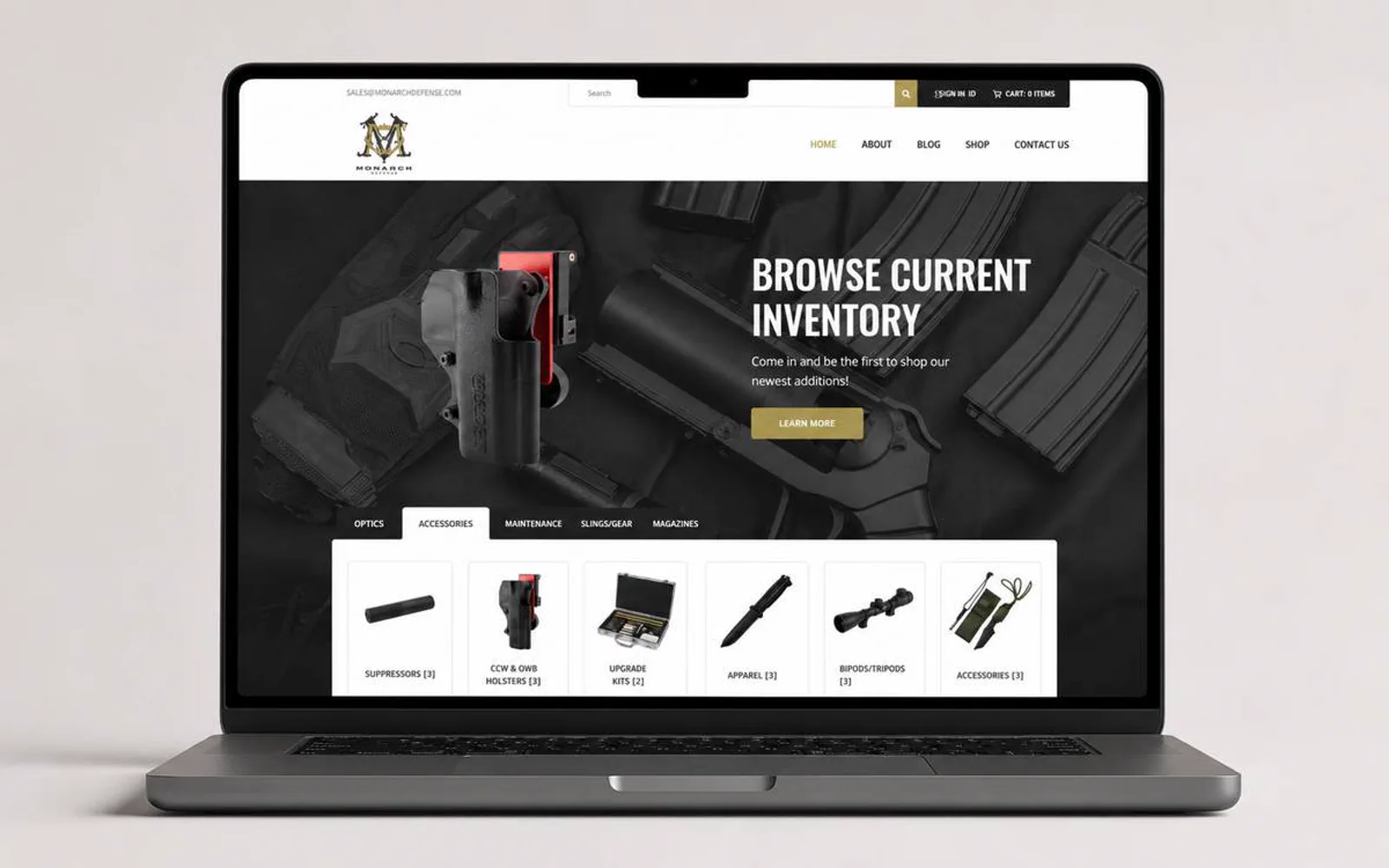
Gear shoppers need category clarity, product trust, and a direct path to purchase.
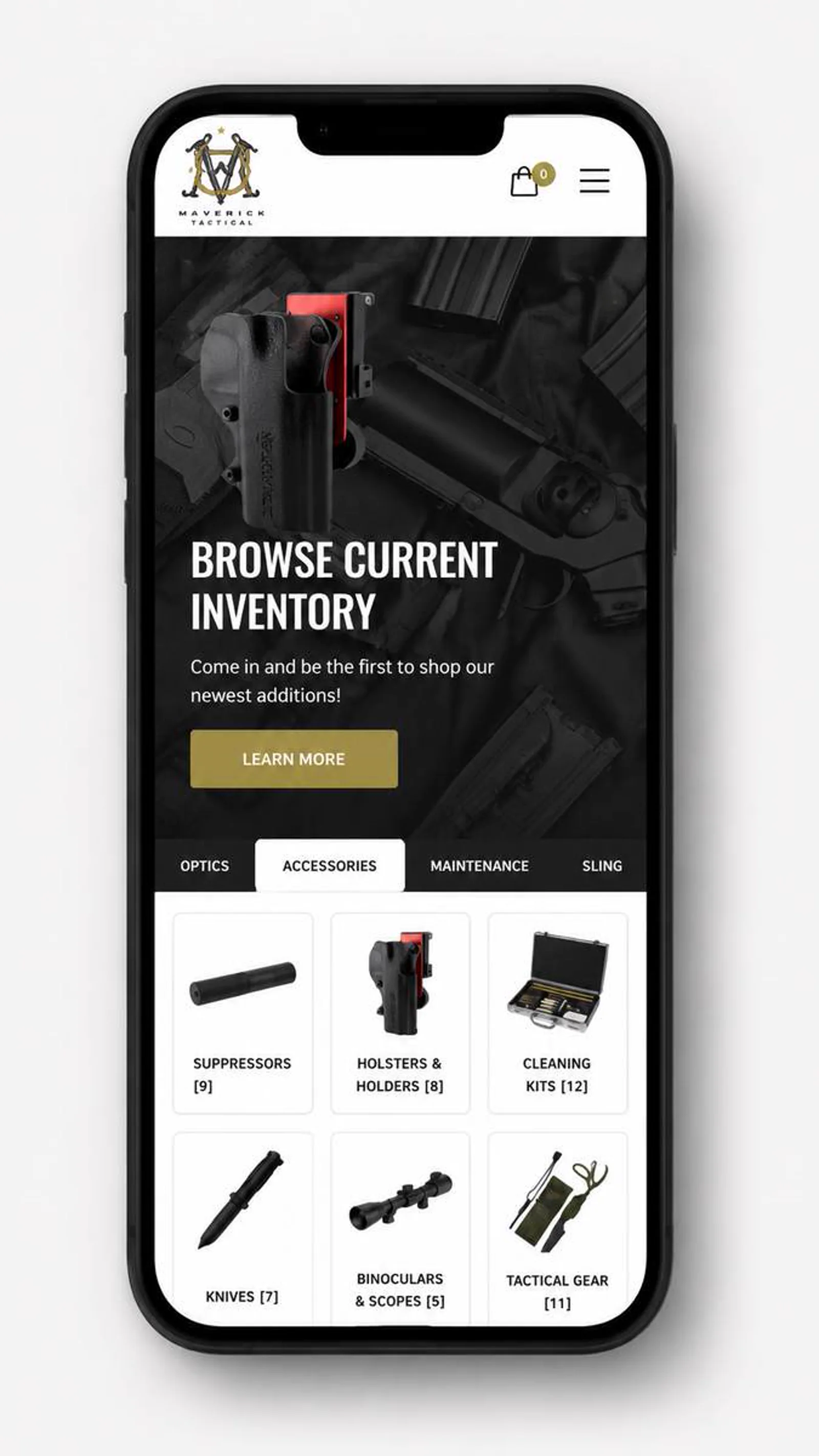
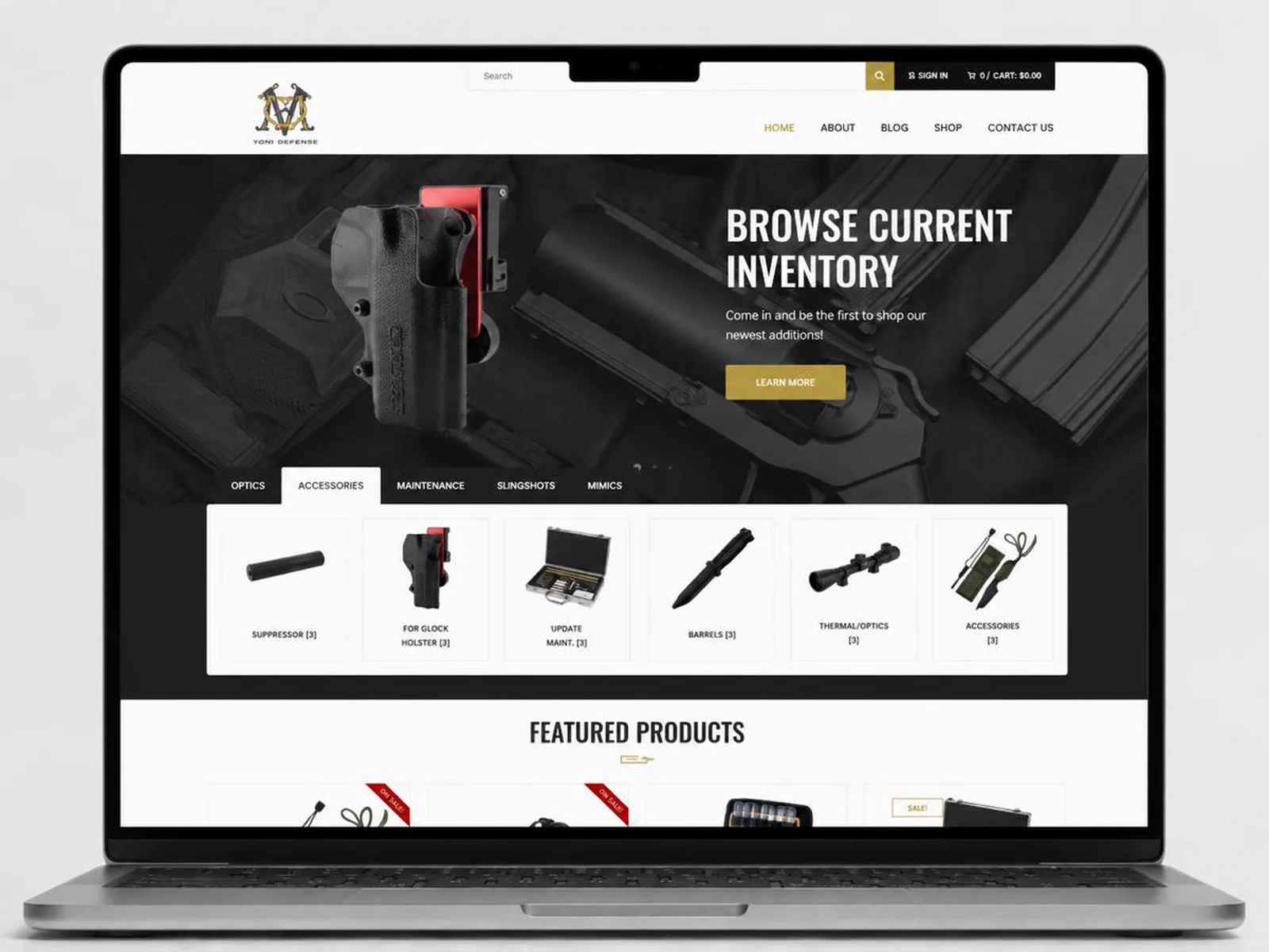
LER Web Services shaped the storefront direction around stronger product hierarchy, darker visual energy, and practical mobile browsing.

Tactical Gear E-commerce · Case study
A tactical gear storefront direction built around category clarity, product confidence, and a more decisive shopping experience.
Project story
Positioning, issues solved, scope, outcome, and the decisions behind the project.
Gear shoppers need category clarity, product trust, and a direct path to purchase.
LER Web Services shaped the storefront direction around stronger product hierarchy, darker visual energy, and practical mobile browsing.
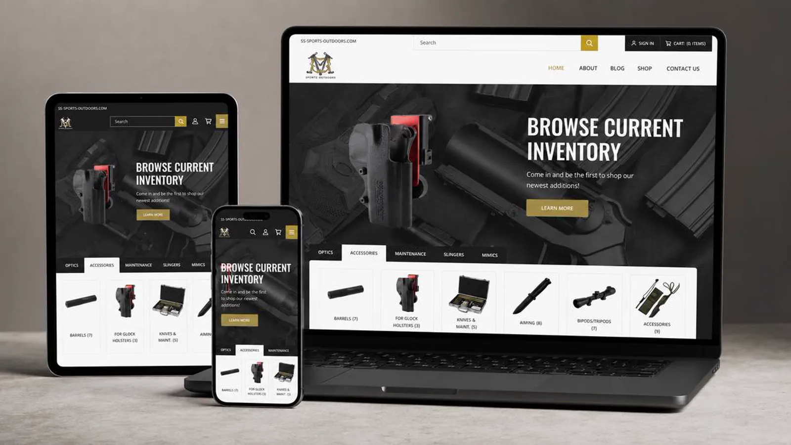
The tactical gear e-commerce experience needed to feel strong and practical while keeping product discovery straightforward.
The tactical gear storefront now has a clearer direction for product discovery and purchase confidence.
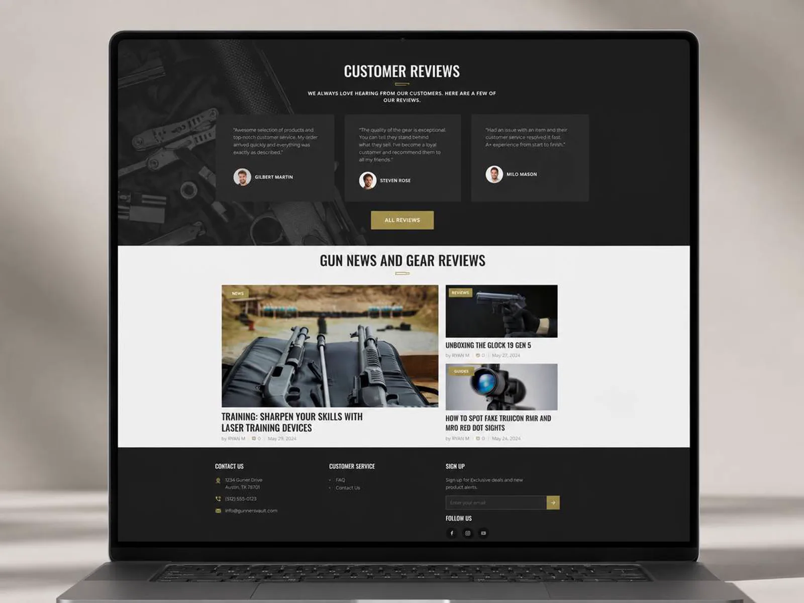
Tactical Gear E-commerce is presented with stronger hierarchy, clearer trust cues, and a more direct path for visitors to understand the next step.
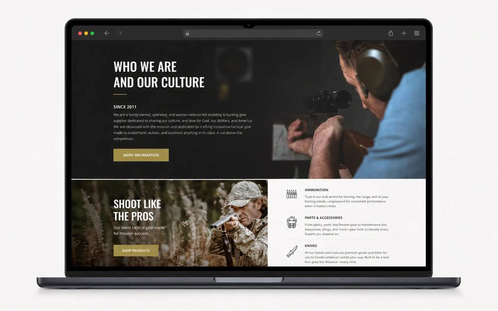
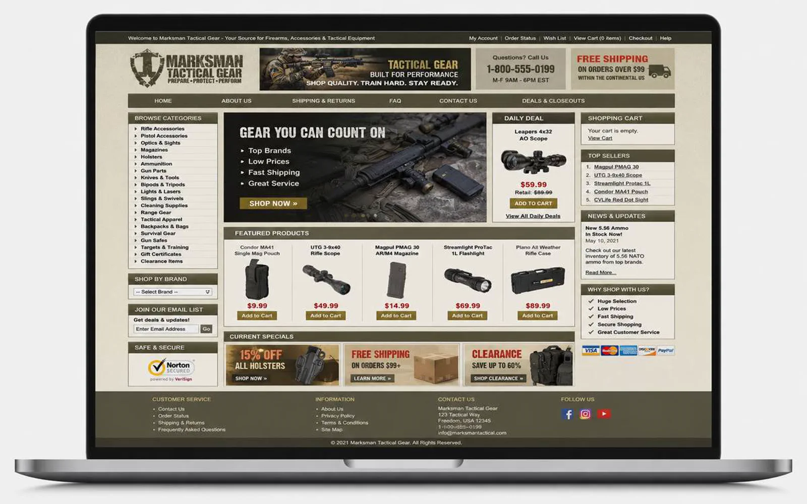
Tactical Gear E-commerce now presents the business with clearer positioning, cleaner responsive screens, stronger content structure, and a calmer path from interest to action. The work brought E-commerce UX, Product category structure, and Responsive storefront design into one consistent public-facing experience.
Visual system
A concise record of the visual direction behind the project.
Editorial sans + practical hierarchy
The visual direction keeps the project clear, polished, and usable across desktop and mobile screens.
The copy direction stays direct: explain the value, reduce uncertainty, and make the next step easier to take.
A standard LER project path, adapted to the scope and available client material.
Discover
I clarified the audience, offer, and practical questions the website needed to answer.
Structure
I organized the page flow around service clarity, proof, and the next action a qualified visitor should take.
Design
I shaped the visual system and core screens so the experience could stay polished across devices.
Review
I reviewed the experience for visual consistency, responsive behavior, and clear paths to contact or purchase.
Project visuals
Selected screens, mockups, and brand moments from the project archive, normalized to the current WebP project library.